
Recently, chess has suddenly become a game favored by Indonesians. The proof is that the sales of this game on the market have increased drastically. Nothing but the euphoria of the chess drama that occurred in Indonesia. Mr. Dadang Subur or better known as the Fan God, took the virtual world by storm by defeating a world-class chess master at Chees.com. This drama reached its peak when Master Dedy Corbuzier also highlighted this phenomenon through a podcast on his YouTube channel. He held a live chess match between Mr. Dadang Subur (Dewa Kipas) vs Grand Master Catur Irene Sukandar. Even though in the end the Fan God was defeated with a score of 3-0, it did not make the Indonesian public curious about this chess game itself. So that you no longer feel curious about this game, here are the facts you need to know about the game of chess.

- History of Chess
Chess is believed to have first appeared in the 7th century in northern India, as Chaturanga. This game is also believed to be the ancestor of similar strategy games that emerged in various other countries, such as xiangqi (Chinese chess), shogi (Japanese chess), and janggi (Korean chess). Meanwhile, chess began to enter Europe around the 9th century, where the Umayyad conquest of Hispania occurred. The chess pieces we know today took their form in the late 15th century in Spain and only had rules that had been standardized in the 19th century.
- Kinds of Chess Pieces
The game of chess is played by two people who compete with each other and each player has 16 pieces with the composition of one King (King), one Queen (Queen), two Ministers (Bishop), two horses (Knight), two rooks (Rook), eight warrior (pawn). Each of these types has different attack movements.
• King: moves in all directions from front-back, right-left, diagonally-vertically, and black-and-white. But unfortunately the king can only move one step.
• Queen: moves in all directions without any step restrictions, provided there are no other pieces blocking his steps.
• Minister: moves diagonally with free strides, but only in one type of square color, black or white.
• Rook: moves horizontally and vertically at a free pace, as long as nothing gets in the way.
• Horse: moves in the letter L, which means two straight square steps followed by one tile right or left. This piece has the advantage over other pieces, which is that it can jump over the pieces in front of it.
• Pawns: can only move forward and move diagonally if eating opponent’s pawns. The unique thing about this pawn is that when a pawn has reached the area of the opponent’s last tile, it can be exchanged for pieces that have been eaten by the opponent.
- Chess as a Thinker Branch
Have you ever wondered why chess can be categorized as a sport? Of course the answer is that this game has met the requirements as a form of strategic thinking sport. Chess games can be categorized as slot online games that require thinking power to understand number patterns and strategies to look for opportunities. Because in chess, athletes are required to be physically and mentally ready to run every match. By relying on the ability to think, this game tests every strategy that is always changing when the opponent’s movements do not match what is expected.
Have you understood the facts about the game of chess? So after this you can apply it in live chess matches and show your greatest strategy.
Tips Dan Trik Bermain Untuk Memenangkan Catur Seperti Pro

Tips Dan Trik Bermain Untuk Memenangkan Catur Seperti Pro – Catur adalah permainan strategi yang membutuhkan kesabaran dan karena ini adalah salah satu permainan intelektual , kita harus berusaha sebaik mungkin jika kita harus menang. Di blog ini, kami akan membahas beberapa tips dan trik hebat tentang cara menguasai catur.
Tips Dan Trik Bermain Untuk Memenangkan Catur Seperti Pro
italiascacchistica – Apakah Anda juga terinspirasi oleh kisah Queen’s gambit dari serial Netflix yang populer dan bertanya-tanya bagaimana cara menjadi grandmaster catur seperti dia? Yah, kita pasti! Jadi kami berpikir mengapa tidak mengeluarkan beberapa tip dan trik yang akan membantu kami dan Anda bermain catur seperti seorang profesional.
Bermain catur dengan teman memang selalu menyenangkan, tetapi momen terakhir saat Anda melakukan skakmat lawan terasa berbeda, bukan? Jadi untuk 100% yakin bahwa kita memenangkan permainan catur berikutnya, kami telah merumuskan beberapa trik catur dari juara catur di dunia nyata, jadi pastikan Anda bertahan sampai akhir untuk mengetahuinya!
Buka Dengan Pion
Trik yang diremehkan atau jika boleh dikatakan trik yang diunggulkan dalam permainan catur adalah langkah pembuka bidak. Seperti yang sudah Anda ketahui, bidak dapat memindahkan dua balok terlebih dahulu, kemudian mengikuti jalur satu petak per langkah. Jadi, menggerakkan bidak di depan raja atau ratu untuk memberi ruang bagi uskup dan benteng yang melakukan perjalanan dengan cara tertentu untuk memasuki permainan adalah trik catur pertama kita. Ini memastikan bahwa Anda memiliki pemain besar dan kecil yang siap menangkap musuh sementara raja Anda tetap aman.
Puri Raja Anda Menjadi Aman
Raja berdiri paling tinggi dalam permainan papan catur, jadi jika Anda bertanya-tanya apa trik untuk menyelamatkan Anda dari skakmat, ini dia. Kastil atau benteng mulai dimainkan saat blok antara raja dan benteng sudah jelas.
Baca Juga : Trik Profesional Catur Untuk Pemula
Pindahkan raja Anda dua petak ke benteng dan benteng Anda bergerak untuk menutupi sisi raja yang lain. Trik catur keren ini akan membantumu menyerang raja lawan jika dia gagal mengasingkan rajanya sekaligus menyelamatkan rajamu!
Selalu Waspadai Jebakan
Tip paling integral untuk memenangkan permainan catur adalah kewaspadaan. Jika Anda kendur atau merasa seperti berada di jempol tangan Anda, maka Anda membuat kesalahan. Berhati-hatilah dan pertimbangkan apa yang harus dipikirkan lawan Anda. Apakah dia memasang perangkap? Pengamatan taktik lawan Anda akan memberikan rencana aksi bagi Anda untuk memenangkan permainan catur, dan memenangkannya seperti seorang profesional!
Serang saat lawan tidak menduganya
Permainan tengah adalah medan pertempuran bagi penyerang, semua bidak catur Anda keluar dan ini adalah waktu yang dihabiskan lawan Anda untuk merencanakan pelarian mereka menuju raja Anda. Pindahkan bidak sebanyak yang Anda bisa ke garis serang tanpa mengganggu pertahanan kastil di sekitar raja Anda sendiri. Kesalahan kecil dan Anda akan mendapatkan cek untuk menutup kemenangan dengan trik sederhana untuk memenangkan catur.
Temukan nilai setiap bidak di papan Anda
Kami tidak akan menyebut ini sebagai trik semata, karena ini benar-benar langkah yang cerdas. Saat merencanakan langkah Anda selanjutnya di papan catur, pahami nilai setiap bidak catur di set catur untuk Anda. Kehilangan bagian dalam catur sangat mudah sehingga Anda harus membuat keputusan yang bijak saat bertukar pemain. Perkawinan beberapa pemain benar-benar dapat membawa Anda ke permainan akhir catur, jadi pastikan Anda tidak menukar benteng atau uskup hanya untuk menyelamatkan bidak!
Kesabaran adalah sahabat Anda
Catur adalah salah satu permainan pengembangan otak yang paling luar biasa , dan memang seharusnya demikian karena mengharuskan Anda untuk mengamati, berpikir, merencanakan, dan menyerang. Kesabaran adalah trik kunci untuk memenangkan catur , anggap saja itu yang paling vital juga! Jika Anda bermain terlalu cepat tanpa cukup memikirkan langkah selanjutnya, Anda pasti akan kalah! Sangat lambat dan mantap memenangkan perlombaan dengan permainan papan catur ini .
Ini adalah trik dan tip keren untuk bermain dan memenangkan catur seperti seorang profesional , dan bersenang-senanglah saat Anda melakukannya! Jika Anda mencari set catur kayu klasik maka jangan lupa untuk memeriksa set catur kayu sheesham dari koleksi kami dan latih semua trik catur yang telah Anda pelajari!
Trik Profesional Catur Untuk Pemula

Trik Profesional Catur Untuk Pemula – Catur mungkin terdengar seperti permainan elegan yang menggiurkan bagi Anda, tetapi permainan ini layak untuk dimainkan.
Trik Profesional Catur Untuk Pemula
italiascacchistica – Banyak pecinta atau kolektor catur mungkin memiliki koleksi catur yang estetikbidak catur kayu staunton, papan catur rosewood emas berkelas, atau set catur marmer kerajaan, tetapi dalam hal memainkan permainan, mereka gagal memberikan tip dan trik catur yang diperlukan untuk memenangkan pertandingan.
Jika Anda salah satunya, kami memiliki beberapa wawasan mengesankan tentang bermain catur seperti seorang profesional yang akan membantu Anda! Jadi, tanpa basa-basi lagi, mari kita mulai.
Kuasai gerakannya
Ada 6 bidak catur berbeda yang bergerak dengan cara tertentu. Mengutip beberapa contoh, bidak hanya memindahkan satu petak pada saat sudah bergerak, sementara pion dapat bergerak hingga 2 petak pada langkah pertamanya. Di sisi lain, seorang uskup bergerak dalam bentuk X. Demikian pula, setiap bidak memiliki gerakannya sendiri, dan Anda harus mempelajarinya untuk mendapatkan kejelasan yang maksimal. Ini adalah strategi catur paling penting bagi pemula untuk memahami pengetahuan permainan.
Baca Juga : Manfaat Positif Bermain Catur Tanpa Anda Sadari
Mulailah permainan dengan pion
Maju pion yang ditempatkan di depan ratu atau raja dua petak ke depan. Langkah ini akan membuka jalan bagi ratu dan uskup untuk memasuki permainan secara bersamaan. Namun, pergerakan mereka terganggu saat panci sedang dalam perjalanan; dengan demikian, masalah tersebut dapat diselesaikan dengan memindahkan bidak tersebut pada langkah pertama. Kami yakin ini adalah salah satu tip dan trik terbaik untuk catur yang belum pernah diceritakan siapa pun kepada Anda. Anda dapat berterimakasih pada kami nanti!
Tembak uskup & ksatria anda
Itu selalu merupakan langkah yang bijaksana untuk mendapatkan uskup dan keluar malam sebelum Anda memindahkan ratu, raja atau benteng. Arahkan mereka ke tengah papan. Dengan demikian, Anda dapat menyerang dari belakang pion. Strategi dan taktik catur sederhana seperti itu adalah batu loncatan menuju kemenangan Anda.
Pikirkan ulang setiap gerakan anda!
Jangan pernah bergerak (bahkan yang paling sederhana) tanpa mempertimbangkan semua kemungkinan yang mungkin ditimbulkannya. Saat giliran Anda tiba, pertama-tama pikirkan langkah terakhir yang dimainkan lawan Anda. Kemudian, hati-hati terhadap jebakan apa pun jika mereka mengarahkan Anda ke sana. Selalu berusaha untuk mengancam raja lawan Anda terlebih dahulu dan tangkap pemain mereka. Terakhir, tanyakan pada diri Anda pada setiap gerakan apakah Anda membiarkan orang-orang Anda tidak terlindungi. Anda akan mendapatkan kejelasan di setiap gerakan dengan cara ini. Jika Anda mencari trik catur untuk pemula , taktik ini pasti akan mengubah Anda menjadi seorang profesional.
Hemat waktu anda
Banyak pemain membuang-buang waktu dengan mengambil bidak lawan atau memainkan terlalu banyak peluang dengan bidak mereka sendiri. Hindari itu!
Puri awal
Buat benteng Anda bermain karena benteng itu akan melindungi raja. Pertama, coba kosongkan semua kotak antara raja dan benteng Anda. Setelah selesai, majukan raja Anda dua kotak ke arah benteng dan pindahkan benteng Anda ke kotak yang ditempatkan di sisi lain raja. Jika lawan Anda gagal mengasingkan jenisnya, Anda dapat secara proaktif melancarkan serangan ke rajanya.
Serangan middlegame
Keluarkan semua uskup dan ksatria Anda ke dalam permainan, dan setelah Anda melakukan rokade, ini adalah gerakan pembuka Anda. ya, Anda tidak salah dengar. Sekarang, kami akan mengungkap salah satu tips dan trik catur kami untuk pemula yang mungkin sedikit menggugah pikiran. Berhati-hatilah untuk mengidentifikasi orang-orang yang tidak terlindungi dari lawan Anda. Yang terpenting, mulailah mencari gerakan yang pada akhirnya menempatkan pasukan Anda pada posisi menyerang.
Kalah potongan secara diam-diam
Ya, memang benar Anda akan memilih anak buah lawan Anda, dan beberapa bidak Anda akan diambil olehnya. Namun, Anda harus dapat menemukan swap yang tepat. Ingat poin yang dibawa setiap bidak catur dan tanyakan pada diri Anda sendiri, “apakah bijaksana untuk menyelamatkan bidak Anda dan kehilangan seorang ksatria?” Tentu saja tidak!
Strategi catur profesional untuk pemula: Pegang kuda Anda saat Anda melihat gerakan yang bagus! Jangan terlalu cepat bersemangat, dan pikirkan langkah yang lebih baik dengan sabar. “Kesabaran adalah kunci kesuksesan catur,” kata mereka.
Raih kemenangan endgame
Setelah pertukaran besar dilakukan dari kedua ujungnya, permainan akhir dimulai. Pada tahap permainan ini, pion menjadi sangat penting. Semakin jauh pion Anda maju, itu menjadi ratu Anda. Dan itu sudah sukses besar. Selanjutnya, lindungi raja Anda dengan menjauhkannya dari jangkauan lawan, memberikan perhatian khusus kepada “ratu” dan tidak membiarkannya diperiksa! Ingat strategi dan taktik catur ini & berlatihlah secara konsisten untuk menang dalam jangka panjang.
Lawan Anda, ketika mengancam untuk menangkap jenis Anda pada langkah selanjutnya; rajamu diperiksa! Anda tidak dapat melarikan diri dari ancaman karena Anda tidak dapat menangkap bidak tertentu yang memeriksa raja Anda. Jadi, sekakmat lawan Anda sebelum dia melakukannya. Anda bisa menjadi master catur dengan mempraktikkan peretasan ini. Untuk membumbui sesi latihan Anda, belilah perangkat catur yang cantik, seperti aset catur kayu lipatatau set catur logam.
Manfaat Positif Bermain Catur Tanpa Anda Sadari

Manfaat Positif Bermain Catur Tanpa Anda Sadari – Pada pertengahan abad ke-17 Jepang, Miyamoto Musashi, prajurit Samurai yang tak terkalahkan, menulis Go Rin No Sho, A Book of Five Rings, sebuah analisis mendalam tentang strategi Samurai yang menang. Selama lebih dari tiga abad mahakarya seni bela diri ini tetap menjadi rahasia Jepang, tetapi pada tahun 1974 ditemukan oleh Barat.
Manfaat Positif Bermain Catur Tanpa Anda Sadari
italiascacchistica.com – Hampir dalam semalam, terjemahan baru ini terjual lebih dari 120.000 eksemplar dalam bentuk hardcover, melambungkan status best-seller dalam bentuk paperback dan mendapat pujian dari surat kabar terkemuka di seluruh dunia.
Dari satu hal, ketahuilah sepuluh ribu
Pesan utama Musashi adalah salah satu ‘penerapan yang lebih luas’, ‘transferabilitas’. Mencapai penguasaan dalam satu disiplin mempersenjatai Anda dengan senjata untuk mentransfer keterampilan itu ke semua bidang kehidupan lainnya.
Meskipun di permukaan-buku Musashi secara khusus merupakan panduan untuk ilmu pedang Samurai, pada tingkat yang lebih dalam ia memberikan cetak biru untuk strategi, keputusan, dan tindakan di rumah, di medan perang, di ruang rapat perusahaan – sebenarnya, di mana pun Anda memilih untuk menerapkannya.
Baca Juga : Seorang anak berusia enam tahun, papan catur, dan pelajaran keunggulan
Musashi meringkas esensinya demikian, menyatakan dan menyatakan kembali temanya di seluruh buku: ‘Dari satu hal, ketahuilah sepuluh ribu hal. Ketika Anda mencapai Jalan strategi, tidak akan ada satu hal pun yang tidak dapat Anda lihat…. Jika Anda mengetahui Jalan secara luas, Anda akan melihatnya dalam segala hal.’
Metafora olahraga pikiran
Terlepas dari kecemerlangannya yang tidak diragukan lagi, buku Musashi memiliki dua kekurangan bagi khalayak modern. Pertama, Musashi sering mengungkapkan dirinya dalam terminologi Zen yang tidak jelas dan sulit ditembus.
Kedua, pembaca abad ke-21 akan merasa sulit, jika bukan tidak mungkin, untuk berpartisipasi pada tingkat yang berarti dalam metafora utama Musashi, yaitu ilmu pedang Samurai, ketika dengan pedang asli Anda menghadapi lawan yang harus Anda bunuh sebelum dia membunuh Anda.
Kami tidak mungkin menggunakan pedang Samurai dalam situasi hidup atau mati. Ilmu pedang samurai akan selalu berada di luar pengalaman pribadi kebanyakan orang.
Oleh karena itu, mari kita pertimbangkan permainan catur yang mudah dipelajari, yang sudah mapan sebagai pemikiran penting dan metafora bisnis. Ini menafsirkan kembali dan memperbarui pesan seni bela diri Musashi, dan memperluasnya melalui dimensi baru, seni bela diri pikiran. Ungkapan seni bela diri, pada kenyataannya, pertama kali digunakan dalam bahasa Inggris dalam terjemahan abad ke-18 Alexander Pope dari Homer’s Iliad.
Dalam berbagai manifestasinya (Barat, Jepang, dan Cina), catur adalah olahraga pikiran paling populer di dunia, dengan lebih dari 600 juta peminat. ( Statistik Yougov) . Seperti yang telah kita lihat dalam eksposisi brilian Daniel Johnson tentang Alpha Zero di edisi awal The Article, Chess juga berada di ujung tombak pencarian kecerdasan buatan.
Juara Dunia enam kali Garry Kasparov, misalnya, dua kali berhadapan dalam pertandingan melawan komputer super Deep Blue IBM dengan dana hadiah jutaan dolar dipertaruhkan. Sekarang perusahaan Deep Mind dari Demis Hassabis CBE, pencetus Alpha Zero, telah mencapai Tag harga £ 400 juta saat diakuisisi oleh Google.
Menang tanpa membunuh
Namun yang paling penting, catur menawarkan pengalaman kemenangan nyata, tanpa membunuh, dan pengalaman paralel kekalahan nyata, tanpa harus mati. Bermain catur, Anda menghadapi tekanan waktu, Anda harus menilai risiko secara akurat, dan Anda harus berpikir secara global dan lokal: dengan kata lain, semuanya tergantung pada Anda. Anda benar-benar menang atau Anda benar-benar kalah.
Tidak ada hasil yang disengaja
Tidak ada hasil kebetulan atau kebetulan dalam catur. Etos hak dan sindrom menyalahkan orang lain atas kemunduran keduanya asing bagi permainan. Memang, kualitas usaha pribadi dan kemandirianlah yang membedakan catur. Pemain catur tidak boleh begitu saja menerima pernyataan otoritas.
Berpikir untuk diri sendiri adalah yang terpenting. Di papan catur, situasi nyata mengisyaratkan dan, seperti yang dikatakan Musashi, dalam menguasai catur, Anda menguasai mikrokosmos semua bentuk pertempuran dan strategi, untuk aplikasi apa pun yang Anda pilih. Dalam pandangan pribadi saya, catur adalah permainan sayap kanan terbaik!
Pelajaran dan manfaat
Jika catur hanya sebuah permainan, catur tidak akan pernah selamat dari cobaan serius yang telah sering dialaminya selama keberadaannya. Oleh beberapa penggemar berat catur telah diangkat menjadi ilmu atau seni.
Bukan keduanya; tetapi karakteristik utamanya tampaknya – apa yang paling disukai oleh sifat manusia – perkelahian. Bukan pertarungan, memang, seperti yang akan menggelitik saraf yang lebih kasar, di mana darah mengalir dan pukulan yang dilakukan meninggalkan jejak yang terlihat di tubuh para pejuang, tetapi pertarungan di mana elemen ilmiah, artistik, murni intelektual memegang. ayunan tak terbagi. ‘
– Emanuel Lasker, Juara Catur Dunia 1894 hingga 1921
Mengapa memilih catur?
Catur terbuka untuk semua orang, tanpa memandang usia, jenis kelamin, status fisik atau ekonomi, dan menawarkan banyak manfaat khusus dan mendalam.
Mengembangkan ingat daya
Grandmaster Internasional dapat memainkan banyak lawan secara bersamaan dan mengingat semua gerakan dari setiap permainan. Mereka tidak dilahirkan dengan keterampilan ini: mereka mengembangkannya melalui latihan dan konsentrasi yang intens. Memori adalah landasan kecerdasan dan basis data untuk berpikir kreatif.
Semua pemikiran kreatif adalah hasil kombinasi baru dari ide-ide yang diingat. Saat Anda mempelajari pembukaan catur dan pola dasar permainan, Anda mulai melenturkan dan memperkuat otot ingatan Anda.
Saya, misalnya, menantang 107 lawan yang ditempatkan di lapangan raksasa di sekitar saya, di Oxford 1973, dan dalam tiga jam hanya kalah satu pertandingan, menang 101 dan seri 5. Setelah pertunjukan, saya dapat mengingat semua gerakan dari setiap permainan.
penuaan Memperlambat proses
Menurut Leonardo da Vinci, ‘Besi berkarat karena tidak digunakan, air yang tidak mengalir menjadi stagnan, demikian pula dengan pikiran manusia.’
Banyak dari apa yang dianggap sebagai penurunan mental seiring bertambahnya usia adalah hasil dari ‘tidak digunakan’. Penelitian telah menunjukkan bahwa individu yang secara teratur melakukan olahraga mental kurang rentan terhadap penyakit Alzheimer dan penyakit lain yang terkait dengan bertambahnya usia. Catur membuat pikiran Anda gesit, kuat, dan jernih seiring bertambahnya usia.
Estetika
Geometri Catur itu indah. Seniman Marcel Duchamp percaya bahwa: ‘Setiap pemain catur mengalami percampuran dua kesenangan estetis: pertama, gambar abstrak, terkait dengan ide-ide estetis; kedua, kesenangan rasional menerapkan gambar ini secara ideografis di papan catur. Tidak semua seniman bisa jadi pemain catur, tapi semua pemain catur adalah seniman.’
Catur adalah kesenangan yang sensual dan ‘murni mental’.’ Perangkat catur yang bagus adalah sebuah karya seni. Saat Anda bermain dan belajar di alam semesta kotak hitam dan putih yang semarak ini, Anda akan menyukai nuansa potongan-potongan di tangan Anda, dan bersenang-senang dalam sapuan diagonal uskup yang dramatis, lompatan ksatria yang menyenangkan, dan yang kuat. dorongan benteng.
Pengetahuan diri dan wawasan orang lain
Bagi mereka yang diberikan refleksi, catur menawarkan cermin untuk pemahaman diri. Bisakah Anda menindaklanjuti ketika Anda telah membuat rencana? Bagaimana Anda bertahan di bawah tekanan?
Apakah Anda tidak sabar? Apakah Anda malas secara mental? Bisakah Anda mengatur waktu? Apakah Anda bermain untuk menang atau seri? Apakah rasa takut membuat kesalahan mencegah Anda mencoba sesuatu yang kreatif? Apakah Anda memperhatikan detail? Apakah Anda pemenang yang murah hati, pecundang yang sakit hati?
Selain mengajari Anda tentang kekuatan dan kelemahan Anda sendiri, catur dapat mengembangkan kemampuan Anda untuk memahami orang lain. Untuk berhasil dalam catur, Anda harus belajar. berpikirlah seperti lawan Anda, meskipun gaya berpikir lawan Anda sangat berbeda dengan gaya berpikir Anda.
‘Hidup itu seperti permainan catur: kita menyusun rencana; rencana ini, bagaimanapun, bergantung pada apa – dalam catur, lawan kita – dalam hidup, takdir kita – akan memilih untuk melakukannya. ‘
Seorang anak berusia enam tahun, papan catur, dan pelajaran keunggulan

Seorang anak berusia enam tahun, papan catur, dan pelajaran keunggulan – Kita harus berjuang untuk keunggulan sebagai individu dan sebagai tim dengan menyadari bahwa kita semua mendekati jalan menuju keunggulan secara berbeda. Tapi bagaimana kita sepenuhnya memahami setiap jalan?
Seorang anak berusia enam tahun,papan catur,dan pelajaran keunggulan
italiascacchistica.com – Putraku, Caden, terpesona dengan catur. Dia menyukai strategi di balik permainan, tetapi kecintaannya pada catur adalah pertarungan yang sulit. Kami telah bermain setiap minggu selama beberapa bulan terakhir. Dan saya cukup beruntung untuk mengatakan dia mengajari saya pentingnya berjuang untuk keunggulan melalui catur.
Sebelum kita membahas detailnya, Anda perlu memahami bahwa Caden adalah anak yang serius. Dia sangat kompetitif tetapi cenderung mudah menyerah ketika ada sesuatu yang sulit. Kedengarannya seperti setiap anak berusia enam tahun di luar sana, bukan? Ini adalah dinamika yang menarik untuk dialami sebagai orang tua. Terutama karena saya tidak ingin dia menyerah terlalu cepat. Saya ingin dia bersenang-senang, tetapi saya juga ingin membangun ketahanan. Saya ingin mendorongnya dengan keras, tetapi tidak terlalu keras.
Baca Juga : Merayakan Keunggulan Permainan Catur Kulit Hitam
Saya telah membaca terlalu banyak cerita tentang orang-orang sukses yang memiliki masa kecil yang sulit. Bagaimana saya menanamkan nilai kerja kompleks Rockefeller tanpa ketidakbahagiaan? Bagaimana cara mengajarinya menjadi master catur tanpa pusing? Ini adalah teka-teki orang tua kuno. Seberapa keras Anda mendorong anak Anda?
Oke, kembali ke Gambit Caden .
Kadang-kadang, Caden memutuskan untuk berhenti bermain, melarikan diri dengan cemberut, atau menjatuhkan bidak karena saya menang atau datang untuk ratunya. Sekali lagi, reaksi enam tahun yang sepenuhnya normal.
Reaksi pertama saya adalah memarahinya, “Caden, ini hanya permainan. Anda harus menjadi olahragawan yang baik. Satu-satunya cara agar Anda menjadi lebih baik adalah jika Anda terus bermain.” Memarahi jarang berhasil. Dia menolak untuk bermain, dan kami berdua pergi dengan frustrasi karena dia berusia enam tahun, dan aku adalah anak kecil dalam tubuh laki-laki.
“Serbuan” ini terus terjadi minggu demi minggu—sampai saya memutuskan untuk mengganti taktik. Ini terutama karena saya membaca Daily Stoic karya Ryan Holiday, di mana dia mengutip Marcus Aurelius:
“Simpan pikiran ini saat Anda merasakan amarah datang—tidak jantan untuk marah. Sebaliknya, kelembutan dan kesopanan lebih manusiawi dan, karenanya, lebih jantan. Pria sejati tidak menyerah pada kemarahan dan ketidakpuasan, dan orang seperti itu memiliki kekuatan, keberanian, dan daya tahan—tidak seperti orang yang marah dan mengeluh. Semakin dekat seseorang dengan pikiran yang tenang, semakin dekat dia dengan kekuatan.”
Saya perlu menenangkan pikiran saya untuk membantu Caden rileks. Wajar untuk marah atau memarahi; itu sifat manusia. Itu mungkin membuat saya merasa lebih baik, tetapi apakah itu menyelesaikan masalah? Itu bukan salah anakku. Dia ingin belajar cara bermain dan menang saat melakukannya. Saya tidak bisa menyalahkannya karena memiliki gen Lacy yang kompetitif.
Jadi, saya mengubahnya. “Aku mengerti kamu kesal. Mari kita mulai lagi. Apakah Anda ingin memulai dari awal, dan saya bisa menjelaskan gerakannya? Dia bereaksi berbeda sekarang. Dia tidak menyerbu. Dia setuju dan menyelesaikan permainan penuh saat saya melatihnya melalui gerakan yang berbeda. Dia hanya ingin kesempatan kedua.
Caden mendemonstrasikan dua reaksi yang sangat berbeda, dan keduanya datang dari tempat berjuang untuk keunggulan. Dia ingin menang. Dia ingin belajar. Dia mencoba untuk berhasil. Tetapi saya harus belajar bagaimana mendorong dan menyemangati dia dengan membantu dan tanpa menjadi reaksioner.
Sekarang dia bersemangat untuk bermain dan menjadi lebih baik setiap kali kami duduk di dewan.
Semua yang dikatakan, konsep yang sama ini berlaku untuk pekerjaan kami. Kita harus berjuang untuk keunggulan sebagai individu dan sebagai tim dengan menyadari bahwa kita semua mendekati jalan menuju keunggulan secara berbeda. Tapi bagaimana kita sepenuhnya memahami setiap jalan?
1. Gunakan panduan untuk memahami cara kita bekerja dan hidup. Gunakan profil kepribadian seperti DiSC atau CliftonStrengths untuk memberi Anda bahasa umum yang dapat digunakan tim Anda untuk lebih memahami diri mereka sendiri dan orang-orang yang berinteraksi dengan mereka. Sebagian besar tes kepribadian memiliki panduan, tetapi Anda juga dapat memilih untuk menyewa konsultan untuk memandu Anda melalui proses tersebut.
2. Baca Lima Disfungsi Tim (lagi). Tidak ada buku yang lebih baik untuk mempelajari cara membangun kepercayaan dan efisiensi dalam tim selain mahakarya Lencioni. Baca buku ini sebagai sebuah tim, dan diskusikan lima langkah untuk membangun kepercayaan, kerentanan, dan kerja sama tim.
3. Selenggarakan pertemuan kisah hidup. Ini adalah salah satu taktik favorit saya untuk membangun kepercayaan dalam tim. Mintalah setiap bawahan langsung Anda untuk membuat slide kisah hidup yang merinci kemenangan dan tantangan pribadi dan profesional mereka. Beri setiap rekan satu tim waktu 15 menit untuk membicarakan slide mereka. Dorong tim untuk menjadi rentan, yang pada akhirnya akan membangun kepercayaan.
4. Personalisasi jalan. Setiap orang mendekati pekerjaan dan jalan mereka menuju keunggulan secara berbeda dan menetapkan tujuan yang sesuai. Misalnya, individu dengan nilai D (DisC) tinggi akan lebih peduli pada hasil akhir daripada nilai I tinggi yang mungkin menyukai pembangunan hubungan.
Pada akhirnya, ini tentang membangun kepercayaan. Kepercayaan adalah dasar bagi tim yang saling bertanggung jawab dalam mengejar keunggulan. Sasaran pribadi itu penting, tetapi yang jauh lebih penting adalah bagaimana kita berjuang untuk keunggulan dan mendukung orang-orang di sekitar kita dalam mengejar keunggulan.
Merayakan Keunggulan Permainan Catur Kulit Hitam

Merayakan Keunggulan Permainan Catur Kulit Hitam – “Tidak seperti hari ini, di mana Anda memiliki jejaring sosial yang luar biasa ini, Anda dapat bermain dengan siapa saja di dunia. Saat itu, Anda harus bermain dengan seseorang di komunitas Anda
Merayakan Keunggulan Permainan Catur Kulit Hitam
italiascacchistica.com – Saya akhirnya pindah kembali ke Harlem, dan saya mulai bermain catur. Tapi saya benar-benar tidak memiliki sumber daya untuk memainkan turnamen teratas secara konsisten dan tidak memiliki sumber daya untuk les privat.
Jadi sebagian besar dari kami adalah otodidak, artinya kami adalah pemain catur otodidak, dan sebagian besar pengetahuan dan pengalaman kami diperoleh melalui buku, bukan komputer dan database yang kami gunakan saat ini.
Itu benar-benar waktu yang sangat berbeda, tetapi ada banyak hasrat untuk permainan ini, dan yang mengejutkan beberapa dari kami menjadi master catur bahkan di generasi itu dengan sumber daya terbatas. Hari ini, akan ada ledakan bakat di seluruh dunia, tapi pasti di dalam komunitas Afrika-Amerika.”
Tentang memiliki seorang pelatih:
“Memiliki pelatih mempercepat kurva belajar Anda lebih cepat. Saya akhirnya mengambil beberapa pelajaran hanya selama sekitar tiga bulan dengan GM Miron Sher , dia adalah pelatih yang luar biasa, dan menurut saya ada jenis heuristik atau pintasan tertentu yang diberikan pelatih kepada Anda.
Baca Juga : 8 Wanita Menuduh Ramirez Melakukan Kesalahan
Anda tidak akan frustrasi. Ya, Anda bisa otodidak, Anda bahkan bisa belajar sendiri, tapi butuh waktu lebih lama, sedangkan dengan pelatihan tradisional, Anda bisa lebih cepat.”
Tentang bermain online vs. over the board:
Hal yang paling kuat dari generasi ini adalah jejaring sosial, artinya Anda bisa bermain di rumah, Anda bisa bermain dengan siapa saja di dunia, sedangkan sebagai pemain di Harlem atau sebagai pemain di New York pada saat itu, saya memiliki keterbatasan. kumpulan pemain, yang menurut saya sangat berbeda dari generasi ini. Saya sangat memuji teknologi ini.”
“Saya menyebutkan jejaring sosial, tetapi ironi bermain di taman adalah Anda bertemu orang-orang. Pembicaraan sampah, keterampilan improvisasi yang Anda dapatkan dari bermain begitu banyak pemain berbeda, dan seluruh pengasuhan dalam komunitas. Banyak hal pemain lain, mereka akan melihat master catur bermain, dan semua orang akan melayang-layang Dan ada semacam pembelajaran perwakilan yang Anda capai.
saya akan berada di taman; Saya akan menonton grandmaster bermain. Jadi Anda belajar tidak hanya melalui permainan Anda, tetapi Anda belajar dengan mengamati permainan tersebut. Dan itu adalah sesuatu tentang pengaturan taman. Dan kemudian ada pertukaran informasi yang indah ini, pertukaran ide ini, dan Anda mempelajari rahasianya.”
Pada catur:
“Catur adalah permainan informasi, dan pada titik tertentu, jika Anda tidak memiliki informasi, terlepas dari bakat Anda, Anda tidak akan berkembang di papan catur.”
Tentang catur sebagai alat pendidikan:
“Sebagian besar waktu, catur berada di sektor swasta. (…) Itu [di] sekolah yang lebih makmur, sekolah kulit putih di pusat kota. Mereka tahu kekuatan permainan dalam hal perkembangan kognitif. Tapi itu tidak namun hal dalam kota.
Begitu uang ini mulai mengalir masuk, (…) kami memiliki bintang baru di GM Maurice Ashley , yang akhirnya menjadi grandmaster. Tapi yang lebih penting, kami melihat ketiga anak kulit hitam ini di halaman depan New York Times—dan seperti, ‘Tunggu dulu, catur itu untuk orang kulit hitam?’
Pada saat itu, itu sangat besar karena sekarang ada penekanan dan sumber daya di dalam kota. Masuk ke sana awalnya, saya tidak begitu tahu kekuatan catur, tapi ada penelitian tahun 1993, (…) yang menunjukkan korelasi positif antara catur dan keterampilan membaca. Itu penting karena kami selalu mengetahui hubungan antara catur dan keterampilan matematika, tetapi salah satu penekanan membawa catur ke dalam sekolah ini adalah meningkatkan nilai membaca.”
“Kamu seorang pemain catur; kamu tahu kekuatannya. Kamu harus membaca buku untuk menjadi lebih baik. Keterampilan fokus yang kamu butuhkan, faktanya kamu dapat mengatakan bahwa keterampilan mengerjakan ujian dan keterampilan catur hampir identik: Ini membutuhkan perhatian terus menerus , itu membutuhkan memori, itu membutuhkan fokus. Jadi, pemain catur yang bermain turnamen selama berjam-jam setiap akhir pekan, dan Anda menempatkan mereka di SAT dua jam? Keuntungan besar bagi pemain catur, dan mereka cenderung mengungguli pemain non-catur dalam standar pengujian.”
Tentang orang Afrika-Amerika yang menjadi grandmaster:
“Di dalam Amerika Serikat, ada beberapa orang di ambang. (…) Saya akan mempertimbangkan Farai Mandizha dari Zimbabwe di ambang, tinggal di sini di New York. Saya akan mempertimbangkan Anda di ambang menjadi grandmaster. Ada terserah -dan-bakat yang akan datang seperti FM James Canty , FM Joshua Colas. Siapa pun di antara Anda dapat menjadi grandmaster. Tetapi ekonomi dan kepraktisan kehidupan sehari-hari Anda dan membuat gelar grandmaster tidak selalu bersamaan.
Jika Anda memberi salah satu dari Anda sumber daya… Jika Anda memberi Farai, Kassa Korley, Joshua Colas, IM Justus Williams sumber daya, kalian akan menjadi grandmaster dalam semalam. Jadi saya masih berpikir bahwa membagi dalam masyarakat. Dan omong-omong, Maurice, sama berbakatnya dan sekuat dirinya, dia memiliki seorang dermawan di belakangnya yang memungkinkannya menjadi grandmaster.
“Kassa, kamu juga pemain bola basket. Mereka baru-baru ini melakukan penelitian tentang pemain bola basket. Ada anggapan bahwa para pemain bola basket ini bangkit dari kota-kota besar dan menjadi atlet NBA ini. Ketika mereka tahu, sebenarnya mereka berasal dari kelas menengah Maksudku, mereka biasanya memiliki ibu dan ayah di sekitar.
Ada struktur pendukung ekonomi, mereka mampu membeli beberapa kamp pelatihan. Begitu pun dalam olahraga, itu adalah hal yang sama. Tidak ada perbedaan antara innercity itu dan bakat Afrika-Amerika dalam bola basket, kecuali bahwa dalam bola basket, kami memiliki superstruktur untuk mendukung perkembangan mereka sepenuhnya, sedangkan dalam catur, kami tidak memiliki superstruktur tersebut untuk mendukung perkembangan. bakat yang akan datang.
Jadi poin Anda diambil dengan baik. Mungkin FM Tani Adewumi dan FM Brewington Hardaway harus mengikuti kelas yang lebih dari biasanya. Keajaiban ini mampu berkembang pada usia dini. Mereka dapat membuat GM, katakanlah, sebelum usia 18 tahun, sebelum menjadi konflik sebagai orang dewasa ketika Anda memiliki tanggung jawab sampingan yang tidak memungkinkan Anda mencapai norma-norma ini secepat mungkin.”
Tentang karir kepelatihannya dan dampaknya:
“Kami benar-benar ingin menunjukkan bahwa anak-anak dalam kota dapat memenangkan kejuaraan nasional. Itulah yang menjadi simbol dari Raging Rooks. Knights of the South Bronx karya David MacEnulty—sekali lagi, sekolah dalam kota memenangkan kejuaraan nasional. Kita bisa lulus obor untuk 318 anak dalam kota yang memenangkan kejuaraan nasional, dan seterusnya. Tidak cukup hanya mengajar anak-anak dalam kota. Kami ingin menghasilkan master, kami ingin menghasilkan juara nasional. Dan sekarang dorongannya adalah untuk menghasilkan grandmaster. The evolusi cukup signifikan.”
Tentang pembinaan:
“Pelatih yang baik akan mengoreksi gerakan Anda, dan pelatih yang hebat akan mengoreksi pemikiran Anda. Bagian dari keajaiban pembinaan adalah mengangkat cermin ke arah seorang anak sehingga mereka dapat melihat pemikirannya sendiri. Terkadang Anda melakukan gerakan karena terlalu percaya diri, Anda meremehkan lawan Anda. Analisis diri semacam ini, kesadaran diri, adalah bagian dari proses kognitif, dan ini membantu mempercepat kurva pembelajaran sebagai pemain. Banyak permainan hilang karena Anda tidak mengetahui langkah ke-14 dari Ruy Lopez, atau karena Anda tidak bisa mengeksekusi permainan akhir benteng dan gadai. Ya, tentu saja, ini adalah hal-hal teknis yang Anda butuhkan untuk memenangkan permainan catur. Tetapi permainan juga kalah karena kurangnya pengetahuan diri.”
“Ada beberapa hukum posisi menang dan beberapa hukum posisi kalah yang menurut saya benar. Hukum nomor satu dari posisi [menang], terlepas dari pemainnya, adalah jika posisi menang, posisi harus menang. Anak muda terkadang berpikir, ‘karena saya memainkan pemain dengan peringkat lebih tinggi, saya harus kalah dalam permainan ini.’ Tidak, saya ingin Anda tahu bahwa posisi menang, bukan pemain.
Hukum lain dalam posisi menang adalah jika lawan melakukan kesalahan dalam posisi menang, artinya mereka tidak memainkan langkah terbaik, Anda memenangkan posisi lebih cepat.
Dan terakhir, hukum ketiga dari posisi menang adalah bahwa meskipun posisi menang, tetapi Anda gagal menindaklanjutinya, Anda menanggapi peluang Anda untuk menang.
Mengapa undang-undang ini penting? Karena Anda membuat orang bertanggung jawab, terlepas dari pemainnya. Ini tentang kekuatan Anda, dan mengenali kemampuan Anda dalam posisi tertentu.
Dan hanya ada satu hukum posisi kalah, yaitu saya bisa kalah dari juara dunia sepuluh kali berturut-turut selama saya belajar dari setiap kekalahan. Itu berarti juara dunia tidak bisa mengalahkan saya dengan cara yang sama. Kami mengatakan kebijaksanaan bukanlah ketiadaan kesalahan. Kebijaksanaan adalah tidak adanya kesalahan yang sama.
Ingin menjadikan anak muda bertanggung jawab. Ya, jika Anda kalah dalam permainan, kami memang harus melakukan penyesuaian. Dalam hal hasil dan hubungannya dengan hasil, itu sangat penting dalam proses mereka menjadi pemain catur.”
Tentang membina bakat baru dalam komunitas Afrika-Amerika:
“Menurut saya ini juga tentang nilai-nilai budaya. Maksud saya, jika kita melihat kekuatan mengembangkan pecatur, kita akan menghabiskan lebih banyak waktu, investasi, dan sumber daya. Tapi yang pasti, ya. Pertama, kita perlu lebih banyak dermawan untuk mengidentifikasi bakat , memupuk bakat, dan mendorongnya. Dan nomor dua kita membutuhkan lebih banyak catur di sekolah, superstruktur yang dapat mengembangkan bakat.”
Tentang bagaimana dia akan mendekati catur sebagai pemain hari ini:
“Saat ini, ada keahlian komputer. Nomor satu, kami memiliki mesin analisis. Sebelumnya, kami menggunakan analisis manusia, sehingga jauh lebih cepat. Nomor dua, kami memiliki database yang dapat digunakan untuk mempelajari tentang pembukaan, dan ke mana harus pergi. Apa itu rencana utama? Kita dapat mulai mengidentifikasi rencana. Dan nomor tiga, kita memiliki internet. Anda akan melihat tingkat gaya yang luas dalam permainan.
Sungguh radikal bahwa kita dapat melakukan hal-hal ini. Jika saya kembali, ini adalah alat yang akan saya gunakan. Saya pasti akan menjadi pemain yang lebih agresif, seperti yang kita lihat dari Alphazero; Steinitz mengatakannya dengan benar: ‘Pemain penyerang selalu menang.’
Tetapi seseorang adalah siapa mereka; Anda masih harus setia pada sifat Anda. Pada akhirnya, Anda harus menemukan diri Anda sendiri. Bagian dari perjalanan seorang pemain catur adalah menemukan diri mereka sendiri. Seiring dengan penilaian jujur tentang gaya Anda sebagai pemain dan menggunakan keunggulan digital ini, inilah yang akan saya lakukan jika saya kembali sebagai pemain.”
8 Wanita Menuduh Ramirez Melakukan Kesalahan
8 Wanita Menuduh Ramirez Melakukan Kesalahan – Delapan wanita menuduh GM Alejandro Ramirez melakukan kesalahan dalam sebuah artikel yang diterbitkan oleh The Wall Street Journal pada hari Selasa.
8 Wanita Menuduh Ramirez Melakukan Kesalahan
italiascacchistica.com – Di surat kabar tersebut, para wanita tersebut mengklaim bahwa Ramirez menggunakan statusnya dalam catur untuk menempatkan dirinya pada posisi berpengaruh dan berulang kali melakukan pendekatan seksual yang tidak diinginkan terhadap mereka sejak 2011.
Kisah yang diteliti secara menyeluruh di The Wall Street Journal muncul tiga minggu setelah WGM Jennifer Shahade eksplosif tweet di mana dia mengatakan bahwa Ramirez telah menyerangnya dua kali dan bahwa korban lain menceritakan kisah mereka sendiri tentang dugaan pelecehan.
Menurut Shahade, dalam beberapa hari, 10 wanita lain dari komunitas catur menghubungi Shahade untuk mengatakan bahwa mereka juga telah diserang atau dilecehkan oleh Ramirez, menurut surat kabar tersebut.
Itu Wall Street Journal berbicara dengan delapan wanita, yang menyajikan cerita serupa tentang Ramirez menjadi “agresif secara fisik saat dia mencium dan meraba-raba mereka secara paksa tanpa persetujuan mereka.
Baca Juga : Game Harus Bersedia Untuk Menyesuaikan
“Berdasarkan Jurnal , tiga orang berusia di bawah 18 tahun pada saat insiden yang dituduhkan, termasuk satu orang yang mengatakan kepada surat kabar bahwa Ramirez “menyediakannya vodka” sebelum dia memaksanya.
Salah satu wanita menceritakan pengalamannya dengan Ramirez dalam rekaman. Claire Grothe bekerja sebagai manajer program di World Chess Hall of Fame di St. Louis, yang terletak di seberang Saint Louis Chess Club.
Dia bilang dia bertemu Ramirez di resepsi 2014 yang diselenggarakan oleh klub. Pada pesta setelahnya di bar Italia terdekat, Grothe berkata bahwa dia mendapati dirinya berbicara dengannya di belakang kamar kecil.
Saat itulah dia mengatakan bahwa Tuan Ramirez mencengkeram lengannya, menariknya ke kamar kecil dan mendorongnya ke dinding, di mana dia dengan paksa menciumnya dan meraih gaun halter-neck untuk meraba-raba payudaranya. Ms. Grothe berkata dia bisa mendorongnya dan pergi.
Grothe mengatakan bahwa Ramirez muncul di mejanya di Hall of Fame keesokan harinya dan mengajaknya berkencan. Grothe mengatakan bahwa akhirnya insiden tersebut membuatnya meninggalkan Chess Hall of Fame akhir tahun itu.
Tujuh wanita lainnya berbicara kepada The Wall Street Journal secara anonim. Salah satunya bercerita tentang insiden di sebuah kamp catur pada tahun 2011, ketika dia berusia 15 tahun dan Ramirez berusia 23 tahun.
Suatu malam, katanya, dia bertanya apakah dia bisa membawa pasta gigi ke kamarnya. Sesampai di sana, dia mendorongnya ke meja dan mulai menciumnya secara paksa bahkan ketika dia mencoba memalingkan muka, katanya.
Dalam pesan yang dilihat oleh The Journal , Ramirez menulis bahwa dia “menipu” dia dengan meminta pasta gigi dan dia ingin menanggalkan pakaiannya dan menikahinya. Dia juga membuat referensi untuk meneliti usia persetujuan di negara bagian asalnya.
Dia mengatakan bahwa Ramirez menyerangnya lagi di turnamen tahun berikutnya. Di salah satu dari mereka, katanya kepada Wall Street Journal , mereka berakhir di kamar hotel sendirian dan dia berkata,
dia naik ke atasnya, menjepitnya ke tempat tidur dan mulai mencium, meraba-raba dan mencoba melepaskan pakaiannya sebelum dia bisa melarikan diri.
Journal merujuk pada dua wanita yang mengatakan Ramirez mengeksploitasi kondisi hidup bersama, seperti kamar hotel. Para wanita berkata,mereka terbangun di tengah malam karena Tuan Ramirez meraba-raba mereka. Salah satu dari mereka mengatakan bahwa hal itu terjadi berkali-kali, termasuk sekali di sebuah rumah yang dioperasikan oleh St. Louis Chess Club.
Pemain lain memberi tahu surat kabar tentang insiden di turnamen tim ketika dia berusia 16 tahun. Ramirez, yang merupakan salah satu pelatih, berusia sekitar 26 tahun saat itu. Wanita itu mengatakan itu terjadi pada malam upacara penutupan, ketika Ramirez mengundangnya dan setidaknya seorang gadis di bawah umur lainnya ke kamar hotelnya untuk minum sebelum pesta.
Tuan Ramirez diduga memberi mereka vodka dan mendorong mereka untuk minum. Malamnya, setelah pesta, Tuan Ramirez membawa gadis berusia 16 tahun itu kembali ke kamarnya, katanya, dan menanggalkan pakaiannya di tempat tidurnya saat dia terlihat mabuk.
Pada saat itu, tambahnya, dia mencoba berhubungan seks dengannya, tetapi dia menolak. Dia kemudian memulai seks oral, ketika dia mengatakan dia tidak dalam posisi untuk menyetujuinya.
Bagian penting dari penelitian The Wall Street Journal masuk ke Catur AS dan Klub Catur Saint Louis. Menurut The Journal , tuduhan tentang perilaku Ramirez telah diketahui badan catur selama beberapa tahun.
The Journal telah melihat surat dari tahun 2021 di mana seorang pengacara untuk Klub Catur Saint Louis menulis bahwa mereka mengetahui tuduhan Shahade pada tahun 2020. Baik klub dan Catur AS diberitahu pada tahun 2021 tentang tuduhan terhadap Ramirez, termasuk penyalahgunaan 15- tahun, menurut wawancara dan dokumen yang ditinjau oleh The Journal . Ramirez tetap dianugerahi pekerjaan sebagai pelatih untuk tim wanita AS di Olimpiade Catur Dunia di Chennai, India pada tahun 2022.
Menanggapi pertanyaan dari Wall Street Journal, Chess.com mengklarifikasi bahwa kami belum “memiliki hubungan kerja dengan Tuan Ramirez sejak 2013, dan kami secara internal setuju untuk tidak mempertimbangkannya kembali untuk pekerjaan di masa depan setelah mendengar tuduhan terhadapnya di 2019.”
Kemarin, Ramirez mengundurkan diri dari Saint Louis Chess Club. Dalam sebuah pernyataan, dia mengakui bahwa kelanjutan afiliasinya dengan klub “saat ini tidak sesuai dengan kepentingan terbaik Klub.”Pengunduran dirinya datang dua hari setelah disajikan dengan daftar rinci tuduhan terhadap dirinya oleh The Wall Street Journal.
Sebelumnya, Ramirez dikeluarkan dari pembinaan tim catur Universitas Saint Louis, sehari setelah tweet Shahade. Ia juga dikeluarkan dari Komisi Atlet FIDE berdasarkan keputusan Dewan FIDE.
Ramirez adalah grandmaster, pelatih, dan komentator berusia 34 tahun. Ia lahir di Kosta Rika dan beralih mewakili AS dalam kompetisi internasional pada 2011. Sebagai salah satu komentator reguler di Saint Louis Chess Club saat itu, ia mewawancarai GM Hans Niemann di tengah skandal kecurangan yang juga melibatkan GM. Magnus Carlsen .
Game Harus Bersedia Untuk Menyesuaikan

Game Harus Bersedia Untuk Menyesuaikan – Pada hari Jumat, GM top Fabiano Caruana dan Hikaru Nakamura serta WGM Jennifer Shahade mengambil bagian dalam diskusi panel di Konferensi Analisis Olahraga tahunan MIT Sloan School of Management di Boston.
Game Harus Bersedia Untuk Menyesuaikan
italiascacchistica.com – Ketiganya berbicara tentang pertumbuhan lebih lanjut dari permainan catur bersama dengan Daryl Morey, Presiden operasi bola basket di Philadelphia 76ers, dan pembawa acara IM Danny Rensch , Chief Chess Officer di Chess.com.
Ini adalah kelima kalinya Chess.com hadir di konferensi tersebut, tetapi tidak pernah sebelumnya pada saat ada begitu banyak minat pada game tersebut. Berjudul “The Chess Renaissance: Modern Challenges for an Ancient Game”, diskusi panel disiarkan langsung di YouTube. Anda dapat menontonnya di sini , mulai dari 9:26:58.
Di bawah ini adalah kutipan-kutipan pilihan dari diskusi tersebut, yang mencakup topik-topik seperti kecurangan, format permainan baru, dan masa depan catur.
Pada kecurangan
Nakamura: “Saya pikir ke depan, kita mungkin akan terus mendengar lebih banyak tentang topik semacam itu. Saya pikir sekarang di luar sana, hal itu perlu ditanggapi dengan serius oleh badan pengatur dan kita akan melihat ke mana arahnya. (…)
Saya pikir pasti, game ini akan menjadi lebih baik karena fakta bahwa orang-orang menyadarinya dan kami memperlakukannya seperti masalah serius.”
Bagaimana rasanya bermain melawan seseorang yang menurut Anda curang?
Caruana: “Itu salah satu masalah terbesar dengan catur online, khususnya. Dan ini adalah masalah yang diketahui dunia luar setelah seluruh skandal Magnus melawan Hans, tetapi sebelum itu, masalah itu membusuk di bawah permukaan bagi banyak pemain dan saya pikir di banyak level catur. Dari level awal, ini adalah sesuatu yang memengaruhi permainan online, hingga level paling atas.
Bahkan jika mungkin tidak ada, kecurigaan dan paranoia tetap ada. Sebagian besar penyelenggara berubah menutup mata terhadapnya karena ini adalah masalah yang sangat sulit dan tidak nyaman dan masalah yang bahkan tidak memiliki solusi yang jelas jika ada sama sekali.
Jadi, banyak penyelenggara memilih untuk tidak membahasnya yang, dalam beberapa hal, mengapa itu adalah hal yang baik bahwa sekarang orang dipaksa untuk mengatasinya dan organisasi, orang yang bertanggung jawab atas catur, sekarang dipaksa untuk mengatasinya karena publik menginginkan jawaban, atau setidaknya menginginkan jawaban.
Baca Juga : Carlsen memimpin, Ivanchuk di antara para pemburu jarak dekat
Dikatakan demikian, dari sudut pandang seseorang yang berpikir mereka sedang ditipu, bahkan jika Anda tidak, itu benar-benar menurunkan level Anda secara dramatis. Karena itu masuk ke kepala Anda. Anda tidak tahu apakah Anda bermain melawan lawan yang sebenarnya, di mana Anda dapat menghadapi hal psikologis yang normal, atau jika Anda bermain melawan seseorang, atau sesuatu, yang akan mengalahkan Anda tidak peduli apapun yang terjadi.”
Bagaimana dunia catur menangani skandal itu?
Morey: “Catur umumnya unggul. Mereka adalah yang pertama menggunakan komputer secara signifikan dalam olahraga mereka. Mereka adalah yang pertama melakukan deteksi kecurangan sistematis dalam olahraga mereka. Anda agak terlambat untuk skandal yang ada di depan halaman setiap surat kabar. Sering kali ketika skandal terjadi, kesalahan terjadi lebih awal. Saya cukup tahu tentang deteksi cheat, saya tahu Anda tidak bisa mengetahui apakah seseorang curang hanya dari satu pertandingan.
Saya tahu beberapa latar belakang bahwa dia telah berbuat curang online. Saya merasa perlu bahwa Anda harus tetap menganggap tidak bersalah sampai bersalah dalam situasi yang berlebihan dan membiarkannya terjadi. Jika seseorang curang, pada akhirnya mereka akan ketahuan.
Sama seperti olahraga lainnya, ada ada skandal steroid, ada skandal doping, ada semuanya. Akhirnya, orang-orang ini ketahuan. Lebih baik membiarkan mereka gantung diri daripada melompat-lompat. Tapi saya merasa komunitas catur pada akhirnya melakukannya dengan benar.”
Streaming dan podcast
Nakamura: “Sangat sulit untuk mengetahui apakah itu karena keadaan Covid dan apa yang terjadi pada tahun 2020, hal semacam itu mengubah dunia catur, dapat melakukan streaming dan membuat konten, atau apakah itu akan tetap terjadi, pertama pertama-tama.
Saya pertama kali mulai bermain catur di internet pada akhir 1990-an. Ada Internet Chess Club. Saya benar-benar bermain game dan menulis komentar, itu disebut kibitzing. Tentu saja, akhir-akhir ini saya benar-benar berbicara, saya tidak ketik, jadi sedikit berbeda tapi saya pikir itu sudah lama datang.
Tentu saja, ada begitu banyak orang yang menyukai catur, dan bisa berbagi itu, Anda tidak bisa benar-benar melakukannya saat Anda hanya berkompetisi. Apa yang telah terjadi dengan diri saya, ada beberapa kreator lain seperti GothamChess, Botez bersaudara, sungguh menakjubkan bahwa kami dapat berbagi permainan dengan lebih banyak orang dengan cara yang belum pernah kami lakukan 10 tahun yang lalu.”
Caruana: “Saya pikir salah satu alasan catur menjadi lebih populer, dan jelas ada ledakan popularitas, tetapi salah satu hal hebat yang dapat dipelajari penggemar catur tentang catur adalah ada banyak cara untuk mendengar pemikiran pemain top (…)
Jika Anda adalah pendatang baru dalam catur, dengan cara yang tidak mungkin, katakanlah kembali ke 20 atau 30 tahun yang lalu, Anda dapat mendengar secara real-time tentang pemikiran para pemain top dan proses berpikir mereka selama Jadi itu hal yang sangat istimewa. Itulah salah satu cara teknologi membawa catur ke setiap level, tidak hanya ke level atas, tetapi juga untuk pemula.
Akankah catur terus berkembang?
Nakamura: “Saya pikir catur akan terus berkembang. Salah satu perbedaan besar antara catur versus katakanlah banyak esports atau game, dan ini khususnya berlaku untuk YouTube, adalah sebagian besar game telah berubah. Mereka memiliki, seperti, tambalan, bug, dan semua hal lainnya.
Jadi saat game berubah, jika Anda menonton Fortnite 2018-2019, saat Ninja bermain dan dia mengalami kenaikan besar, Anda dapat menonton videonya tetapi sekarang jika Anda membuka YouTube dan menonton video Ninja bermain Fortnite dari periode waktu itu, videonya tidak relevan.
Tidak ada yang relevan dengan permainan hari ini. Dengan catur, katakanlah ada video saya dari tahun 2017, yang masih relevan bahkan hingga hari ini. Fakta bahwa catur sangat hijau dan Anda dapat menonton video sekarang atau dalam 10 tahun dari sekarang, itu akan tetap sama, itu adalah keuntungan besar yang dimiliki catur dibandingkan permainan lainnya.”
Apakah catur perlu diubah dalam hal kontrol waktu, format tiebreak, Chess960?
Caruana: “Inilah alasan mengapa Magnus pada dasarnya tidak bermain di kejuaraan dunia berikutnya, karena dia tidak menyukai formatnya. Tapi itu mungkin murni karena alasan pribadi, hanya karena dia tidak menyukai semua persiapan yang dilakukan untuk itu dan jumlah waktu dan tekanan yang harus dia curahkan. Tapi saya pikir ada tempat untuk catur peluru, untuk catur 30 detik, hingga pertandingan panjang, klasik, satu pertandingan sehari yang kita dulu secara historis.
Saya pikir di mana minat datang sebagian besar dipertaruhkan. Tidak ada yang akan menonton pertandingan satu pertandingan sehari jika tidak ada yang dipertaruhkan, tetapi jika itu adalah kejuaraan dunia, jika ada banyak uang dan prestise serta relevansi sejarah yang diinvestasikan oleh kedua pemain dalam pertandingan tersebut, dan semua orang sangat tertarik. Kami melihat bahwa kejuaraan dunia secara konsisten menarik jumlah penonton terbesar karena orang ingin mengetahui siapa juara dunia berikutnya. “
Shahade: “Saya pikir benar-benar ada ruang untuk semuanya, karena pertumbuhan catur. Saya pikir itu sangat membantu memotivasi orang, bahwa ada berbagai cara agar mereka bisa berhasil dalam catur. Beberapa orang bisa sangat bagus dalam blitz, cepat, klasik .
Tentu saja, kita berbicara tentang level profesional, tetapi bahkan untuk pemain level amatir, fakta bahwa Anda mungkin sangat buruk dalam peluru tetapi Anda sangat bagus dalam bughouse atau sangat bagus dalam teka-teki. Gagasan bahwa Anda bisa menjadi seorang pembuat konten bahkan jika Anda tidak pandai catur. Bahwa ada berbagai cara untuk menjadi ahli catur menurut saya sangat kuat.”
Carlsen memimpin, Ivanchuk di antara para pemburu jarak dekat

Carlsen memimpin, Ivanchuk di antara para pemburu jarak dekat – Magnus Carlsen mengakhiri hari pertama Piala Generasi Julius Baer dengan satu-satunya keunggulan dengan 10/12 poin. Carlsen memenangkan tiga pertandingan dan bermain imbang dengan Anish Giri pada hari Minggu.
Carlsen memimpin, Ivanchuk di antara para pemburu jarak dekat
italiascacchistica.com – Empat pemain berdiri berdekatan pada 9/12 — Praggnanandhaa, Arjun Erigaisi, Hans Niemann dan Vasyl Ivanchuk. Delapan dari enam belas peserta akan maju ke babak sistem gugur, yang akan dimulai pada hari Kamis.
Banyak aksi
Hanya 8 dari 32 pertandingan yang dimainkan pada hari pertama aksi di Generation Cup yang berakhir imbang. Dan kemenangan tidak terdistribusi secara merata, karena enam pemain berdiri setidaknya tiga poin di atas pemain yang ditempatkan di bagian bawah meja turnamen.
Setelah empat ronde, beberapa peserta sudah perlu mempertimbangkan untuk menggunakan pendekatan agresif pada hari ke-2, karena mereka harus segera mengumpulkan poin jika ingin bergabung dalam pertarungan memperebutkan tempat di sistem gugur.
Memuncaki klasemen adalah favorit abadi Magnus Carlsen, yang mengoleksi tiga kemenangan dan sekali imbang dengan skor 10/12. Memenangkan babak penyisihan tidak akan menjadi tugas yang mudah bagi petenis Norwegia itu, karena tidak kurang dari empat pemain tertinggal satu poin.
Tiga anak muda dan seorang veteran membentuk kelompok pengejar, dengan bintang India Praggnanandhaa dan Arjun bergabung dengan Hans Niemann dan Vasyl Ivanchuk.
Ivanchuk memulai hari dengan kekalahan melawan Pragg, dan kemudian meraih tiga kemenangan berturut-turut, termasuk kemenangan beruntun atas grandmaster elit Anish Giri dan Jan-Krzysztof Duda.
Legenda Ukraina itu diwawancarai setelah itu, dan dengan terus terang berbagi keinginannya untuk melihat perang di negaranya berakhir secepat mungkin. Ivanchuk menjelaskan :
Saya berharap perang akan selesai secepat mungkin. Saya tidak ingin tahu bahwa orang yang saya kenal terbunuh. Saya berharap orang bisa berpikir logis, mereka perlu melakukan sesuatu untuk menghentikan mimpi buruk ini. Orang-orang muda dibunuh untuk apa-apa.
Setelah aksi hari pertama, penyelenggara mengumpulkan kompilasi yang bagus dari ekspresi para pemain selama pertandingan online.
Tidak semuanya mulus bagi Ivanchuk pada hari Minggu, karena ia memulai hari dengan kekalahan mengecewakan melawan Pragg. Petenis Ukraina itu melakukan kesalahan dua kali dari posisi menang hingga akhirnya kalah melawan lawannya yang (jauh) lebih muda.
Dengan raja yang lebih aman dan sepasang uskup, White jelas berada di kursi pengemudi di sini. Pada titik ini, sudah waktunya untuk mewujudkan tepi posisi menjadi keuntungan yang lebih nyata, dengan bidak di g5 jelas akan mati untuk Hitam.
Ivanchuk 33.Bxg5 alami menang, sementara 33.Rxg5 terlalu canggih — Pragg dengan cepat membalas dengan 33…Nxg5 34.Bc4+ Ne6 dan serangan White kehabisan tenaga.
Baca Juga : Mengenang Erich Eliskases (15 Februari 1913 – 2 Februari 1997)
Mesin menunjukkan angka nol sekarang, tetapi Hitamlah yang memiliki keunggulan material untuk maju. Ivanchuk mungkin memasuki garis ini dengan berpikir bahwa dia tetap menang dengan pasangan uskup, dan terus maju dengan 35.d5 , yang sebenarnya membuatnya dalam posisi kalah setelah 35…Qxc4 36.dxe6+ Qxe6 . Pragg tidak goyah begitu tabel berbalik dan mendapatkan kemenangan dua langkah kemudian.
Komentator Peter Leko, setelah menggambarkan apa yang terjadi pada Ivanchuk sebagai “perasaan yang paling mengerikan”, menunjukkan kepedulian terhadap rekan lamanya :
Sekarang saya sangat mengkhawatirkan Ivanchuk, bagaimana dia akan pulih dari ini?
Seperti yang kita ketahui sekarang, pria berusia 53 tahun itu berhasil bangkit kembali, setelah mengalahkan Ivan Saric, Giri dan Duda di tiga ronde berikutnya. Sungguh orang Ukraina yang tangguh!
Dalam pertarungan generasi lainnya dari babak pertama, Boris Gelfand melakukan kesalahan pada langkah ke-20 dan harus mengundurkan diri segera setelah itu dalam permainannya dengan pemain putih melawan Hans Niemann.
Setelah 19…e5 , satu gerakan yang membuat game terus berjalan adalah 20.Bxe5. Masalah dengan 20.Bg5 , seperti yang dimainkan oleh Gelfand, adalah bahwa Black kemudian memiliki 20…Rc2 , memenangkan sepotong dengan paksa.
Ratu putih hanya dapat melarikan diri dari serangan dengan 21.Qc1, dan setelah 21…Rxe2 dengan serangan yang ditemukan, f3-knight telah kehilangan salah satu pembelanya dan pasti akan jatuh pada langkah selanjutnya. Gelfand mengundurkan diri setelah benteng menyusup di c2.
Seandainya Putih ditangkap pada e5 pada posisi diagram pertama, 20…Rc2 tidak akan efektif karena 21.Qxd4.
Mengenang Erich Eliskases (15 Februari 1913 – 2 Februari 1997)
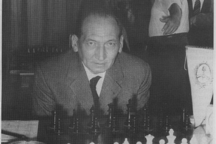
Mengenang Erich Eliskases (15 Februari 1913 – 2 Februari 1997) – Nama Erich Eliskases tidak asing lagi bagi sebagian kecil pecinta catur saat ini. Namun, pemain Austria itu adalah salah satu pemain terbaik dunia di akhir tahun 1930-an.
Mengenang Erich Eliskases (15 Februari 1913 – 2 Februari 1997)
italiascacchistica.com – Pada tahun 1941 dia seharusnya bermain untuk Kejuaraan Dunia bersama Alexander Alekhine. Tapi ternyata berbeda. 15 Februari 2023 adalah hari ulang tahun ke-110 Eliskase, yang lahir di Innsbruck, Austria, dan meninggal di Cordoba, Argentina.
Pada ulang tahun ke-110 Erich Eliskase
Nama Erich Eliskase telah memudar di benak sebagian besar penggemar catur, tetapi Eliskase adalah salah satu pemain terbaik dunia pada tahun 1930-an dan seharusnya bermain untuk Kejuaraan Dunia pada tahun 1941.
Erich Eliskases adalah orang Austria, lahir di Innsbruck pada tanggal 15 Februari 1913 sebagai anak seorang penjahit. Orang tuanya berasal dari Bruneck, Tyrol Selatan, yang diberikan kepada Italia setelah Perang Dunia Pertama. Nama “Eliskases” berasal dari Rhaeto-Romanic.Eliskase baru belajar bermain catur pada usia dua belas tahun, secara kebetulan:
“Pada musim gugur tahun 1925 saya melihat sebuah pamflet, berjudul “Das Schachspiel” dipajang di etalase; setelah mendengar sesuatu tentang permainan ‘paling sulit’ ini, saya memutuskan untuk membeli pamflet tersebut. mulai, saya sangat tertarik pada permainan sehingga saya kurang lebih meninggalkan semua pekerjaan favorit saya yang lain.
Saya belajar sendiri selama setahun tanpa lawan selain saudara laki-laki saya dan teman sekolah, yang saya kalahkan tanpa kesulitan.” (Fred Reinfeld, “Erich Eliskases”, The Chess Review, 1/2 Jan/Feb 1934 hal. 8-9)
Di Carl Peter Wagner, seorang fotografer, dia menemukan seorang mentor yang kuat. Wagner adalah salah satu pemain terbaik di Innsbruck pada tahun 1920-an dan telah mendirikan Innsbruck Chess Society pada tahun 1926. Eliskase kini bertemu setiap sore dari pukul lima untuk bermain catur dengan seorang teman catur dari Innsbruck SG di Café Marx. Segera dia juga menghadiri malam klub Innsbruck SC di Café Weiß dan Klub Catur Schlechter di Café Clenk dan membuat kemajuan pesat dalam kekuatan permainannya.
Eliskase menjadi Juara Tyrol pada usia 15 tahun dan Juara Austria pada usia 16 tahun. Dia dipanggil ke tim nasional Austria untuk pertama kalinya pada usia 17 tahun, dan pada Olimpiade Catur Hamburg 1930 dia adalah pemain termuda di turnamen tersebut. bermain di papan ketiga (11 dari 15, Austria berada di urutan keempat).
Setelah lulus SMA pada tahun 1931 Eliskase belajar ekonomi di Wina selama setahun, tetapi kemudian memutuskan untuk menjadi pemain catur profesional dan keluar. Di Wina dia bergabung dengan SC Hietzing, dimana dia bersaing dengan Ernst Grünfeld untuk menjadi pemain terbaik di klub dan kemudian di Austria.
Setelah Eliskase juga mengalahkan Rudolf Spielmann di beberapa pertandingan di tahun-tahun berikutnya, peringkat dalam catur Austria menjadi jelas. Memenangkan turnamen besar juga menjadikan Anda seorang grandmaster, meski ini belum menjadi gelar resmi.
Selain kemenangan turnamennya, Eliskase kemudian mendapatkan uang sebagai editor Wiener Schachzeitung , tetapi pekerjaannya sebagai editor tidak serta merta menguntungkan kemajuannya sebagai pemain. Namun, analisis dan anotasinya di Wiener Schachzeitung sangat diapresiasi oleh para pemain terbaik.
Pada tahun 1935 Eliskase membantu Max Euwe mempersiapkan pertandingan kejuaraan dunianya melawan Alexander Alekhine. Pada tahun 1937, Alekhine secara bergiliran mengundang petenis Austria itu menjadi rekan latihannya untuk mempersiapkan pertandingan revanche melawan Euwe. Namun, Eliskase hanya mendapat bayaran tidak lebih dari sekotak rokok emas.
Di paruh kedua tahun 1930-an Eliskase memiliki serangkaian kesuksesan turnamen. Dia menang di Zurich dan Swinemünde pada tahun 1936, juga di Noordwijk pada tahun 1938 (di depan Paul Keres dan Max Euwe), di Milan pada tahun 1939, di Bad Harzburg pada tahun 1939 dan n Bad Elster di depan Josef Lokvenc.
Eliskases absen dari Olimpiade Catur (Praha) 1931 karena dia membuat “Abitur” pada waktu itu. Tapi di Olimpiade tahun 1933 (Folkstone) dan 1935 (Warsawa) dia ambil bagian lagi, tapi masih bermain di belakang Grünfeld atau Grünfeld dan Spielmann. Pada Olimpiade Catur tidak resmi di Munich 1936, Eliskase mewakili Austria di papan pertama.
Setelah aneksasi Austria ke Reich Jerman pada tahun 1938, Eliskase mengambil bagian dalam Kejuaraan Jerman Raya pada tahun 1938 dan 1939 dan memenangkan kedua kompetisi tersebut. Selama periode ini, kesuksesan Eliskase menempatkannya di antara pecatur top dunia. Ahli statistik Jeff Sonas melihat Eliskases sebagai petenis nomor sembilan dunia dalam peringkat dunia tidak resmi yang kemudian dihitung untuk tahun 1938 hingga 1941.
Setelah Eliskase memenangkan pertandingan melawan Efim Bogolyubov pada tahun 1939 (11.5-8.5, +6 =11 -3), Juara Dunia Alexander Alekhine menganggap penduduk asli Innsbruck itu layak dan berpotensi menjadi penantang dalam pertandingan Kejuaraan Dunia. Ini, direncanakan untuk tahun 1941, namun tidak terjadi, karena Eliskase sudah tidak lagi berada di Reich Jerman pada saat itu.
Baca Juga : Master Catur SimplyDevina Menemukan Kembali Kecintaannya Pada Catur
Sebagai pemain terbaik di Jerman Raya, Eliskase menjadi pemain papan pertama untuk Jerman di Olimpiade Catur 1939 di Buenos Aires.
Selama Olimpiade, Jerman menginvasi Polandia dan Perang Dunia Kedua dimulai. Namun, Olimpiade dimainkan hingga selesai, meski dalam kondisi sulit. Jerman memenangkan medali emas tetapi banyak pemain Eropa tidak kembali ke Eropa yang dilanda perang. Semua anggota Tim Jerman Raya – Eliskase, Ludwig Engels, Paul Michel, Albert Becker dan Heinrich Reinhardt – juga tetap tinggal di Amerika Selatan.
Dengan banyaknya pecatur imigran, termasuk Miguel Najdorf, tim Argentina menjadi salah satu yang terbaik di dunia setelah berakhirnya Perang Dunia Kedua. Eliskase mengambil bagian dalam empat Olimpiade Catur lagi untuk Argentina, dan pada tahun 1964, di Olimpiade terakhirnya, dia bahkan bermain di papan pertama.
Eliskases telah mengambil kewarganegaraan Argentina dan menetap di Cordoba pada tahun 1951. Pada tahun 1954 dia menikah dengan Maria Esther Almedo, dengan siapa dia memiliki seorang putra, Carlos Enrico (lahir 1957). Dia memberikan pelajaran di sekolah perwira di Kordoba, dan di antara murid-muridnya adalah Henrique Mecking muda.
Eliskase juga memenangkan beberapa turnamen di Amerika Selatan, termasuk turnamen di Mar del Plata pada tahun 1948.
Dua tahun kemudian Eliskase menjadi salah satu peserta Turnamen Antarzonal Stockholm-Saltsjöbaden, finis kesepuluh dan kehilangan satu tempat di Turnamen Kandidat dengan selisih dua tempat. FIDE menganugerahi Eliskase gelar Master Internasional pada tahun 1950 dan gelar Grandmaster pada tahun 1952. Pada tahun 1955 ia finis ketiga di Kejuaraan Nasional Argentina di belakang Najdorf dan Rossetto.
Dari waktu ke waktu, Eliskase juga bermain melawan rekan-rekannya dari Timnas Jerman Raya, seperti Ludwig Engels yang berangkat ke Brasil.Sementara itu, bagaimanapun, Eliskase memainkan lebih sedikit turnamen di luar Amerika Selatan dan secara bertahap kehilangan kontak dengan pemain top dunia.
Kesuksesan besar terakhirnya di Eropa adalah tempat kedua di turnamen Hoogovens 1959, yang saat itu masih diadakan di Beverwijk, di belakang Olafsson dan di depan Donner, O’Kelly de Galway dan Larsen.
Yang terakhir bertahan hidup oleh Eliskase di Mega Database adalah dari tahun 1976, saat dia bermain di Arco Open. Tim Hagemann memiliki korespondensi pribadi dengan Eliskase dan tak lama sebelum kematiannya pada tahun 1996 Eliskase mengiriminya manuskrip buku teksnya “Stellungsspiel” dengan permainannya sendiri.
Buku itu telah diterbitkan dalam bahasa Portugis di Rio de Janeiro pada tahun 1943. Eliskase juga menawarkannya dalam bahasa Jerman kepada de Gruyter, tetapi tidak diterima. Erich Eliskase menyerahkannya kepada Tim Hagemann untuk melakukan apa yang diinginkannya.
Hagemann memiliki manuskrip yang diterbitkan pada tahun 2000 oleh Caissa Publishing House, Kecskemet, Hungaria. Hagemann menulis:
“Stellungsspiel”, karya calon juara dunia, adalah permata sastra catur yang terlupakan. Naskah tersebut selesai pada tahun 1941, tetapi pada saat itu hanya versi Portugis yang diadaptasi ke pasar Brasil – Eliskase telah tinggal di Amerika Selatan sejak 1939 – yang dapat diterbitkan.
Setengah tahun sebelum kematiannya, Eliskases memberi saya manuskrip asli yang lama, dan saya segera menyadari bahwa itu harus diterbitkan, bahkan setelah sekian lama. Meskipun sekarang ada beberapa risalah berharga tentang masalah ini, “Stellungsspiel” memiliki kualitas dan martabat sastra catur klasik.
Tidak kurang dari Lasker memuji Eliskase sebagai pembuat anotasi game terbaik. Permainan posisi .adalah karya hidupnya. Pada bulan-bulan terakhir hidupnya, meskipun fisiknya semakin lemah, Eliskase membaca bukunya sekali lagi, menghapus bagian pembuka yang telah usang dan menyempurnakan analisis permainan akhir yang sudah menyeluruh.
Dalam buku mereka “Forgotten Masters: buku teks dan buku bacaan dengan permainan terbaik oleh Leonhardt, Rotlewi, Sultan Khan, Petrov dan Eliskase. (Schachverlag Kania, Eberdingen 2018) penulis Frank Zeller dan Tim Hagemann mendedikasikan salah satu bab untuk Eliskase.
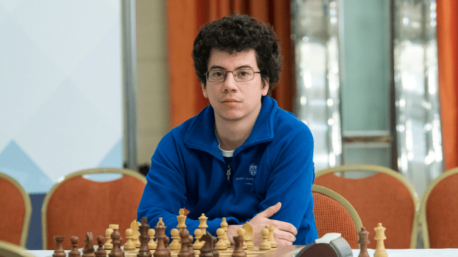
Master Catur Simply Devina Menemukan Kembali Kecintaannya Pada Catur

Master Catur SimplyDevina Menemukan Kembali Kecintaannya Pada Catur – SimplyDevina adalah pemain catur bergelar ( master FIDE wanita ),pelatih,dan streamer dengan pengikut hampir 10 ribu penggemar di saluran Twitch-nya.Dikenal karena aliran catur yang instruktif dan menghibur dengan suasana santai,Devina juga baru-baru ini mencoba mengatur turnamen online.
Master Catur SimplyDevina Menemukan Kembali Kecintaannya Pada Catur
italiascacchistica.com – Kami berbicara dengan Devina tentang bagaimana dia menemukan kembali kecintaannya pada catur melalui streaming,menavigasi psikologi kekalahan dan peningkatan dalam catur,dan mengatasi bahaya mengunyah kelinci peliharaannya melalui kabel mikrofon.Baca lebih lanjut di bawah ini!
1.Anda mulai mengalirkan catur selama pandemi.Apa yang membuat Anda memutuskan untuk memulai?
Saya masih kuliah dan sebenarnya tidak tahu tentang sisi catur Twitch yang meledak sekitar waktu itu.Beberapa teman saya telah melompat ke kereta streaming catur,jadi saya mendengarkan aliran mereka dan berpikir itu agak keren melihat orang berbicara dan berinteraksi dengan mereka.
Saat itu saya tidak tertarik bermain catur lagi,tetapi saya pikir saya akan mencobanya.Setelah semester saya selesai,saya mem-boot streaming pertama saya dan mencobanya bersama seorang teman.Ada beberapa orang yang masuk,dan itu menyenangkan!
Ini adalah pertama kalinya saya benar-benar bermain catur tanpa tekanan dan hanya untuk bersenang-senang.Saya terus melakukannya dan tidak berpikir akan terjadi apa-apa,dan kemudian itu menjadi bagian dari rutinitas normal saya.
2.Siapa beberapa streamer catur favorit pribadi Anda? Apakah ada orang yang Anda ambil inspirasinya?
Sebelum saya mulai streaming,saya sama sekali tidak tahu ini adalah sesuatu…Saya tahu Botez bersaudara dan GM Hikaru Nakamura sedang streaming sebelumnya,tetapi saya belum tahu itu adalah sesuatu.
Maju cepat ke hari ini,saya menikmati banyak streamer yang berbeda.Saya mungkin akan mengatakan salah satu favorit saya yang saya dapatkan inspirasinya adalah The Chess Nerd ! Saya benar-benar satu minggu lebih tua darinya,jadi kami seumuran dan dalam perjalanan yang sama.
Saya memandangnya karena dia semakin jauh dalam perjalanan dan berusaha membuatnya penuh waktu.Karyanya sangat menginspirasi saya.Jika dia bisa bekerja dan bekerja setiap hari untuk mengeluarkan konten yang sangat keren,saya ingin mencoba mengikutinya.
Di dunia streamer Twitch,setiap orang berada di jalur kehidupan yang sama sekali berbeda,jadi menemukan seseorang yang sangat mirip dengan Anda sangatlah keren karena Anda dapat terhubung di level yang berbeda.
Saya merasa banyak streamer memiliki kombinasi berbeda dari apa yang dapat mereka bawa ke meja,dan seluruh dunia konten di luar permainan kompetitif ini menunjukkan bahwa Anda tidak harus menjadi yang teratas untuk memberikan nilai.Ini membawa peluang bagi semua orang.
3.Anda bermain catur kompetitif saat masih muda sebelum mengalami kehilangan kecintaan pada permainan tersebut.Bagaimana hubungan Anda dengan catur berubah selama bertahun-tahun?
Saya mulai bermain secara kompetitif sekitar usia sembilan tahun.Saya bermain di kompetisi hampir setiap minggu.Ada perjalanan,banyak belajar… itu adalah bagian utama,setiap hari dalam hidup saya sampai saya hampir berusia 18 tahun.
Hampir 10 tahun tekanan konstan dengan pembelajaran yang ketat dan ekspektasi benar-benar membuat saya lelah.Ini bukan tentang kenikmatan permainan lagi,hanya berorientasi pada hasil.Sebagian besar berasal dari harapan orang tua.Saya merasa seperti tidak bermain untuk diri saya sendiri.
Saya sudah lama ingin keluar dari permainan saat saya berusia sekitar 17 tahun,tetapi sulit karena saya diharapkan untuk bermain setiap minggu.Saya perlahan-lahan melepaskan diri dari tempat kejadian.
sampai streaming pertama saya.Saya telah membuang sebagian besar ingatan saya dengan catur dan belajar.Saya benar-benar tidak pernah ingin kembali ke permainan,sebenarnya!
Ketika saya mulai bermain catur secara streaming,saya merasa seperti tidak memiliki tekanan itu lagi.Saya berada di babak berbeda dalam hidup saya,dan saya dapat mendekati catur dengan perspektif yang menyenangkan di mana tidak ada tekanan.
Orang-orang yang menonton dalam obrolan tidak peduli apakah saya menang atau kalah atau membuat kesalahan seorang ratu; mereka semua ada di sana untuk kesenangan dan hiburan dan untuk terhubung.Itu adalah sesuatu yang belum pernah saya rasakan sebelumnya.
Itu benar-benar membuat saya menikmati permainan lagi.Sekarang saya bisa bermain berjam-jam,dan saya senang mencoba mengajar dan membantu orang sebaik mungkin.Ini adalah perubahan besar ke arah yang benar.
4.Anda baru-baru ini menyelenggarakan turnamen luar biasa yang menampilkan banyak streamer lain,termasuk grandmaster.Bisakah Anda memberi tahu kami lebih banyak tentang itu?
Saya sangat suka membuat jenis turnamen bertema unik; Saya menemukan bahwa itu sangat menyenangkan di luar semua acara luar biasa yang telah diadakan.
Saya memikirkan satu hal selama musim liburan tahun lalu,jadi saya memutuskan untuk menyampaikannya kepada staf Chess.com untuk mengetahui apakah mereka mau membantu mendukung saya.Mereka cukup baik untuk mendukung dan mensponsori acara tersebut,yang sangat keren.
Temanya adalah Sadie Hawkins Hand & Brain Jingle Ball 2022 dari SimplyDevina…mungkin nama terpanjang untuk sebuah acara!
Sadie Hawkins adalah tarian di masa di mana para gadis meminta anak laki-laki untuk berdansa dengan mereka.Saya memutuskan untuk mengubahnya menjadi acara di mana streamer wanita akan meminta streamer pria untuk berpasangan dalam acara tangan dan otak,jadi satu orang adalah tangan dan satu orang adalah otak.
Saya melakukan yang terbaik untuk menyebarkan berita,dan kami benar-benar mendapatkan 14 tim (atau 28 pemain) yang gila bagi saya.Kami memiliki peringkat minimum 700,dan naik menjadi 2600 yang sangat menakjubkan.Orang-orang seperti GM Jeffery Xiong,FM James Canty III,GM Benjamin Bok,dan lainnya bergabung.
Saya ingin kekacauan,jadi tambahkan kontrol waktu blitz hanya untuk membuatnya menyenangkan.Sepertinya para peserta dan penonton sama-sama menikmatinya,yang sangat diharapkan oleh penyelenggara.
Sangat keren karena Benjamin Bok dipasangkan dengan VelcroDot yang memiliki sekitar 1200 blitz,jadi menarik untuk melihat hasilnya jika mereka menghadapi orang lain yang mungkin diberi peringkat sekitar 2200 dan 1900.
Baca Juga : Apakah Catur Membuat Anda Lebih Cerdas?
Itu agak seimbang,dan keren untuk dilihat bagaimana permainan dimainkan secara berbeda ketika pemain dengan peringkat lebih rendah adalah tangan atau ketika pemain dengan peringkat lebih tinggi adalah tangan.
5.Bayangkan Anda bisa melakukan kolaborasi berbasis catur di streaming Anda dengan siapa pun di dunia.Siapa itu,dan mengapa?
Sejujurnya,saya merasa itu adalah Ludwig.Saya telah menjadi penggemarnya sejak saya menemukannya melalui PogChamps pertama,dan saya langsung menyukai humornya.Saya menonton semua video YouTube berceritanya karena menurut saya dia adalah pendongeng terbaik,dan saya suka dia masih bermain catur dan menikmati permainannya.
Apa yang dia lakukan akhir-akhir ini,terutama dengan event chessboxing,sungguh luar biasa.Saya hanya berpikir akan sangat menyenangkan untuk memilikinya di streaming.
Anda juga memiliki podcast yang banyak berfokus pada kesehatan mental.Kesehatan mental dan catur banyak bersinggungan,terkadang dengan cara yang positif dan terkadang negatif.Apa pendapat Anda tentang aspek psikologis catur dan bagaimana pengaruhnya terhadap kesehatan mental?
Menurut saya catur pasti dapat memengaruhi kita dengan cara yang baik dan buruk,tergantung pada orangnya.Saya dapat menghubungkannya dengan fakta bahwa saya mengajar terutama orang dewasa.
Beberapa dari mereka adalah pemula,beberapa adalah pemain menengah,tetapi banyak dari mereka yang lebih baru dalam permainan dan ketika kalah,mereka marah pada diri mereka sendiri: “Saya hampir menang.Mengapa saya tidak bisa berkembang atau menang?! “
Saya selalu berusaha mengingatkan mereka bahwa untuk setiap kehilangan yang mereka alami,orang lain juga mengalami kerugian yang sama parahnya,atau bahkan lebih buruk; itu pasti bagian dari permainan.
Dan itu bukan untuk membatalkan kekalahan mereka,tetapi hanya tentang belajar bagaimana menghadapi kekalahan atau ketika segala sesuatunya tidak berjalan sesuai keinginan mereka.Catur adalah olahraga yang bagus untuk itu karena sering terjadi.
Ada begitu banyak contoh di mana saya tinggal satu pertandingan lagi untuk memenangkan turnamen atau gelar atau sesuatu,dan saya kehilangan semuanya dalam satu pertandingan.Seluruh duniaku sepertinya runtuh pada saat itu.
Saya mencoba untuk melihat para pemain top dan menyadari bahwa mereka memiliki lebih banyak hal yang salah untuk mereka,dan lihatlah mereka sekarang.mereka bangkit,mereka belajar dari kesalahan mereka,dan mereka melanjutkan ke turnamen berikutnya.
Satu hal yang saya pelajari dari melakukan taekwondo adalah ketika Anda terjatuh 10 kali,Anda bangkit kembali 11 kali.
Itu adalah sesuatu yang sering saya gunakan dalam catur — bisa fokus untuk menjernihkan pikiran,terutama di tengah turnamen setelah kekalahan terjadi,menyadari bahwa Anda adalah manusia,tidak menyalahkan diri sendiri,dan menghadapinya permainan demi permainan.
Beberapa turnamen akan naik turun,beberapa akan luar biasa,dan beberapa akan berjalan buruk.Itu bagian dari permainan.Catur sayangnya tidak didasarkan pada perkembangan linier atau eksponensial.
6.Terakhir,dan yang paling penting,dapatkah Anda memberi tahu kami tentang kelinci Anda?
Saya punya dua: Luna adalah Dwarf Belanda yang berulang tahun ke dua bulan ini.Dan kemudian Zoe yang berusia lima tahun bulan ini; Saya mendapatkannya dari tempat penampungan pada bulan Juli.Dia campuran Harlequin,tapi kami tidak tahu dengan apa.
Luna adalah iblis kecil yang lolos dari segalanya karena dia kecil dan imut,dan Zoe adalah kelinci yang lebih lembut dan ingin tahu,suka bermain.Mereka segelintir tapi aku mencintai mereka.Luna telah merusak mikrofon saya saat streaming sebelumnya,mengunyah salah satu kabel saya.Saya menggunakan headphone keempat saya setelah dia mengunyah yang terakhir.
Apakah Catur Membuat Anda Lebih Cerdas?

Apakah Catur Membuat Anda Lebih Cerdas? – Catur telah lama dianggap sebagai permainan strategi yang membuat orang lebih pintar dari sebelumnya. Jika anda adalah seorang pengagum permainan catur, maka manfaat otak utama bermain catur yang akan kami bahas disini tentunya akan menyita perhatian anda.
Apakah Catur Membuat Anda Lebih Cerdas?
italiascacchistica – Jika menyangkut kesehatan otak Anda, ada banyak cara untuk merawatnya dengan baik. Kesehatan otak bergantung pada banyak faktor, baik dengan mengonsumsi makanan yang tepat, berolahraga secara teratur, dan memastikan Anda mendapatkan jumlah tidur yang optimal.
Bersamaan dengan ini, mengembangkan kebiasaan memecahkan teka-teki yang rumit dan memilih untuk mempelajari bahasa baru juga dapat menjaga otak manusia tetap tajam dan gesit. Sekarang pertanyaan kritisnya adalah, ‘Apakah catur membuat Anda lebih pintar?’ Jika kita mengikuti imajinasi populer, catur telah lama dikaitkan dengan kecerdasan dan cengkeraman yang baik atas pemikiran strategis.
Baca Juga : 7 Tips Catur Pemula Untuk Meningkatkan Permainan Secara Instan
Banyak penelitian oleh akademisi dan ilmuwan di seluruh dunia telah bergulat dengan masalah yang sama ‘Apakah catur membuat Anda lebih pintar’, dan terutama menyimpulkan dengan persetujuan. Jika Anda adalah pemain catur yang rajin, Anda akan sangat senang setelah membaca artikel ini, karena kami telah memilih 8 cara catur dapat membuat Anda lebih pintar!
Catur Membantu Meningkatkan Intelligence Quotient (IQ)
Orang-orang telah menghubungkan catur dengan para otaku dan kutu buku yang sangat imajinatif untuk waktu yang lama. Namun, ini jauh dari kebenaran. Memang benar bahwa anak-anak yang lebih cerdas cenderung tertarik pada catur.
Tetapi penelitian modern telah menunjukkan bahwa tidak masalah jika seorang anak sebelumnya pernah bermain catur, dan hanya empat bulan pelatihan catur dapat meningkatkan IQ keseluruhan mereka secara signifikan.
Catur dapat Mencegah Awal Penyakit Alzheimer
Catur bisa sangat bermanfaat bagi populasi yang lebih tua, yang cenderung lebih rentan terhadap penyakit Alzheimer. Seiring bertambahnya usia manusia, sel otak mereka mulai kehilangan neuroplastisitas kemampuan sel otak untuk mengubah strukturnya sebagai respons terhadap data baru. Catur dapat membuat perbedaan besar dalam konteks ini dengan membantu menjaga kesehatan sel-sel otak.
Seiring dengan permainan pemecahan masalah seperti sudoku, teka-teki silang, teka-teki, dan teka-teki, catur juga dapat mengurangi kemungkinan seseorang tertular penyakit Alzheimer atau bentuk penyakit neurodegeneratif lainnya dengan menambahkan catur ke dalam rutinitas rutin mereka.
Kedua Sisi Otak Berolahraga Saat Anda Bermain Catur
Sebuah tim peneliti Jerman telah menemukan bahwa ketika kita bermain catur, kedua sisi otak kita bagian logis dan bagian kreatif, terlibat dalam memecahkan masalah di papan catur. Pengungkapan ini bertentangan dengan apa yang dikemukakan sebelumnya sehubungan dengan catur. Dikatakan bahwa catur hanya merangsang bagian logis dari otak manusia, yaitu belahan otak kiri.
Selain itu, belahan kanan, atau sisi kreatif otak, tidak terlalu terlibat saat seseorang bermain catur. Namun, ini telah dibantah oleh para peneliti Jerman, dan kami dapat dengan yakin mengatakan bahwa catur adalah alat yang sangat baik untuk melatih kedua belahan otak manusia.
Catur dapat Memicu Kreativitas dalam Pikiran Manusia
Seperti yang telah disebutkan di bagian sebelumnya, catur mengaktifkan kedua sisi otak manusia. Artinya, jika Anda bermain catur secara teratur, Anda akan memiliki peluang lebih besar untuk menjadi orang yang lebih kreatif. Dengan kata lain, dengan menghabiskan waktu bermain catur, seseorang akan memiliki kesempatan yang lebih kuat untuk melahirkan ide-ide orisinal di benak mereka.
Sebuah studi tingkat sekolah oleh seorang pria bernama Robert Ferguson menguji kecakapan kreatif siswa di kelas tujuh hingga sembilan. Semua siswa diminta untuk mengambil satu kegiatan ekstra kurikuler dan memberikan waktu untuk itu setidaknya seminggu sekali selama 32 minggu. Setelah 32 minggu berlalu, siswa yang sama disuruh mengikuti serangkaian ujian kognitif. Hasil penelitian menunjukkan bahwa kelompok anak sekolah yang menjadikan catur sebagai kegiatan sepulang sekolah mereka mendapat peringkat tertinggi dalam ujian.
Catur Meningkatkan Tingkat Konsentrasi Seseorang
Kita hidup di zaman di mana fokus pada satu tugas bisa menjadi hal yang paling menantang untuk dilakukan. Dengan banyaknya gangguan di sekitar kita sepanjang hari, kita kehilangan kekuatan mental untuk hanya duduk dan berkonsentrasi pada satu pekerjaan. Ini semua bisa berubah dengan catur, permainan yang dapat meningkatkan tingkat konsentrasi Anda secara drastis.
Seperti yang Anda ketahui, bermain catur membutuhkan fokus dan konsentrasi yang sangat tinggi. Jika Anda bermain catur sesekali, Anda memiliki peluang untuk meningkatkan perhatian Anda ke tingkat yang sama sekali baru. Ini dapat digunakan di bidang kehidupan lain, di mana keputusan yang dibuat dengan pikiran terfokus dapat berlangsung lama untuk memastikan bahwa pilihan yang tepat telah dibuat.
Alat Bantu Catur dalam Perencanaan dan Pandangan ke Depan
Korteks prefrontal adalah bagian dari otak manusia yang mulai berkembang lama kemudian, dan ini adalah wilayah otak yang bertanggung jawab untuk pengendalian diri, perencanaan, dan penilaian. Pada manusia, sampai usia 25 tahun korteks prefrontal terus berkembang. Oleh karena itu, permainan strategi seperti catur dapat merangsang pertumbuhan bagian otak ini dan mengubah anak-anak dan dewasa muda menjadi individu pembuat keputusan yang lebih baik.
Apakah Catur Membantu dalam Kehidupan Nyata?
Catur, dalam banyak hal, seperti makanan untuk otak Anda. Itu dapat meningkatkan tingkat konsentrasi Anda dan mengembangkan memori, intuisi, dan kreativitas. Ini juga dapat membantu mempertajam keterampilan mengekstraksi informasi berharga dari seperangkat prinsip yang diberikan.
Studi dalam beberapa tahun terakhir menunjukkan bahwa catur berpotensi meningkatkan kapasitas untuk membuat keputusan yang lebih baik, memecahkan masalah yang rumit, dan mempelajari hal-hal baru dengan lebih cepat.
Apakah Catur Meningkatkan Kekuatan Otak?
Serangkaian penelitian luas telah dilakukan dalam beberapa dekade terakhir untuk mengetahui seberapa jauh catur dapat meningkatkan kekuatan otak manusia dan menjawab pertanyaan ‘Apakah catur membuat Anda lebih pintar?’
Dari apa yang telah ditemukan dalam studi tersebut, sekarang menjadi kebenaran yang mapan bahwa catur dapat mempertajam kognisi, keterampilan matematika, dan daya ingat. Namun, terlalu dini untuk menyimpulkan apakah catur dapat membantu seseorang mencapai nilai ujian yang lebih tinggi dalam semua jenis ujian.
Apakah Catur Membuat Anda Lebih Cerdas? – Kesimpulan
Bukti yang menunjukkan catur sebagai sahabat otak manusia cukup banyak. Dalam sejumlah penelitian, telah disimpulkan bahwa menjadikan catur sebagai bagian dari gaya hidup Anda dapat bermanfaat dalam lebih dari satu cara.
Dari kemampuan kognitif yang lebih baik hingga pemancar saraf yang lebih tajam, catur dapat membuat otak Anda hidup lebih sehat dengan sendirinya. Tapi itu semua tergantung pada berapa banyak waktu yang Anda habiskan dengan permainan.
7 Tips Catur Pemula Untuk Meningkatkan Permainan Secara Instan

7 Tips Catur Pemula Untuk Meningkatkan Permainan Secara Instan – Dipercayai bahwa catur adalah permainan yang mudah dipelajari tetapi sulit untuk dikuasai. Atau itu? Tentu dibutuhkan dedikasi yang tinggi untuk memenangkan gelar seperti Grandmaster, International master, dan bahkan FIDE master dalam hal ini. Namun, meningkatkan level ketika Anda seorang pemula bukanlah hal yang sulit untuk dipecahkan.
7 Tips Catur Pemula Untuk Meningkatkan Permainan Secara Instan
italiascacchistica – Anda hanya perlu mendapatkan beberapa tip catur untuk pemula dan mempraktikkannya dalam permainan Anda. Kiat catur ini bukanlah pola catur rumit yang harus membebani otak Anda. Alih-alih, ini adalah prinsip sederhana yang perlu diingat saat Anda berada di papan dengan lawan Anda. Itu dia. Sepertinya Anda bersemangat untuk menang, mari kita mulai! 7 tips catur pemula untuk meningkatkan permainan Anda secara instan:
1. Selalu Berpegang Pada Pusat!
Jika Anda bertanya kepada pemain catur profesional apa tip catur terbaik untuk pemula, jawabannya adalah Kendalikan pusat, selalu! Menempatkan bidak catur Anda di tengah papan catur secara alami meningkatkan jangkauannya ke seluruh papan catur. Saat bidak catur Anda berada di tengah papan, bidak tersebut mencakup lebih banyak kotak, sehingga memiliki kontrol yang lebih baik atas papan catur. Tidak seperti tip catur lainnya untuk pemula, yang satu ini berlaku untuk keseluruhan permainan. Mencoba mengontrol bagian tengah bermanfaat bagi Anda sepanjang permainan; dari pembukaan hingga akhir permainan.
Baca Juga : Bagaimana Cara Memenangkan Catur Dalam 3 Langkah?
2. Kembangkan Pasukan Anda
Bidak catur Anda secara harfiah adalah pasukan yang berusaha menjebak raja musuh dan melindungi raja Anda. Anda tidak ingin mereka tidur di tengah perang, bukan? Tentu saja tidak. Jadi buat mereka maju dengan mengembangkan bidak catur Anda. Sekarang bagaimana Anda mengaktifkan bidak Anda? Jawabannya adalah dengan memindahkannya dari satu kotak ke kotak lainnya untuk tujuan yang pasti. Sebagai permulaan, bidak Anda seperti ksatria, uskup, dan benteng dapat mempertahankan bidak Anda yang lain atau mereka dapat menyerang musuh. Saat Anda menjadi lebih baik dalam catur, Anda juga dapat memindahkan bidak untuk melakukan serangan strategis, membuat ruang, dan banyak tujuan lainnya! Namun, karena kita hanya berurusan dengan tip catur untuk pemula, intinya yang perlu diingat adalah memindahkan bidak Anda dari posisi rumah dengan cara yang terarah.
3. Tetap Aktifkan Mode Peringatan Anda
Kesalahan paling umum yang bahkan dilakukan oleh pemain amatir adalah mengabaikan serangan musuh. Pemain cenderung memiliki visi terowongan saat menyerang musuh dan mengabaikan apa yang akan datang untuk mereka. Ini karena mereka tidak sabar, gugup, atau terlalu bersemangat untuk melakukan gerakan licik yang telah mereka pikirkan. Karenanya tip catur khusus untuk pemula ini kurang teknis dan lebih manusiawi. Tapi ayolah, bukan berarti tidak ada teknis yang melekat padanya. Berada dalam mode siaga dalam catur berarti selalu memperhatikan CCT! C pertama berarti cek, yang kedua untuk menangkap, dan T berarti ancaman. Jadi aturan praktis berlaku sebelum memainkan gerakan Anda, berhati-hatilah terhadap kemungkinan pemeriksaan, tangkapan, dan ancaman yang berbaris terhadap Anda.
4. Permainan Taktis
Satu hal yang akan membuat Anda unggul dalam permainan catur adalah taktik catur. Periode. Kiat catur lain untuk pemula tidak memberi Anda keuntungan langsung dalam pertandingan catur; mereka mekar dari waktu ke waktu dan menuai buah perlahan. Tidak seperti tip catur lainnya untuk pemula, berhasil melakukan permainan taktis seperti pin, tusuk sate, garpu, cek yang ditemukan, dll. Pasti akan memberi Anda keuntungan materi atau setidaknya akan meningkatkan posisi Anda. Mempelajari taktik catur tidaklah sulit, apalagi jika Anda belajar dari pelatih kami yang terus menyederhanakan konsep hingga Anda memahaminya. Pastikan Anda juga berlatih taktik catur dengan bantuan teka-teki. Psssst! Tebak apa? Kami juga menempatkan teka-teki menarik setiap minggu di halaman Instagram kami.
5. Tingkatkan Matematika Anda!
Bahkan jika tujuan akhir Anda adalah untuk menskakmat raja lawan, Anda harus memenangkan pertempuran kecil antara bidak lain yang terjadi dalam permainan. Untuk memenangkan pertempuran internal ini, Anda perlu mencetak lebih banyak poin dalam perdagangan atau pertukaran antar bidak catur. Dan, untuk menghitung skor di tengah pertarungan, pertama-tama Anda harus mengetahui nilai setiap bidak di papan catur. Hanya dengan begitu Anda dapat dengan cepat melakukan penjumlahan dan pengurangan skor dan membuat keputusan yang tepat. Misalkan Anda berada di tengah pertempuran.
Anda menangkap ksatria musuh dengan uskup Anda, lalu mereka menangkap uskup itu dengan sebuah benteng tetapi Anda kembali menangkap benteng mereka dengan pion. Bisakah Anda menebak siapa yang menang di sini? Itu kamu! Anda menang karena Anda mencetak 8 poin dengan imbalan memberikan 3 poin. Ini karena Anda menangkap ksatria dan benteng musuh Anda sedangkan mereka hanya bisa menangkap uskup Anda. Saat bermain catur, Anda harus menghitung dengan cara yang sama dalam sekejap karena jam akan terus berdetak! Anda tidak dapat membuang terlalu banyak waktu atau Anda akan kehilangan permainan seiring berjalannya waktu!
6. Pertahankan Kekuatan Ratu
Tidak memindahkan ratu Anda terlalu cepat bisa menjadi salah satu tips catur yang bagus untuk pemula. Saat Anda memindahkan ratu terlalu dini, Anda memberi lawan Anda kesempatan untuk menangkapnya, yang sebenarnya adalah hal terakhir yang Anda inginkan. Misalnya, lawan Anda dapat memanfaatkan ratu Anda sebagai alat untuk memainkan taktik catur dan menangkap bidak Anda yang lain. Namun, tip catur ini jangan dianggap terlalu serius karena ada banyak situasi luar biasa di mana Anda harus memindahkan ratu di awal permainan. Salah satunya adalah saat lawan melakukan blunder sehingga bisa langsung menghukumnya dengan serangan yang kuat. Lebih banyak alasan untuk mengeluarkan ratu di awal permainan catur bisa jadi untuk menyerang bidak yang tidak dijaga atau mungkin memaksa lawan Anda ke posisi yang buruk. Jika Anda dapat menggunakan ratu dengan benar di tengah permainan, itu bisa sangat mematikan bagi lawan Anda. Sehubungan dengan tip catur ini, ingatlah untuk tidak memindahkan ratu Anda lebih awal tanpa tujuan yang kuat dan jika Anda melakukannya, pastikan Anda tidak kehilangan dia!
7. Pelajari Pembukaan Dasar
Jika Anda seorang pemain catur pemula, Anda pasti kehabisan ide untuk memainkan langkah pertama dalam permainan catur Anda. Nah dalam keadaan seperti itu apa yang bisa menyelamatkan Anda? Jika jawaban Anda untuk pertanyaan ini adalah, “Langkah acak”, maka dengarkan! Mempelajari pembukaan, variasi, dan teori catur bukanlah tip yang bagus untuk pemula. Mereka sebenarnya adalah inti dari kursus catur tingkat lanjut. Namun, tidak ada salahnya untuk mengenal mereka! Yang harus Anda lakukan adalah melakukan beberapa gerakan pembuka sehingga Anda tidak duduk di depan papan catur sambil memikirkan dan menekankan gerakan pertama Anda. Memainkan bukaan catur memberi Anda awal yang terarah dan juga membantu Anda di tengah permainan. Anda baik-baik saja tanpa bukaan catur tetapi pikirkanlah, Anda jauh lebih baik dengan mengetahui dasar-dasarnya saja!
Bagaimana Cara Memenangkan Catur Dalam 3 Langkah?

Bagaimana Cara Memenangkan Catur Dalam 3 Langkah? – Sebagian besar dari kita menghubungkan catur dengan pertempuran mental yang intens selama berjam-jam. Rata-rata, permainan catur membutuhkan waktu berjam-jam sebelum mencapai kesimpulannya. Dalam acara televisi, Anda mungkin pernah menyaksikan dua pesaing berjuang untuk menemukan langkah mematikan yang akan menyelesaikan permainan.
Bagaimana Cara Memenangkan Catur Dalam 3 Langkah?

italiascacchistica.com – Namun seringkali, permainan catur membutuhkan waktu yang lama dan melelahkan untuk mencapai akhirnya. Jadi, ketika Anda mengetahui judul topik hari ini ‘Cara Memenangkan Catur dalam 3 Langkah’, Anda pasti memiliki rasa tidak percaya. Meski jarang, ada cara menyelesaikan permainan catur lebih awal.
Baca Juga : Yang Perlu Anda Ketahui Tentang Chess Boxing
Metode populer yang diterapkan oleh beberapa pecatur di seluruh dunia adalah ‘Scholar’s Mate’, yang memungkinkan pecatur mengalahkan lawannya hanya dalam empat langkah. Lalu ada ‘Fool’s Mate’ yang hanya membutuhkan dua aksi untuk menyelesaikan sebuah game. Artikel ini akan membahas bagaimana pecatur dapat mengalahkan lawannya hanya dengan menerapkan tiga jurus.
Bisakah Anda memenangkan catur dalam tiga gerakan? Ada dua metode dimana seseorang bisa memenangkan permainan catur dalam tiga gerakan. Yang pertama membutuhkan bantuan tangkapan, dan yang kedua tidak membutuhkan tangkapan. Kami akan mengambil masing-masing secara individual untuk teliti lebih dekat.
Setelah Anda menguasai kedua teknik ‘Cara Memenangkan Catur dalam 3 Langkah’, Anda pasti akan menjadi pemain catur yang lebih berbahaya daripada yang ditakuti banyak orang!
Cara Memenangkan Catur dalam 3 Langkah
Untuk memenangkan pertandingan catur hanya dalam tiga langkah bermain putih, seseorang harus mulai dengan memindahkan e-pion ke petak/petak e4. Sebagai balasannya, mari kita anggap hitam akan memainkan e-pion-nya ke e5. Selanjutnya, putih merespon dengan memindahkan bidak ratu ke blok h5.
Setelah itu, hitam akan melakukan blunder dengan memindahkan rajanya ke blok e7. Pada titik ini, tergantung pada pecatur putih untuk memanfaatkan situasi dan memberikan skakmat dengan menangkap pion hitam yang ditempatkan di e5. Ini berarti bahwa raja hitam tidak akan memiliki tempat untuk pergi dan terpojok secara menyeluruh.
Untuk mewujudkan gameplay ini, pemain yang menangani bidak hitam harus melakukan kesalahan fatal selama pertandingan. Jadi, kapan pun Anda bersaing dengan siapa pun, cari celah dalam pengambilan keputusan saingan Anda, dan lompat ke peluang ketika Anda dapat melihat bahwa Anda dapat memanfaatkan kesalahan yang mereka lakukan.
Metode yang dibahas di atas berkisar pada prosedur skakmat hitam dalam tiga langkah dengan menangkap bidak lawan. Pada bagian ini, kita akan melihat cara lain untuk mencapai skakmat dalam tiga langkah besar. Di sini juga, putih akan mengambil bidak hitam untuk memenangkan pertandingan.
Teknik kedua di mana putih dapat skakmat hitam dalam tiga langkah bergantung pada penciptaan squat lemah di sekitar raja hitam setelah pengambilan keputusan yang buruk. Semuanya dimulai saat putih memainkan e4 dan hitam merespons dengan f5.
Pergerakan putaran kedua melihat putih menangkap pion hitam di f5. Balck kemudian memainkan g-pionnya ke g5, sehingga menyebabkan celah besar di depan rajanya yang tidak dijaga. Pemain catur kulit putih yang waspada kemudian mengambil peluang bagus yang diberikan kepada mereka dengan memainkan ratu putih ke kotak h5.
Saat ini terjadi, putih skakmat raja hitam. Saat bermain game yang sebenarnya, ingatlah bahwa membuka raja Anda di awal game bisa mematikan. Jika Anda melakukan eros besar seperti yang telah kita lihat di sini, lawan yang cerdik akan langsung membunuh atas biaya Anda.
Ide bagus adalah fokus pada bidak Anda yang ditempatkan di tengah pada awal pertandingan catur. Sebagian besar pakar catur akan setuju bahwa mengendalikan kotak tengah di awal pertandingan catur bisa sangat membantu dalam memastikan bahwa kemenangan akhir ada di tangan Anda. Memainkan bidak yang ditempatkan di sisi papan Anda di awal akan membuka raja Anda terhadap ancaman yang akan segera terjadi dari lawan Anda.
Cara Terbaik untuk Memenangkan Catur dalam 3 Langkah
Cara ketiga putih bisa bermain untuk memenangkan pertandingan catur setelah hanya tiga putaran sekali lagi bergantung pada serangkaian gerakan buruk dari sisi hitam. Sedangkan dua metode pertama yang telah kita bahas di atas berfokus pada skakmat yang dicapai setelah penangkapan, rumus saat ini sama sekali tidak melibatkan penangkapan bidak catur.
Di sini juga, kegagalan pemain catur menangani bidak hitam untuk memutuskan langkah awal yang efektif menyebabkan kejatuhan cepat mereka di tangan pemain putih yang waspada. Hitam akan membuat kesalahan dengan memindahkan pion di sisi raja di awal pertandingan dan dengan demikian hampir mengundang putih untuk menyerang rajanya yang tidak dijaga.
Dalam teknik permainan ini, ratu putih kembali menjadi terkenal dengan memberikan pukulan kematian terakhir kepada raja hitam. Untuk lebih memahami cara ini, mari kita ikuti langkah-langkahnya satu per satu dari awal. Pada awalnya, putih cocok dengan gerakan e-pion to e4 yang populer. Hitam membuat kesalahan pertama di sini dengan memindahkan f-pion ke f6. Putih kemudian memainkan d-pionnya ke d4.
Baca Juga : Tokoh Asing Di Balik Kemerdekaan Indonesia
Pada titik ini, hitam kembali membuat kesalahan penilaian yang fatal dan memainkan g-pion-nya ke g5. Langkah ini dikenal dalam bahasa catur sebagai ‘blunder’. Segera setelah hitam memainkan gerakan ini, putih yang waspada segera memindahkan ratunya dari posisi awal dan menempatkannya di h5. Raja hitam langsung diskakmat karena tidak menemukan ruang untuk melarikan diri.
Situasinya sedemikian rupa sehingga tidak ada bidak hitam lain yang bisa menyelamatkan raja mereka yang terkepung. Putih mengakhiri rangkaian hitam dengan kecepatan kilat, bahkan tanpa perlu menangkap bidak lawan. Ini adalah cara terbaik untuk memenangkan catur dalam 3 gerakan jika diterapkan dengan benar.
Kesimpulan
Sekarang kita telah membahas tema hari ini ‘Cara Memenangkan Catur dalam 3 Langkah’, sekarang waktunya untuk memahami bahwa gaya permainan ini tipikal di level pemula. Ada beberapa kesempatan ketika profesional catur terkenal membuat kesalahan selama pertandingan, sehingga menyerahkan permainan kepada lawan mereka.
Sebagai pemain catur yang mempelajari trik perdagangan, Anda harus selalu mengawasi potensi kesalahan catur yang dilakukan lawan Anda selama pertandingan dan bersiap untuk melompat ke sana.
Dalam catur, sangat penting untuk tetap waspada sepanjang waktu. Anda tidak pernah tahu kapan lawan Anda akan membuka sisi raja mereka dengan kesalahan penilaian. Di saat-saat yang tepat itu, tugas Anda adalah menyerang raja saingan Anda dengan ratu yang sangat berkuasa.
Yang Perlu Anda Ketahui Tentang Chess Boxing
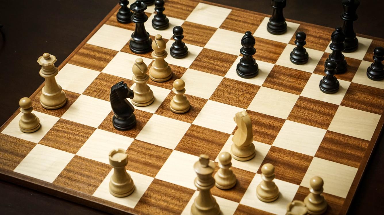
Yang Perlu Anda Ketahui Tentang Chess Boxing – Seperti namanya, ‘Chess Boxing’ merupakan olahraga yang merupakan gabungan antara catur dan tinju. Siapa pun yang ingin berpartisipasi dalam olahraga ini perlu mengasah tidak hanya keterampilan mentalnya, tetapi juga kemampuan fisiknya.
Yang Perlu Anda Ketahui Tentang Chess Boxing

italiascacchistica.com – Pemain chess boxing berpartisipasi untuk bersaing dalam putaran alternatif tinju dan catur cepat. Kontes berlanjut dengan cara ini sampai salah satu pesaing kalah atau mengundurkan diri dari pertarungan.
Baca Juga : 5 Papan Catur Termahal Di Dunia
Sesuai aturan, satu pemain akan kalah saat tersingkir di babak tinju atau skakmat di babak catur. Selain dua hal tersebut, pemain juga bisa dinyatakan sebagai pemenang ketika lawannya kehabisan waktu dalam pertarungan tertentu, atau mereka dengan sengaja menghalangi kelancaran pertandingan catur. Dalam kasus ekstrim, pelanggaran aturan yang terus-menerus selama seri tinju pertandingan chess boxing dapat menyebabkan diskualifikasi dari turnamen.
Kejuaraan Chess Boxing
Dalam hal Kejuaraan, tiga kepala organisasi global mengadakan acara semacam itu. Namun, beberapa badan terkenal telah menyiapkan turnamen kejuaraan independen mereka sendiri. Tetapi tiga badan utama yang akan kita bicarakan di sini adalah – World Chess Boxing Organisation (WCBO), World Chess Boxing Association (WCBA), dan Chess Boxing Global (CBG).
World Chess Boxing Organisation (WCBO)
World Chess Boxing Organisation (WCBO) muncul di kota Berlin, Jerman, pada tahun 2003. Menjadi badan dunia pertama dari jenisnya, ia memiliki tanggung jawab untuk mengadakan kontes kejuaraan tinju dunia hingga 2013.
World Chess Boxing Association (WCBA)
World Chess Boxing Association (WCBA) adalah dewan paling terkenal kedua yang dibentuk pada tahun 2013. Tujuan utamanya adalah untuk mempromosikan dan mengembangkan lanskap chess boxing di planet ini. Itu memegang turnamen kejuaraan sebagai gantinya dan juga mengakui juara yang keluar dari pangkuan WCBO.
Chess Boxing Global (CBG)
Badan pengatur tingkat internasional terpenting ketiga kebetulan adalah Pemasaran Global Chess Boxing, juga disebut sebagai Chess Boxing Global (CBG). Sejak awal, liga profesional ini didirikan pada tahun 2013 dan telah menjadi tuan rumah resmi banyak kontes kejuaraan di berbagai tempat.
Sejarah Chess Boxing
Tinju catur telah ada di sirkuit olahraga profesional sejak tahun 1992. Ini adalah aktivitas olahraga unik yang membutuhkan kecerdasan dan kekuatan fisik. Dari awal yang sederhana pada tahun 1992, olahraga ini perlahan tapi pasti mendapatkan khalayak yang lebih luas di negara-negara seperti Inggris, Prancis, Jerman, Belanda, Jepang, dan Rusia. Dengan orang-orang dari masing-masing yang dengan sepenuh hati merangkul olahraga baru ini, chess boxing menangkap imajinasi dari beragam penonton.
Dewan pengatur internasional semuanya telah menyepakati seperangkat peraturan dan regulasi standar yang menjadi pilot permainan di seluruh dunia. Berikut ini adalah poin utama yang perlu diingat saat memainkan game ini di level mana pun:
Selama putaran catur, tidak boleh ada pemain yang dengan sengaja membuang waktu saat memutuskan untuk bergerak. Wasit yang memimpin pertandingan catur dalam cabang olahraga tersebut diberi wewenang penuh untuk menghukum kontestan atas keterlambatan waktu yang disengaja.
Semua peserta harus memiliki rekam jejak pengetahuan yang terbukti dalam catur dan tinju.
Pesaing dalam turnamen diharuskan memiliki peringkat catur minimal 1800 untuk dipertimbangkan untuk mendapat tempat dalam kompetisi tertentu.
Sebagai olahraga, chess boxing memberi semua peserta banyak kesempatan untuk menunjukkan nilai mereka. Aturan permainan cukup fleksibel untuk memungkinkan setiap pesaing memenangkan pertarungan setelah mengalahkan lawan mereka, baik di babak catur atau di babak tinju.
Dengan kata lain, jika seorang pemain mengalahkan lawannya di babak tinju, mereka akan diumumkan sebagai pemenang pertandingan. Demikian pula, jika seseorang melakukan skakmat pada lawannya di bagian catur permainan, wasit menyatakannya sebagai pemenang keseluruhan.
Aturan standar chess boxing menyatakan bahwa pertandingan lengkap akan terdiri dari total enam putaran catur dan total lima putaran tinju. Sebuah permainan dapat dihentikan sebelum seluruh catur, dan putaran tinju selesai. Hal ini bisa terjadi karena seorang pemain kalah di babak sebelumnya, baik dalam catur maupun tinju.
Pemain Chess Boxing
Dalam chess boxing, kontes dimulai saat wasit menunjuk ke jam, dan kedua kontestan saling mengunci dalam putaran catur empat menit. Setelah ini dibereskan, para pemain menuju ke ring tinju untuk bertarung selama tiga menit. Para pesaing kembali ke papan catur saat ronde tinju selesai.
Baca Juga : Pemenang Oscar Terbesar Film Peraih Oscar Terbaik Sepanjang Masa
Siklus ini berlanjut hingga pemenang terbentuk. Kedua pemain bertarung habis-habisan dalam enam catur dan lima ronde tinju. Di antara setiap babak, apakah itu catur atau tinju, semua pemain diberikan waktu istirahat satu menit untuk memulihkan diri dari ketegangan di babak sebelumnya.
Ketika para pemain duduk saling berhadapan untuk bermain catur, mereka melepaskan sarung tinju mereka. Dan kemudian, selama jeda satu menit, mereka harus memakai sarung tinju lagi. Setiap pemain dibekali dengan earphone untuk dipakai selama berlangsungnya permainan catur agar tidak terdengar suara gaduh dari penonton yang masuk ke telinga mereka.
Bagian catur dari chess boxing dimainkan dengan jam dua belas menit sebagai pencatat waktu. Ini menjadikan catur setengah dari chess boxing sebagai bentuk ‘catur cepat’. Jika seorang pemain dianggap mengambil terlalu banyak waktu, wasit dapat memaksa mereka untuk bergerak dalam waktu 10 detik.
Bagaimana Pemenang Dideklarasikan dalam Chess Boxing
Putaran tinju dalam chess boxing dimainkan sesuai aturan permainan tinju biasa. Hal yang sama berlaku untuk bagian catur dari pertandingan. Untuk menentukan pemenang, umumnya kinerja para pemain di babak catur menjadi pertimbangan. Kecuali ada pelopor yang jelas muncul di babak catur, pengawas pertandingan mempertimbangkan hasil putaran tinju.
Bila poin yang diraih oleh kedua pemain sama pada babak tinju dan catur, maka pemain yang bertanding menggunakan bidak catur hitam dinyatakan sebagai pemenang akhir.
Oleh karena itu, untuk memenangkan pertandingan chess boxing yang adil dan seimbang, seorang pemain harus melakukan skakmat pada lawan di babak catur atau mengalahkan lawan di babak catur. Mundurnya satu pemain di babak catur juga merupakan tanda kekalahan. Jika semua ini tidak terjadi, perbedaan poin dalam babak tinju dipelajari untuk menggarisbawahi pemenang.
5 Papan Catur Termahal Di Dunia
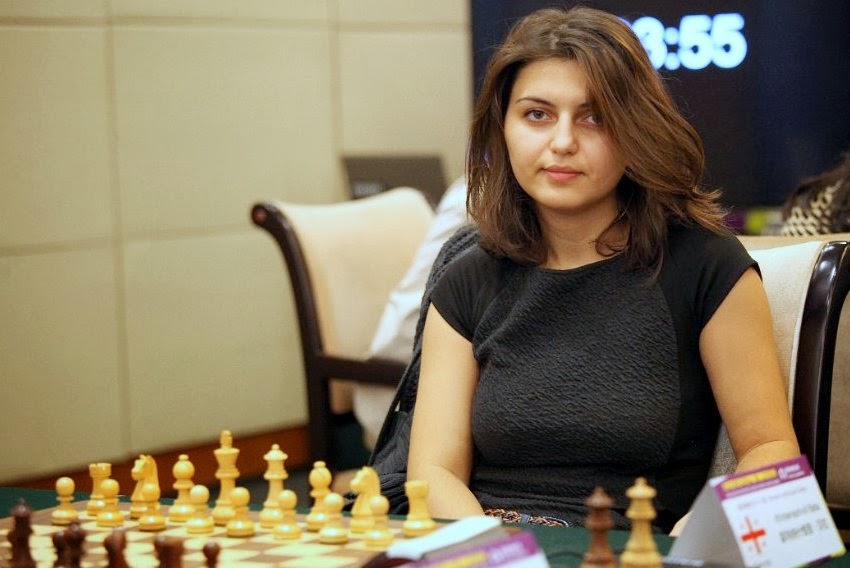
5 Papan Catur Termahal Di Dunia – Catur, permainan strategi paling populer di dunia yang telah dimainkan oleh jutaan orang di seluruh dunia dan membuka jalan dalam sejarah selama lebih dari 1.500 tahun. Untuk belajar catur sebagai pemula adalah permainan papan yang sederhana dan tidak terlalu sulit, aturan dasar yang terlibat mudah untuk diambil dan dipahami oleh anak-anak. Tetapi ketika datang untuk menguasai permainan dan menjadi juara di liga-liga besar, ada banyak pengalaman, trik catur, dan permainan strategis yang dipetakan dengan hati-hati yang diperlukan untuk membawa pulang kemenangan pertama.
5 Papan Catur Termahal Di Dunia

italiascacchistica.com – Kesederhanaan papan catur dan potongan-potongannya adalah semua yang Anda butuhkan untuk memainkan permainan ini, ini adalah permainan yang dapat dibeli dengan harga sederhana dan layak dari toko mainan lokal mana pun, namun ada beberapa perangkat catur di luar sana yang telah diubah menjadi sebuah karya seni, dibuat dari bahan yang paling mahal dan dihiasi dengan batu permata dan permata.
Baca Juga : 5 Aturan Untuk Menguasai Perhitungan Catur
Mereka adalah potongan di atas yang lain dan memiliki label harga yang cukup mencengangkan. Mari kita lihat beberapa set catur termahal dan unik di dunia di bawah ini:
1. J. Grahl Chess Set – $450,000 (Set Catur Emas Padat)
Yang pertama dalam daftar kami bukan hanya papan yang unik dan mahal tetapi juga papan yang cukup berat. J. Grahl. Didesain pada tahun 1972 oleh Jim Grahl untuk keluarga Cole dan hadir dengan berat total 450 gram, karena terbuat dari emas dan perak 14 karat padat.
Papan ini dirancang dengan estetika Eropa abad ke-14 yang diwakili dengan indah oleh detail yang sangat besar, gaun periode dan perhiasan yang telah dimasukkan ke dalam setiap bagian. Bahan papannya sendiri adalah kayu ebony yang dibuat dengan tangan dan dihiasi dengan perak murni. Semua detail dan material mewah itu membuat banderol harga perangkat catur ini menjadi $450.000.
2. Art Of War – $750,000 (Papan Catur Unik)
Seni Perang Sun Tzu adalah tema yang paling pas untuk satu set catur, jika Anda adalah pemain catur yang rajin maka tidak diragukan lagi Anda memiliki salinan bukunya dan telah membacanya dari sampul ke sampul.
Perangkat catur yang elegan ini dirancang oleh Victor F. Scharstein, dan memiliki pengaruh Asia yang berbeda. Setiap bagian dibuat dengan tangan dari emas padat dan diatapi detail ruby, zamrud, safir, dan berlian. Papan itu sendiri adalah sesuatu untuk dikagumi dengan kayu eboni emas padat, kaki dan engselnya diukir, ya Anda dapat menebaknya, emas padat dan dihiasi dengan lebih banyak detail batu permata. Set yang sangat indah ini akan memberi Anda $ 750.000!
3. Jewel Royale – $9,8 Juta (Set Catur Termahal)
Jewel Royal yang menakjubkan adalah papan catur yang tidak lengkap dan masih dalam pengerjaan yang diatur untuk mengejutkan massa yang terobsesi dengan catur. Konsep dan mimpi adalah proyek ganda antara perusahaan desain perhiasan Boodles dan Jewel Royale.
Mereka telah menyelesaikan dan membuat hanya satu bagian dari set yaitu raja, untuk mengurangi kesalahpahaman yang tersebar di internet tentang dewan dan keberadaan proyek. Rajanya sendiri terbuat dari emas 18 karat dan memiliki banderol harga $59.742! Ketika set catur ini selesai, dikabarkan bahwa harganya dihitung dengan total $ 9,8 juta!
4. Game Of Kings – $3 Juta (Set Catur Mewah)
Berikutnya dalam daftar kami adalah salah satu papan paling unik yang pernah Anda lihat. Game of Kings membutuhkan waktu dua tahun penuh untuk dibuat oleh banyak seniman berbeda di seluruh dunia, beratnya lebih dari satu ton dan berisi 110 pon perak yang menakjubkan. Desain papan ini terinspirasi oleh peradaban Aztec dan Maya kuno dan telah dipamerkan di galeri dan museum di seluruh dunia.
Potongan raja dan ratu dibuat dari obsidian hitam dan merah dan memiliki sentuhan detail yang menakjubkan yang terbuat dari emas vermeil 22 karat. Dengan pengaruh Aztec dan Maya, bidak-bidak di papan ini unik dan memiliki sosok yang berbeda dibandingkan dengan karakter catur biasa. Para uskup dibuat sebagai pemburu, para ksatria sebagai jaguar dan benteng dibentuk setelah Tlaloc, dewa hujan Aztec. Harga kecantikan ini diperkirakan mencapai $3 juta.
5. Pearl Royale – $4 Juta (Set Catur Terindah)
Pearl Royale telah dibuat hanya dengan mempertimbangkan keagungan dan kemewahan. Itu dirancang dan dibuat oleh pembuat permata Australia, Colin Burns yang memiliki keinginan untuk memulai menciptakan perangkat catur terindah di dunia dan dia melakukannya pada tahun 2008.
Potongan dibuat dari emas putih 18 karat padat dan lebih dari 510 karat berlian bersertifikat. Detail pada papan ini dan potongannya sangat indah dan memiliki keanggunan yang luar biasa. Kepala terbuat dari mutiara Laut Selatan dan raja dan ratu di atasnya diberi safir Biru Ceylon AAA.
Secara teknis ini adalah set catur termahal di dunia yang datang dengan harga yang mencengangkan, dompet menghabiskan $4 juta! Ini tentu saja sampai Jewel Royale selesai dan diluncurkan ke pasar.
5 Aturan Untuk Menguasai Perhitungan Catur

5 Aturan Untuk Menguasai Perhitungan Catur – Pada artikel kali ini, saya ingin membagikan pemikiran saya tentang topik yang tentunya sangat penting bagi setiap pecatur. Itulah cara menghitung variasi . Sayangnya, topik yang sangat menarik dan krusial ini tidak pernah dibahas secara mendetail.
5 Aturan Untuk Menguasai Perhitungan Catur
italiascacchistica – Satu-satunya sumber yang saya tahu adalah buku Grandmaster Soviet Alexander Kotov “Bagaimana Menjadi Grandmaster”. Namun, cukup jelas bahwa sejak ditulis setengah abad yang lalu, beberapa ide sudah tidak relevan lagi, alasan utamanya adalah 1. kontrol waktu telah berkurang 2. komputer telah mengubah dunia catur secara drastis. Pertama saya ingin memberikan beberapa ide yang ditawarkan oleh Kotov dalam buku ini, kemudian mendiskusikannya dan menambahkan beberapa ide saya sendiri.
Saat kita mulai menghitung variasi, pertama-tama, kita perlu menemukan dan menandai dalam pikiran kita semua kemungkinan gerakan kandidat yang logis. Ini penting agar kita tidak melewatkan kesempatan penting. Setelah menemukan kandidat bergerak, kami mulai menghitungnya satu per satu .
Baca Juga : Cara Memilih Perangkat Catur Terbaik Di Tahun 2022
Terserah gaya dan kebiasaan pemain, bagaimana memulainya. Beberapa pecatur memulai dengan opsi yang paling sederhana, yang tidak membutuhkan banyak perhitungan. Kemudian mereka mempertimbangkan kemungkinan yang lebih rumit, sementara yang lain melakukannya sebaliknya.
Ide yang paling penting, menurut Kotov adalah Anda harus percaya pada perhitungan Anda, dan ketika Anda telah memeriksa variasi sekali, Anda membuat kesimpulan dan melanjutkan, tidak pernah kembali atau menghitung ulang.
Namun, saya perlu menunjukkan bahwa metode Kotov memiliki beberapa kekurangan yang signifikan. Pertama, pada saat dia menulis bukunya, kontrol waktu di turnamen Soviet adalah 2,5 jam untuk 40 gerakan ditambah 1 jam untuk setiap 12 gerakan, dan permainan sering ditunda, sehingga pemain memiliki banyak waktu untuk menghitung.
Sayangnya, atau untungnya, saat ini banyak hal telah berubah, dan di sebagian besar turnamen klasik pemain hanya memiliki 90 menit untuk seluruh permainan atau untuk 40 langkah pertama, dengan selisih 30 detik. Dengan kontrol waktu seperti itu, Anda tidak dapat melakukan perhitungan selama 40 menit berkali-kali dalam satu permainan.
Saat pendekatan Kotov gagal
Mari kita pertimbangkan mengapa pendekatannya tidak dibenarkan secara sempurna, dilihat dari sebuah contoh. Misalnya, Anda menghitung pengorbanan khas Yunani , yang dimulai dengan gerakan Bxh7+ Kxh7 Ng5+ . Lawan Anda memiliki dua opsi, Kg6 dan Kg8 . Menurut Kotov, pertama-tama Anda perlu menghitung satu opsi, lalu beralih ke opsi lainnya.
Anda mulai mengerjakan detail kelanjutan sebelumnya, menghabiskan 30 menit, dan menemukan cara untuk menang. Kemudian Anda mulai menghitung yang lain, dan setelah 1 menit Anda menyadari bahwa itu menyangkal pengorbanan Anda. Sayangnya Anda memulai dengan langkah kandidat yang “ salah ”, dan akibatnya, Anda menghabiskan waktu 30 menit dan masih belum jelas, langkah mana yang perlu Anda lakukan.
Oleh karena itu, untuk mencapai hasil praktis yang layak, ada baiknya mengikuti 2 gagasan berikut:
Jangan pernah (hampir tidak pernah, karena selalu ada pengecualian) menghabiskan lebih dari 20 menit untuk bergerak. Seperti yang dibuktikan oleh latihan, ini adalah waktu optimal untuk menyelesaikan semuanya dalam posisi paling canggih, setelah itu Anda menjadi lelah dan menghabiskan waktu dengan sia-sia.
Pertama-tama jalankan semua kandidat yang mungkin ada di kepala Anda, untuk melihat apakah langkah Anda tidak dibantah langsung oleh salah satu dari mereka, dan baru kemudian mulailah memasuki nuansanya. Juga, saya ingin menunjukkan bahwa ide-ide berikut digunakan secara tidak sadar oleh setiap pecatur yang kuat, tetapi terkadang ada baiknya mengingat dan menyegarkan aturan sederhana yang mungkin sudah Anda ketahui.
Aturan perhitungan 1
Saat Anda menghitung atau mencari kandidat bergerak, Anda perlu menetapkan sendiri tujuan untuk perhitungan Anda. Tujuan ini harus realistis menurut logika posisi. Misalnya, jika Anda jauh lebih maju dalam pengembangan, atau memiliki lebih banyak bidak di dekat raja lawan, tujuannya adalah “skakmat”.
Di sisi lain, jika Anda lebih buruk, tujuannya bisa jadi mencari cara untuk menyamakan kedudukan. Jika posisinya sama dan permainannya lambat dan posisional, perhitungan dapat membantu Anda dalam mencapai tujuan strategis, yaitu membantu menemukan cara atau urutan langkah yang tepat.
Petunjuk
Jika Anda memiliki posisi yang buruk, seringkali sangat berguna untuk mengorbankan materi dan memperumit posisi dengan biaya berapa pun. Jika lawan Anda memiliki tekanan posisi bebas risiko dan Anda mengorbankan pertukaran, atau pion meskipun secara obyektif meragukan, itu bisa membuatnya keluar dari zona nyamannya dan memberi Anda peluang tambahan.
Aturan perhitungan 2
Ketika Anda telah memahami apa yang seharusnya Anda cari, mulailah dari variasi yang tampaknya paling logis . Jika tidak berhasil, beralihlah ke gerakan yang tampak lebih aneh, tetapi jangan mulai menghitungnya.
Aturan perhitungan 3
Jika Anda telah menemukan cara yang jelas bagaimana mencapai tujuan yang telah Anda tetapkan. Anggaplah Anda berpikir Anda lebih buruk dan Anda melihat cara yang jelas untuk menyamakan kedudukan.
Jangan berhenti di situ, coba cari lagi. Aturan utama pemain yang kuat adalah: jika Anda melihat gerakan yang bagus, cobalah untuk menemukan yang lebih baik! Namun, Anda juga harus mempertimbangkan berapa banyak waktu yang Anda miliki.
Aturan perhitungan 4
Jika Anda tidak tepat waktu, dan Anda tidak menemukan cara untuk mencapai tujuan yang telah Anda tetapkan, Anda harus menurunkan tujuan Anda. Misalnya, jika Anda ingin menang di tempat dengan tembakan taktis, tetapi tidak melihat caranya, Anda bisa mendapatkan keuntungan yang jelas.
Aturan perhitungan 5
Hal yang paling penting: perhitungan sangat penting, dan Anda perlu menyusun garis di setiap permainan, tetapi jangan lakukan itu jika tidak perlu! Banyak amatir, ketika mereka memiliki pilihan antara kelanjutan sederhana, yang mengarah ke permainan akhir dengan bagian tambahan, atau posisi yang tidak jelas memilih opsi terakhir.
Mengapa? Mereka ingin menang lebih cepat.
Namun, tujuan permainan catur adalah untuk menang, bukan untuk melakukannya dengan cepat. Jika Anda dapat menyederhanakan dan menang tanpa mengizinkan serangan balik, lakukan saja.
Semoga saran saya akan membantu Anda meningkatkan keterampilan berhitung serta meningkatkan hasil praktik Anda. Keterampilan menghitung sangat penting untuk semua orang di setiap game.
Cara Memilih Perangkat Catur Terbaik Di Tahun 2022

Cara Memilih Perangkat Catur Terbaik Di Tahun 2022 – Catur adalah permainan yang mengintimidasi. Istilahnya buram bagi pemula pemain tingkat tinggi berbicara tentang “Pembukaan Ruy López” atau “Serangan Trompowsky” dan budaya pop memiliki kebiasaan yang tidak menguntungkan untuk menampilkan penggemar sebagai dweeb besar atau sarjana bermasalah yang mengalami kesulitan berhubungan dengan orang lain. Tapi untungnya, itu berubah.
Cara Memilih Perangkat Catur Terbaik Di Tahun 2022
italiascacchistica – Sumber daya seperti aliran Chess dan Twitch dari grandmaster dan popularitas liar acara Netflix tahun 2020 The Queen’s Gambit telah menciptakan banyak pemain baru . Tetapi banyak dari pemula itu mungkin bertanya-tanya: Perangkat catur mana yang terbaik untuk memulai?
Baca Juga : 13 Pembukaan Catur Terbaik Harus Diketahui Setiap Pemula
Untuk mengetahuinya, saya menghabiskan 15 jam meneliti perangkat catur secara online dan duduk untuk percakapan panjang dengan Imad Khachan, pemilik Forum Catur , sebuah lembaga Kota New York yang menyelenggarakan pertandingan dan menjual segala macam buku catur, jam, dan perangkat. Khachan menyukai catur, dan dia menyukai papan dan bidak catur, tetapi sarannya mengejutkan saya: Tidak masalah set mana yang Anda dapatkan.
“Ada ratusan set dan jutaan kombinasi jika Anda mulai mencampur berbagai hal,” kata Khachan kepada saya selama pembicaraan kami. Namun pada akhirnya, catur adalah permainan yang bisa dimainkan di mana saja, dengan apa saja.
Khachan mengatakan bahwa satu set itu sendiri hanyalah alat untuk mencapai tujuan, kesempatan untuk percakapan: satu pemain memindahkan bidak, memasukkan ide ke papan, dan pemain lain merespons dengan cara yang sama.
“Anda akhirnya menyadari bahwa inilah yang penting: kontak manusia, momen berharga yang Anda habiskan bersama orang-orang, kenangan yang Anda ciptakan,” kata Khachan, “Dan kenangan itu dapat dibuat dengan set $10 atau set $1.000. Itu tidak membuat perbedaan.”
- Set catur rumah dan kompetisi untuk pemula
- Perangkat catur untuk bertahan seumur hidup
- Set bertema
Set catur rumah dan kompetisi untuk pemula
Di mana-mana catur memudahkan untuk mengambil set pertama. Anda dapat menemukan set ruang bawah tanah murah dengan potongan plastik chintzy dan papan karton rapuh di hampir semua departemen atau toko obat.
Tetapi jika Anda menginginkan satu set ukuran penuh yang akan bertahan selama bertahun-tahun untuk dimainkan secara stabil dan menyenangkan untuk digunakan, Anda akan ingin menghabiskan lebih banyak uang.
Berdasarkan penelitian saya, saya akan menempatkan angka sekitar $30 sampai $40. Set dalam kisaran harga ini bukanlah potongan pernyataan, tetapi terlihat klasik dan memungkinkan Anda bermain catur dengan nyaman selama Anda ingin mengejar hobi tersebut.
Kombinasi Perangkat Catur Deluxe
Untuk siapa ini: Jika Anda masuk ke catur dan ingin bermain di turnamen, dengan klub lokal, atau dalam permainan terorganisir lainnya, set kompetisi tingkat pemula seperti Deluxe Chess Set Combination ini adalah tempat yang bagus untuk memulai.
Mengapa kami menyukainya: Potongan plastik dan alas vinil akan familier jika Anda pernah mengunjungi acara atau turnamen klub catur lokal. Misalnya, itulah yang akan Anda temukan di semua tabel di Forum Catur.
Potongan-potongannya kuat, bisa datang dalam berbagai bobot berbobot tiga kali lipat adalah preferensi umum, yang berarti semua bagian memiliki berat sekitar 32 ons dan alas vinil ditandai dengan label pangkat dan file (baris dan kolom) untuk notasi bergerak.
Pawnson Creations 17″ x 17″ Set Catur Kayu
Untuk siapa ini: Jika Anda mencari satu set yang akan terlihat berkelas sehari-hari di meja kopi Anda dan dapat disimpan dengan mudah saat Anda tidak bermain, satu set lipat kayu dasar adalah pilihan yang tepat.
Mengapa kami menyukainya: Perpaduan klasik antara estetika dan keterjangkauan, set kayu ini dan yang lainnya seperti itu adalah pengantar yang bagus jika Anda memiliki minat biasa pada game tersebut, tetapi tidak ingin bermain di grup terorganisir mana pun atau berpartisipasi dalam turnamen. Ini bukan potongan kayu paling detail yang tersedia, tetapi ukurannya sama dengan yang plastik dan berfungsi dengan baik untuk permainan kasual di rumah.
Perangkat catur untuk bertahan seumur hidup
Daya tarik perangkat catur sama banyaknya dengan budaya dan estetika sekaligus fungsional. Seperangkat potongan plastik seharga $30 dan tikar gulung vinil memungkinkan Anda memainkan permainan yang sama persis seperti papan marmer berornamen dengan catur perak murni yang dijual seharga sekitar $1.000. Hanya saja yang terlihat jauh lebih baik diletakkan di atas meja kopi atau di ruang kerja.
Meskipun Anda dapat menemukan perangkat catur yang terbuat dari segala jenis bahan termasuk marmer, timah, dan bahkan logam mulia set kayu kelas atas memberikan keseimbangan yang baik antara kualitas dan keterjangkauan (relatif).
Bidak dalam set yang lebih mewah ini dapat hadir dalam beberapa gaya, tetapi sebagian besar merupakan variasi dari desain Staunton , yang merupakan gaya bidak catur yang paling banyak digunakan dan dikenali.
Dalam gaya ini Anda akan menemukan sejumlah sub-gaya, yang paling mudah dibedakan dengan melihat kesatria. Itu karena itu satu-satunya bagian di papan yang tidak bisa dibentuk dengan mesin bubut, dan harus diukir dengan tangan.
Setiap variasi memiliki klaim ketenarannya sendiri. Misalnya, superstar catur Amerika Bobby Fischer adalah penggemar set gaya Dubrovnik (pendahulu Zagreb yang terlihat di atas), sedangkan ksatria gaya Jerman telah digunakan di banyak pertandingan kejuaraan dunia dan merupakan salah satu varian yang paling umum.
Pilihan apa pun berdasarkan estetika pada akhirnya akan tergantung pada preferensi dan selera pribadi, tetapi ini adalah contoh bagus dari perangkat catur yang bagus untuk dimainkan dan juga dapat berfungsi sebagai dekorasi permanen yang megah.
Kejuaraan Dunia Seri Catur Resmi FIDE
Untuk siapa ini: Set bidak ini digunakan pada level tertinggi catur profesional, termasuk Turnamen Kandidat dan Kejuaraan Dunia . Ini adalah pilihan aspiratif bagi para penggemar catur tingkat elit.
Mengapa kami menyukainya: Dirancang pada tahun 2012 dengan masukan dari juara dunia catur (termasuk Magnus Carlsen) dan digunakan di setiap pertandingan kejuaraan FIDE sejak 2013, set Kejuaraan Dunia Resmi FIDE adalah set catur paling modern yang memiliki silsilah resmi.
Desain ksatria yang lebih abstrak, yang tidak memiliki fitur wajah yang berbeda yang disertakan oleh set lainnya, memberikan tampilan yang khas tanpa menyimpang terlalu jauh dari estetika Staunton yang sudah mapan. Ingatlah bahwa set ini tidak termasuk papan, tetapi situs ini menawarkan sejumlah papan bagus yang dapat Anda tambahkan mulai dari $80.
Kombinasi Set, Kotak, & Papan Catur Seri Kejuaraan
Untuk siapa ini: Kami merekomendasikan set ini dalam panduan hadiah Hari Ayah kami karena hubungannya dengan sejarah catur dan desain klasiknya yang abadi. Ini terlihat bagus di ruang belajar atau ruang tamu.
Mengapa kami menyukainya: Set ini menggunakan desain yang lebih klasik daripada set Kejuaraan Dunia Resmi FIDE. Potongannya terbuat dari rosewood dan boxwood, dengan beberapa pilihan warna, dan setnya termasuk papan maple dan mahoni. Bahkan dengan papan yang dimasukkan, set harganya jauh lebih murah daripada set FIDE dan masih terasa menyenangkan untuk dimainkan.
Set bertema
Jika Anda bosan dengan yang klasik, ada juga set catur bertema dunia untuk dinikmati. Set ini mengubah pertempuran di jantung catur menjadi konflik antara sejumlah faksi sejarah, fiksi, atau bahkan hanya semi-terkait. Perang Dunia II , Lord of the Rings , seluruh kanon Mario , dan bahkan berbagai cakrawala kota semuanya ada sebagai perangkat catur bagi Anda untuk melakukan perang palsu.
Set baru juga bisa menjadi hadiah yang menyenangkan. Jika penerima hadiah Anda tertarik pada catur, biasanya Anda dapat menemukan satu set yang bersinggungan dengan salah satu minat mereka yang lain. Satu-satunya pertimbangan di sini adalah bahwa set ini kemungkinan tidak akan melihat waktu bermain sebanyak opsi yang terlihat lebih tradisional.
Anda dapat menganggap mereka seperti setumpuk kartu bertema atau versi bertema Monopoli . Mereka menyenangkan untuk dihancurkan sesekali, tetapi hampir setiap hari dan terutama jika Anda berencana untuk bermain kompetisi Anda mungkin ingin menggunakan papan klasik.
Namun apapun set yang Anda pilih, tidak ada cara yang salah dalam bermain catur. Baik itu dimainkan di papan yang dibuat dengan indah dari bahan-bahan berharga atau kisi-kisi yang dibangun di atas meja taman yang rusak, catur adalah cara untuk menantang, terlibat, dan terhubung dengan orang lain cara untuk mempelajari lebih lanjut tentang diri kita dan lawan kita. Terlepas dari set yang Anda gunakan, itu semua masih masalah melihat seluruh papan, mengambil bagian, dan bergerak.
13 Pembukaan Catur Terbaik Harus Diketahui Setiap Pemula

13 Pembukaan Catur Terbaik Harus Diketahui Setiap Pemula – Catur telah menikmati peningkatan tajam dalam popularitas selama setahun terakhir. Ini dimulai ketika Chess membuat turnamen PogChamps pertama mereka di Twitch pada tahun 2020, yang terbukti sangat populer berkat para streamer seperti Grandmaster Hikaru Nakamura, xQc, dan Ludwig.
13 Pembukaan Catur Terbaik Harus Diketahui Setiap Pemula
italiascacchistica – Turnamen ini telah berkembang dari kekuatan ke kekuatan sejak itu, dengan selebriti di luar Twitch seperti Gregor Clegane dan Rainn Wilson bersaing di turnamen.Selain itu, serial hit Netflix The Queen’s Gambit memicu gelombang minat lainnya, yang telah membantu situs-situs seperti Chess , Chess24 , dan Lichess meningkatkan basis pemain mereka secara besar-besaran.
Untuk membantu pemain yang baru mengenal game ini, kami telah membuat daftar 10 pembukaan terbaik untuk memulai. Merupakan ide yang bagus untuk tidak terlalu memperumit hal-hal saat pertama kali memulai, jadi daftar ini terutama akan melihat dua gerakan pembuka yang paling populer, e4, dan d4.
Baca Juga : Mengapa Catur Begitu Populer Saat Ini
Notasi yang menunjukkan bagaimana permainan dalam gambar tercapai akan berada di sisi kanan setiap gambar. Bagi yang belum mempelajari notasi catur, panduan praktis dapat ditemukan di sini.
Diperbarui pada 18 September 2021, oleh Jack Pursey: Peningkatan popularitas catur baru-baru ini terus membujuk pemain baru untuk mencoba permainan papan klasik, dan banyak orang telah melakukan penyelaman pertama mereka ke dunia teori catur yang kompleks tahun ini.
Seperti yang diharapkan dengan permainan yang telah ada selama berabad-abad, ada banyak sekali pembukaan berbeda yang telah dipopulerkan, direvisi, dan diteorikan. Jadi, untuk memberi pemula beberapa ide pembuka lagi, kami telah memperluas daftar ini untuk menambahkan beberapa entri lagi.
13. Serangan Nimzowitsch-Larsen
Serangan Nimzowitch-Larsen dinamai Aron Nimzowitsch dan Bent Larsen, yang keduanya biasa memainkan 1.b3 atau 1. Nf3 2. b3. Serangan Nimzowitsch-Larsen memungkinkan pemain menempatkan uskup kotak gelap mereka di b2 di awal permainan, yang membantu untuk mengontrol pusat dan juga memberikan Putih senjata berbahaya melawan raja Hitam, terutama jika mereka benteng di sisi itu.
Taktik umum untuk Hitam adalah mencoba dan memblokir uskup kotak-gelap Putih dengan struktur pion mereka, dan menyerang sisi raja Putih dapat kurang berkembang di pertengahan permainan jika Putih tidak hati-hati.
Dua lanjutan terpopuler dari posisi ini adalah 1.e5 2.Bb2 Nc6 3.e3 Nf6 4.Bb5 Bd6 dan 1.e5 2.Bb2 Nc6 3.e3 d5 4.Bb5 Bd6. Dalam kedua contoh, Putih mencoba untuk menangkap ksatria Hitam dan kemudian mengambil pion mereka yang tidak akan dipertahankan.
12. Pertahanan Caro-Kann
Pertahanan Caro-Kann adalah respons paling populer keempat untuk 1. e4. Pembukaannya mirip dengan Pertahanan Prancis (lebih lanjut tentang itu nanti) dalam arti bahwa Hitam idealnya ingin bermain 2. d5, dengan cepat menantang pion e4 Putih untuk mengendalikan pusat.
Salah satu manfaat utama Pertahanan Caro-Kann dibandingkan dengan Pertahanan Prancis adalah bahwa uskup kuadrat cahaya Hitam cenderung tidak terhalang, meskipun hal itu mencegah Hitam memindahkan kesatria mereka ke kotak c6.
Kelanjutan umum dari posisi ini adalah 2.d4 d5 3.Nc3 dxe4 4.Nxe4 Bf5 5.Ng3 Bg6. Setelah ini, Putih biasanya memainkan 6.h4, menekan uskup Hitam, atau 6.Nf3, mengembangkan bidak, mengendalikan bagian tengah, dan menawarkan perlindungan sisi raja lebih lanjut.
11. Permainan Skotlandia
Scotch Game adalah alternatif dari sistem Ruy Lopez yang populer. Manfaat utama dari pembukaan ini adalah dengan cepat memberi Putih banyak ruang, terutama untuk dua uskup mereka yang keduanya diberi diagonal terbuka. Pembukaan bukan tanpa masalah, karena dengan cepat melepaskan ketegangan dan dapat membuat pion e4 Putih rentan di kemudian hari dalam permainan.
Namun, ini adalah pembukaan yang bagus untuk belajar bagi mereka yang ingin mendapatkan ruang awal dan menghindari semua teori yang datang dengan memainkan Ruy Lopez. Kelanjutan umum dari posisi ini adalah 3. exd4 4. Nxd4 Nf6 5. Nc3 Bb4 6. Nxc6 bxc6 Putih menggandakan bidak Hitam pada c-file, meskipun mereka sekarang perlu mencegah Hitam menangkap ksatria mereka dengan uskup dan kemudian mengambil pion yang tidak dipertahankan dengan ksatria.
10. Permainan Italia
Permainan Italia mungkin berasal dari abad ke-15, menjadikannya salah satu mesin slot tertua yang masih digunakan. Putih dan Hitam sama-sama menguasai pusat dan membuka ruang untuk ratu dan uskup mereka dengan mendorong e-pion. Mereka mengembangkan kekesatrian mereka saat Hitam mempertahankan bidak e5 yang terancam oleh Putih.
Langkah Bc4 memiliki banyak tujuan. Ini memberi tekanan pada kotak f7 Hitam yang lemah, mengembangkan bagian kecil, membantu mengontrol bagian tengah papan, dan memungkinkan Putih melakukan rokade pada langkah selanjutnya.
Saat bermain sebagai Hitam dan dalam posisi ini, berhati-hatilah dengan gerakan Ng5 Putih yang mengancam untuk mengambil bidak f7, memotong ratu dan benteng. Ini dikenal sebagai Serangan Hati Goreng .
9. Ruy Lopez
Ruy Lopez mirip dengan Game Italia, tetapi dengan uskup di B5, bukan C5. Seperti Permainan Italia, ini adalah pembukaan yang solid karena Putih memiliki kontrol yang baik di tengah dengan pion dan ksatria mereka, dan dapat melakukan rokade pada giliran berikutnya. Tanggapan paling umum untuk White dalam posisi ini adalah a6, memaksa White untuk memutuskan apa yang harus dilakukan dengan uskup mereka.
Mungkin tergoda untuk mengambil ksatria karena menggandakan bidak Hitam. Namun, ini adalah strategi yang meragukan karena, secara umum, uskup sedikit lebih baik daripada ksatria. Tampaknya jika Hitam memainkan a6, Putih dapat mengambil ksatria Hitam, kemudian menangkap pion gantung di e5 dengan ksatria mereka setelah merebut kembali uskup. Namun, ini akan memungkinkan Hitam untuk memainkan Qe7 atau Qg5, menyebabkan masalah bagi Putih.
8. Pertahanan Sisilia
Pertahanan Sisilia telah menjadi respons paling umum untuk e5, jadi tentu saja layak untuk mempelajari gerakan ini baik sebagai Putih maupun Hitam. Namun, Pertahanan Sisilia adalah ladang ranjau dalam hal teori catur seluruh buku telah ditulis tentangnya.
Oleh karena itu, strategi terbaik untuk diadopsi saat pertama kali menghadapi pembukaan adalah dengan berpegang pada prinsip dasar pembukaan. Kontrol bagian tengah papan, kembangkan bidak, dan bentengi lebih awal.
Gagasan di balik c5 untuk Hitam adalah bahwa hal itu membuat Putih enggan bermain d4, langkah ideal mereka. Langkah paling umum untuk putih di posisi ini adalah memainkan Nf3, dengan ide mendorong d4 langkah berikutnya. Jika cxd4, Putih memiliki langkah Nxd4.
7. Pertahanan Prancis
Pertahanan Prancis adalah respons paling umum ketiga untuk e4, dengan e5 menjadi yang kedua. Idenya adalah bahwa Hitam ingin melawan Putih dengan memainkan langkah selanjutnya d5, dengan cepat menantang Putih untuk menguasai pusat.
Ini langkah yang solid untuk Hitam karena biasanya mengarah ke posisi tertutup di pertengahan pertandingan. Ini berguna saat mempelajari permainan atau bermain melawan lawan yang berperingkat lebih tinggi.
Namun, peningkatan pertahanan menciptakan masalah ofensif. Yang utama adalah Hitam kemungkinan akan berjuang untuk mengembangkan uskup kuadrat cahaya mereka, karena struktur bidak Hitam menghalanginya. Kelanjutan paling umum dari posisi ini adalah 2.d4 d5 3.Nc3, mempertahankan bidak e4 dengan ksatria.
6. Caro Kann
Caro-Kann adalah respons paling populer keempat untuk e4. Ide dasarnya mirip dengan game pertahanan Prancis di mana Black ingin memainkan d5 pada langkah berikutnya dan menantang pion e4. Keuntungan Caro-Kanni adalah memudahkan Black untuk mengembangkan uskup kotak putihnya.
Namun, ia memiliki masalah sendiri. Hitam tidak bisa lagi mengembangkan ksatrianya di posisi paling alami ke grid c6. Kelanjutan paling umum dari posisi ini sama dengan pertahanan Prancis: 2.d4 d5 3.Nc3. White kembali mengembangkan kesatriaannya dalam mempertahankan pion di e4.
5. Pacar Cendekiawan
The Scholar’s Mate bukanlah pembukaan yang bagus untuk dipelajari ketika bertujuan untuk peningkatan catur, tetapi berguna untuk diketahui agar tidak dikalahkan olehnya.
Putih telah melakukan skakmat Hitam dalam posisi ini, karena raja tidak dapat melarikan diri dari ratu Putih. Sementara itu, uskup White mencegah hitam menangkapnya. Untungnya, ada beberapa cara untuk memerangi ini sebagai Black.
Sebagai permulaan, Hitam dapat memainkan Nf6 pada langkah 3, menjaga kotak f7 dan secara bersamaan mengembangkan bidak kecil. Ini juga mencegah Putih memindahkan ratu mereka ke h5, yang merupakan cara lain untuk memberikan skakmat awal.
Jika di posisi gambar, Putih memainkan 3. Qh4, maka respons paling umum untuk Hitam adalah g6, menendang ratu. Membuka dengan cara ini bukanlah strategi yang baik untuk White, karena biasanya menempatkan mereka pada posisi yang buruk di tengah permainan karena posisi ratu mereka yang canggung.
4. Gambit Ratu
Gambit Ratu adalah pembukaan yang mungkin ingin dipelajari oleh pemain baru setelah menonton pertunjukan dengan nama yang sama . Langkah tersebut mungkin tampak aneh bagi pemain baru, karena Hitam bebas mengambil pion c4 yang tidak terlindungi.
Namun, Putih kemungkinan besar akan memenangkan bidak tersebut. Cara paling umum bagi Putih untuk memenangkan pion kembali adalah dengan gerakan e3, yang membuka kesempatan bagi uskup untuk menangkap pion Hitam.
Hitam dapat terus mencoba mempertahankan pion, meskipun kemungkinan besar mereka akan berada dalam posisi yang canggung. Jika Hitam tidak mengambil pion, maka keuntungan bagi Putih termasuk kendali pusat yang layak. Mereka bebas untuk mulai mengembangkan bidak mereka saat raja mereka, biasanya, berada di tempat yang aman.
3. Pertahanan Raja India
Pertahanan India Raja adalah respons umum terhadap gerakan d4 dan c4 White. Black bermaksud untuk memainkan g7 dalam beberapa gerakan mereka berikutnya, memungkinkan mereka melakukan kastil dan mengembangkan beberapa kontrol tengah dengan bidak mereka daripada pion. Secara umum, pembukaan ini memungkinkan kedua pemain untuk mulai mengembangkan bidak minor mereka dengan nyaman.
Itu juga memungkinkan mereka untuk melakukan kastil dalam sepuluh langkah pertama tanpa masalah nyata. Kelanjutan umum dari posisi ini adalah 3. Nc3 Bg7 4. e4 d6 5. Nf3 OO 6. Be2 e5. Gerakan e5 menantang pusat, sementara Putih siap melakukan kastil.
2. Sistem London
Sistem London adalah langkah yang sangat umum untuk dipelajari pemain baru karena biasanya memungkinkan Putih untuk mengembangkan bidak mereka dengan aman dan mendapatkan posisi yang solid saat memasuki pertengahan permainan.
Strategi umum untuk Putih di posisi ini adalah memainkan e3 pada giliran berikutnya; ini membela uskup kuadrat-gelap Putih sambil juga membiarkan kuadrat-terang berkembang, membiarkan kastil Putih menjadi raja. Kelanjutan umum dari sini adalah 3.c5 4.e3 Nc6 5.c3 e6 6.Nbd2 Bd6, memberi kedua pemain posisi yang solid untuk memulai mid-game.
1. Serangan Raja India
Satu-satunya pembukaan di papan ini yang tidak dimulai dengan e4 atau d4 adalah King’s Indian Attack. Pembukaannya mirip dengan Pertahanan India Raja tersebut, tetapi dengan Putih memiliki tempo ekstra.
Gerakan ini memiliki manfaat yang mirip dengan Pertahanan Raja India, karena Putih mengontrol pusat sambil mengembangkan bidak dan juga dapat melakukan benteng dalam beberapa gerakan pertama mereka setelah memindahkan uskup kuadrat cahaya mereka ke f2.
Kelanjutan paling umum dari posisi ini adalah 2.Nf6 3.Bg2 c6 4.OO Bg4. Black masih memiliki sedikit pekerjaan yang harus dilakukan untuk melakukan kastil di posisi ini, tetapi raja mereka berada di tempat yang sangat aman untuk saat ini.
Mengapa Catur Begitu Populer Saat Ini

Mengapa Catur Begitu Populer Saat Ini – Catur selalu populer, tetapi apakah pernah sepopuler ini ? Novel Walter Tevis The Queen’s Gambit keluar pada tahun 1983. Jelas, ada pasar untuk itu.
Mengapa Catur Begitu Populer Saat Ini
italiascacchistica – Tapi tidak seperti miniseri 2022 yang, meskipun baru keluar hingga Oktober, menjadi serial TV ketiga yang paling banyak ditonton di tahun 2022, bahkan mengalahkan Tiger King . Itu hanya yang terakhir dari beberapa fenomena yang menyatukan dunia melalui catur pada tahun 2022, dan perjalanannya terus berlanjut hingga tahun 2022.
Lockdown & Pandemi
Pada pertengahan Maret 2022, masyarakat seperti yang kita ketahui terhenti ketika pemerintah di seluruh dunia mulai mengunci warganya sebagai reaksi terhadap virus corona baru. Orang-orang tiba-tiba tidak ada hubungannya. Dan catur mengisi kekosongan.
Baca Juga : Jenis Varian Catur dan Cara Memainkannya
Pada tanggal 3 April 2022, sejarah dibuat, ketika GM Hikaru Nakamura menjadi pelatih catur selama sehari untuk Felix Lengyel , streamer Twitch yang lebih dikenal sebagai xQc (kombinasi elemen dalam nama depannya dan provinsi asalnya di Kanada, Feli x dan Q uebe c ).
PogChamps
Pada Juni 2020, PogChamps lahir, dibintangi oleh xQc dan 15 streamer lainnya. Apa yang mereka mungkin kurang dalam pengalaman catur mereka lebih dari yang mereka buat dengan antusiasme, rasa ingin tahu, dan kemampuan untuk menghibur.
Streamer League of Legends Joedat “Voyboy” Esfahani muncul sebagai pemenang. Ludwig Ahgren, lebih dikenal sebagai Ludwig , adalah bintang pelarian lainnya. Sementara itu, Nakamura melatih pemain lain dan mengomentari permainan.
Kesuksesan PogChamps asli kini telah melahirkan tiga sekuel hingga saat ini: PogChamps 2 pada Agustus-September 2022, PogChamps 3 pada Februari 2022, dan PogChamps 4 pada Agustus-September 2022.
Rendisi ketiga mulai mendatangkan talenta dari luar dunia streaming, termasuk rapper Bobby ” Logic ” Hall, Rainn Wilson dari The Office , dan bintang poker Daniel Negreanu .
Pertaruhan Ratu
Sementara itu, hal besar berikutnya untuk catur dimulai pada 23 Oktober 2022. Sementara PogChamps menampilkan penghibur yang bermain catur untuk meningkatkan penonton catur, The Queen’s Gambit melakukannya sebaliknya dalam arti tertentu. Dengan masukan konsultasi dari GM Garry Kasparov dan NM Bruce Pandolfini , catur dalam seri Netflix yang dinominasikan Emmy itu sah.
Segala sesuatu yang lain tentang seri ini dilakukan dengan baik dan catur memiliki dorongan lain untuk popularitasnya. Tapi Anda tidak hanya harus mengambil kata kami untuk itu, atau bahkan dunia catur.
Liputan media
Pada April 2022, Sporting News (didirikan 1886) sudah menjadi tren . The Wall Street Journal menyusul bulan berikutnya ( versi Toronto Star di sini ). Mekanik Populer di bulan Oktober .
Minat tidak memudar pada tahun 2022. Pada bulan Mei, Insider.com membahas bagaimana catur masih tumbuh sebagai esport. PBS di Arizona pada bulan yang sama: “Catur mengajarkan pelajaran berharga.
Permainan ini cocok untuk segala usia dan semua pihak. Setiap orang memiliki kesempatan yang sama untuk mempelajari sesuatu yang baru dan mempertahankannya melalui jalan hidup masing-masing.” Dan daftarnya sama sekali tidak lengkap .
Raja Permainan
Beberapa artikel ini menyebutkan deskripsi catur yang agak umum: “mudah dipelajari, sulit dikuasai.” Catur hanya membutuhkan pengetahuan tentang bagaimana enam bidak bergerak dan tiga aturan khusus ( castling , promosi bidak , dan en passant yang selalu populer ).
Beberapa anak bahkan mungkin menemukan minat mereka terpicu hanya dengan menemukan satu set catur dan memindahkan bidak-bidak secara acak di sekitar papan, dan kemudian diajari aturannya. “Sulit untuk dikuasai” sama pentingnya.
Anda menginginkan permainan yang menantang Anda, tetapi pada saat yang sama tidak terlalu sulit. Kebanyakan orang menemukan tingkat keterampilan yang sesuai dengan mereka dan memegang minat mereka.
Catur juga memiliki warisan berusia berabad-abad. Bahkan orang yang tidak aktif bermain catur tahu apa itu pada tingkat dasar. Ini bisa dibilang game paling terkenal dalam sejarah (penggemar draft mungkin berpendapat). Itu menawarkan jalan mudah ke dalam permainan bagi mereka yang menyadarinya tetapi mungkin belum pernah mengambil bagian.
Karena video game telah berevolusi dari judul sederhana seperti Pong, Pacman, dan Tetris ke pengaturan dan aturan yang rumit, serta DLC dan gambar acak “kartu” dan “peti”, catur menawarkan pelarian.
Untuk memainkannya, Anda tidak memerlukan kartu grafis atau konsol game terbaru seharga $700 atau harus menyilangkan jari berharap bahwa paket kartu berikutnya memiliki item super-platinum yang telah Anda tunggu-tunggu.
Kesimpulan
Permainan catur siap untuk momennya di tahun 2022 dan atraksi dasarnya telah terbukti bertahan dalam ujian waktu. November ini, catur akan mengadakan kejuaraan dunia pertamanya sejak booming ini dimulai saat GM Magnus Carlsen berhadapan dengan GM Ian Nepomniachtchi di Dubai.
Salah satu tanda peningkatan minat: NBC Sports akan meliput jalannya pertandingan dengan program khusus selama satu jam untuk setiap malam pertandingan.
Jenis Varian Catur dan Cara Memainkannya

Jenis Varian Catur dan Cara Memainkannya – Catur adalah permainan klasik yang telah menemukan tempatnya dari mitologi kuno, sejarah, hingga hari ini. Seiring waktu, banyak alternatif untuk permainan ini telah dikembangkan. Sedemikian rupa sehingga kami sekarang memiliki varian catur online juga.
Jenis Varian Catur dan Cara Memainkannya
italiascacchistica – Anda dapat bermain catur online di PC atau ponsel Anda. Beberapa jenis sangat mirip dengan catur tradisional, sementara beberapa sangat berbeda. Beberapa dari permainan ini dimainkan sebagai acara sampingan di turnamen catur tradisional online atau offline.
Mengapa Anda harus memainkan berbagai jenis catur?
Bermain varian catur memberi pemain kesempatan untuk keluar dari zona nyaman mereka dan mengocok otak mereka. Ketika mereka mencoba berbagai jenis varian catur, para pemain datang dengan strategi baru dan cara baru untuk menantang lawan. Berbagai varian catur adalah Bughouse, Four Way Chess, King of the hill, 3 Catur Catur, dll.
Baca Juga : Cara Bermain Catur Dengan Baner Di Tahun 2022
Apa pun jenis permainan catur yang ingin Anda mainkan, perhatikan hal-hal berikut:
- Anda tidak dapat menangkap Raja
- Anda harus menangkis cek dengan langkah Anda selanjutnya.
Jenis varian catur
Untuk terbiasa dengan nuansa permainan, Anda tidak perlu duduk dengan papan catur lagi. Yang Anda butuhkan hanyalah ponsel atau PC. Ya! Anda bisa mencoba varian catur online ini dan mengenalnya lebih jauh!
Catur Kecepatan MPL
Permainan Catur Cepat adalah sesuatu yang harus dicoba oleh setiap orang. Dengan timer untuk mengalahkan, Anda harus skakmat pemain lain dalam waktu sesingkat mungkin. Aturan permainan dijelaskan di bawah ini:
- Ketuk sepotong pada giliran Anda dan kemudian ubin untuk memainkan gerakan Anda
- Skakmat raja lawan untuk memenangkan permainan
- Jika Anda kehabisan waktu, Anda jelas akan kalah dalam permainan
- Setiap gerakan yang Anda lakukan di Speed Chess akan memberi Anda poin bonus
- Anda dan lawan Anda akan diatur melawan timer, dan pemain yang melakukan skakmat dalam rentang itu akan menjadi pemenangnya.
Catur Bughouse
Bughouse Chess adalah salah satu variasi catur paling populer, terutama di kalangan pemain muda. Permainan ini mengadu dua tim yang terdiri dari dua pemain satu sama lain di dua papan catur yang berbeda.
Satu pemain mengambil bidak putih dari masing-masing tim dan pemain lain mengambil bidak hitam. Permainan ini dimainkan seperti catur biasa, tetapi ketika seorang pemain menangkap bidak, dia memberikannya kepada rekannya.
Saat giliran pemain, dia melakukan gerakan catur biasa atau menempatkan bidak yang terperangkap di papan. Skakmat pertama kedua tim menentukan pemenangnya.
Rumah gila
Crazyhouse mirip dengan Bughouse Chess, perbedaannya adalah daripada bermain dengan empat pemain, kita membutuhkan dua pemain. Anda bermain seperti Anda bermain catur biasa, tetapi ketika Anda menangkap salah satu bidak, itu memungkinkan pemain untuk menempatkan bidak yang sama dengan warnanya nanti di papan, seperti Bughouse.
Crazyhouse adalah jenis catur sosial yang menyenangkan dan terkenal. Ini juga mendorong pemain untuk membawa lebih banyak variasi potongan. Crazyhouse menekankan pentingnya keselamatan Raja. Menjadi sulit bagi lawan untuk dikalahkan jika Anda mengelilingi Raja Anda dengan pembela.
Raja Bukit
Ini adalah permainan di mana Anda harus membawa Raja ke salah satu bidak ke kotak tengah papan. Istilah ini juga dikenal sebagai “puncak bukit”. King of the Hill, atau KOTH seperti yang dikenal, adalah permainan populer di mana mendominasi bagian tengah papan itu penting.
Permainan berakhir dengan cara dan metode tradisional yang sama skakmat, jalan buntu, dan time-out. Cara lain permainan berakhir adalah ketika Anda mendapatkan Raja ke salah satu kotak pusat, yaitu e4, d4, e5, dan d5.
Ini umumnya dikenal sebagai kotak “puncak bukit”. Anda memenangkan permainan segera, baik untuk Putih atau Hitam. Tujuannya adalah untuk mendapatkan alun-alun pusat, terlepas dari posisinya.
3 Catur Catur
Varian populer lainnya di dunia catur, 3 Check, sangat mirip dengan catur biasa, dengan aturan tambahan. Di sini, Anda dapat memenangkan permainan catur dengan memeriksa Raja lawan tiga kali bersama dengan aturan reguler untuk memenangkan pertandingan.
Catur 960 (Fischer Acak)
Fischer Random atau Chess 960 juga merupakan jenis di mana Anda dapat menerapkan aturan catur normal kecuali bahwa dalam permainan Catur 960, ada 960 posisi awal yang unik.
Dua bidak uskup dapat pindah ke kotak dengan warna yang berlawanan.
Bahkan aturan catur catur berlaku di sini; namun, posisi awal raja dan benteng mungkin berbeda. Saat castling berpindah ke g1 (g8) dan rook ke f1(f8), sama seperti castling kingside dalam catur standar. Raja pindah ke c1(c8) dan benteng ke d1(d8) saat melempar sisi ratu, seperti sisi ratu dalam catur standar.
Jenis catur ini adalah varian yang dirancang untuk menghilangkan persiapan pembukaan tanpa mengubah permainan secara mendasar. Setelah diurutkan, permainan akan berjalan seperti permainan catur biasa.
Aturan bermain Catur 960:
- Seperti dalam permainan normal, pion ditempatkan bersama dengan peringkat kedua.
- Posisi hitam selalu menyalin posisi putih, dan setiap sisi harus memiliki uskup dari setiap warna.
- Raja selalu ditempatkan di antara benteng.
- Dengan mengingat aturan tersebut, ada 960 kemungkinan posisi awal dalam catur untuk memulai. Ini dapat ditentukan dengan dadu juga.
Catur Atom
Varian catur online lain yang dapat Anda mainkan sekarang adalah Catur Atom. Di sini, bidak catur dapat menemui hasil yang lebih mematikan daripada catur standar.
Potongan yang ditangkap tidak hanya dikeluarkan dari papan; potongan-potongan yang ditangkap juga dibunuh. Selain pion, setiap bidak dalam radius satu persegi “meledak” dan dikeluarkan dari papan. Pemenangnya adalah orang pertama yang bisa meledakkan Raja lawan.
Catur Empat Pemain
Varian catur jenis ini dimainkan dengan empat orang secara bersamaan. Game ini sangat sering dimainkan secara online dan juga dianggap sebagai jenis yang paling populer. Karena game ini dimainkan dengan empat pemain, kesenangannya hanya empat kali lipat.
Semangat bersaing yang sehat juga ada. Game ini juga mengajarkan kesabaran, karena Anda harus menunggu tiga putaran sebelum bisa bermain. Anda dapat memainkan game catur online ini di berbagai platform.
Varian catur empat arah dimainkan di papan khusus, di mana empat pemain memulai permainan. Permainan berlanjut searah jarum jam. Anda tidak dapat bermitra dengan salah satu dari empat pemain. Setiap orang harus bermain secara individu. Pemenang dinyatakan ketika pemain melakukan skakmat pada salah satu dari tiga raja lainnya.
Kesimpulannya
Ini dia! Sekarang setelah Anda mengetahui cara dan varietas yang berbeda, Anda dapat menggunakan satu set catur dan mencoba setiap jenisnya. Mungkin Anda dapat menemukan favorit dari daftar ini!
Anda dapat mengambil nafas dan mencoba varian catur ini daripada versi klasik. Bagaimanapun, itu adalah cara yang bagus untuk melatih otak Anda dan menikmati permainan yang menyenangkan bersama teman dan keluarga.
Cara Bermain Catur Dengan Baner Di Tahun 2022

Cara Bermain Catur Dengan Baner Di Tahun 2022 – Catur adalah permainan kuno yang menelusuri akarnya kembali ke India. Beberapa strategi di turnamen top hari ini juga dapat ditemukan dalam permainan yang terjadi ratusan tahun yang lalu, sementara yang lain muncul dalam dua atau tiga dekade terakhir dengan munculnya kecerdasan buatan .
Cara Bermain Catur Dengan Baner Di Tahun 2022
italiascacchistica – Biarkan membaca panduan ini menjadi langkah pertama Anda untuk mempelajari salah satu permainan papan paling populer sepanjang masa.
Bagaimana Pengaturan Papan Catur?
Papan catur adalah kotak yang dibagi menjadi delapan baris, atau peringkat, dan delapan kolom, atau file. Kotak bergantian antara terang dan gelap. Papan catur selalu diatur sedemikian rupa sehingga kotak di sisi kanan bawah ringan. Potongan selalu diatur dengan cara yang sama. Di tengah peringkat pertama, Anda memiliki raja dan ratu.
Baca Juga : 10 Alasan Untuk Bermain Catur. Manfaat Besar Catur!
(Ratu selalu memakai warna yang serasi, jadi ratu putih harus berada di kotak terang, dan ratu hitam harus berada di kotak gelap.) Di kedua sisi pasangan, bekerja ke arah tepi, Anda memiliki uskup, lalu ksatria, lalu benteng. Peringkat kedua selalu delapan pion.
Bagaimana Potongan Bergerak?
Benteng bergerak dalam garis lurus, horizontal atau vertikal, untuk sejumlah kotak kosong. Ksatria bergerak dalam pola berbentuk L, dua kotak secara horizontal atau vertikal, lalu satu kotak pada sudut 90 derajat. Ksatria adalah satu-satunya bidak yang bisa melompati bidak lain.
Uskup bergerak secara diagonal, untuk sejumlah kotak kosong. Setiap uskup mulai di kotak terang atau gelap, dan tetap di kotak warna itu untuk keseluruhan permainan. Dalam beberapa komentar, Anda akan melihat referensi ke uskup persegi “terang” atau “gelap”.
- Ratu bergerak secara horizontal , vertikal atau diagonal, untuk sejumlah kotak kosong.
- Raja bergerak satu kotak ke segala arah. Raja tidak bisa pindah ke kotak di mana ia diserang oleh bidak lain. Raja-raja yang berlawanan harus tetap terpisah setidaknya satu persegi.
- Pion bergerak maju satu kotak pada satu waktu. Pada langkah pertama mereka, pion dapat bergerak dua kotak ke depan, meskipun mereka tidak dapat melompati bidak lainnya. Mereka mungkin hanya menangkap secara diagonal.
- Putih selalu bergerak lebih dulu, dan pemain hanya bisa menggerakkan satu bidak selama giliran mereka. Menjadi yang pertama memberi pemain dengan bidak putih sedikit keuntungan.
Aturan lainnya
Serangan terhadap raja disebut cek . Ketika raja dalam kendali, serangan harus diblokir, penyerang harus ditangkap atau raja harus pindah ke kotak yang aman. Castling adalah jenis gerakan khusus, dan merupakan satu-satunya saat pemain dapat menggerakkan dua bidak sekaligus.
Raja bergerak di atas dua kotak di kedua arah, dan kemudian benteng melompat ke sisi lain raja. Ini memungkinkan Anda untuk membawa raja Anda ke tempat yang aman dan membawa benteng Anda ke tengah papan, di tempat yang lebih kuat.
Ada beberapa aturan ketika datang ke rokade. Seorang pemain tidak dapat melakukan kastil jika mereka dalam keadaan cek. Raja tidak bisa kastil jika melintasi kotak yang dikendalikan oleh musuh, juga tidak bisa pindah ke kotak yang dikendalikan oleh musuh. Raja tidak bisa kastil jika ada potongan di antara itu dan benteng. Itu pasti langkah pertama raja, dan langkah pertama benteng.
- Ketika pion mencapai ujung papan yang berlawanan, ia naik menjadi ksatria, uskup, benteng atau ratu.
Pion dapat berpromosi ke salah satu bidak ini terlepas dari apakah pemain telah menangkapnya sebelumnya. Pion dapat melakukan jenis penangkapan khusus yang disebut en passant. En passant adalah bahasa Prancis untuk “secara sepintas.”
Jika pion bergerak dua kotak pada gerakan pembukaannya dan mendarat di sebelah pion lawan, lawan dapat bergerak untuk menangkap pion pemain pertama dengan bergerak secara diagonal di belakangnya. Ini hanya dapat dilakukan segera setelah pion pertama bergerak dua kotak.
Bagaimana Anda menang?
Memenangkan permainan catur dilakukan dengan memasukkan raja lawan ke dalam skakmat . Ini adalah saat raja diperiksa dan tidak dapat melarikan diri. Raja tidak ditangkap seperti bidak biasa; jika skakmat terjadi, permainan berakhir begitu saja.
Dalam permainan catur berjangka waktu, jika jam pemain turun ke nol, mereka kalah. Seorang pemain juga dapat mengundurkan diri kapan saja. Terkadang, permainan catur bisa berakhir seri. Ada lima cara untuk itu terjadi.
- Kebuntuan terjadi ketika menjadi satu giliran pemain dan mereka tidak memiliki langkah hukum.
- Tidak ada cukup bidak di papan bagi salah satu pemain untuk melakukan skakmat terhadap yang lain.
- Jika suatu posisi diulang tiga kali, salah satu pemain dapat mengklaim hasil imbang. Pengulangan terjadi ketika potongan yang sama berada di kotak yang sama, dan itu adalah langkah pemain yang sama. Ini tidak harus terjadi berturut-turut, jadi jika posisi yang sama muncul pada langkah 23, gerakan 27 dan gerakan 30, hasil imbang dengan pengulangan dapat diklaim.
- Kedua pemain menyetujui hasil imbang.
- Lima puluh gerakan berturut-turut dimainkan di mana tidak ada pemain yang menangkap bidak atau memindahkan bidak.
Panduan Menguasai Seni Catur
Selama pandemi, banyak yang beralih ke catur untuk mengisi pikiran mereka. Dan permainan ini semakin populer sejak itu.
- Jika Anda seorang pemula catur, panduan ini akan membantu Anda memulai .
- Mencoba untuk mengesankan musuh Anda? Pastikan Anda mengetahui semua istilah yang tepat .
- Ratu adalah bidak catur yang paling kuat. Selami sejarah game ini untuk mencari tahu alasannya .
- Catur juga bisa menjadi aktivitas yang bagus untuk dipelajari anak-anak catur dapat mengajari mereka keterampilan sosial dan cara mengekspresikan emosi mereka .
- Ingin menyempurnakan teknik Anda? Mainkan Chess Replay, teka-teki interaktif kami berdasarkan permainan catur bersejarah.
10 Alasan Untuk Bermain Catur. Manfaat Besar Catur!

10 Alasan Untuk Bermain Catur. Manfaat Besar Catur! – Catur adalah olahraga yang membantu Anda mengembangkan konsentrasi dan meningkatkan tingkat pemikiran Anda. Karena tidak bergantung pada usia dan juga tidak menuntut pensiun, olahraga ini dimainkan oleh semua umur sepanjang tahun.
10 Alasan Untuk Bermain Catur. Manfaat Besar Catur!
italiascacchistica – Di sini saya meninggalkan Anda daftar alasan untuk bermain catur dan Anda akan melihat mengapa Anda harus bermain catur:
10 alasan untuk bermain catur. IM Alberto Chueca Pelatih catur
10. Bersosialisasi
Olahraga ini selalu mengharuskan Anda bermain melawan orang lain. Bermain dengan orang lain mengarah pada komunikasi, interaksi, dan hubungan sosial. Jika Anda pergi ke kejuaraan atau memutuskan untuk bermain di klub, olahraga ini membantu bersosialisasi. Ini adalah salah satu alasan mengapa Anda harus bermain catur setiap kali Anda memiliki waktu luang.
Baca Juga : 3 Cara Bermain Catur Dapat Membantu Anda Membaca Orang
9. Mengapa catur menyenangkan?
Catur adalah salah satu olahraga paling menarik karena tidak pernah berulang, tidak pernah ada dua pertandingan yang sama, dan tidak pernah membuat Anda bosan.
Anda bahkan dapat memainkannya secara online! Ada banyak situs internet yang mengesankan di mana Anda dapat bermain catur dan bersenang-senang. Bermain catur itu menyenangkan dan, jika Anda menang, itu bahkan lebih baik!
8. Meningkatkan tingkat belajar Anda
Ini meningkatkan tingkat belajar Anda karena membutuhkan banyak strategi dan banyak pemikiran logis. Semakin banyak Anda berlatih olahraga ini, semakin Anda dapat meningkatkan tingkat pengetahuan Anda. Ini juga akan membantu Anda dalam aspek dan bidang lain dari kehidupan dan pekerjaan.
7. Meningkatkan imajinasi dan kreativitas
Olahraga ini juga membantu meningkatkan imajinasi dan kreativitas Anda. Catur memiliki gerakan yang tak terhitung jumlahnya dan begitu banyak garis yang bisa dimainkan.
Pikiran para pemain catur terus diuji. Karena itu, jika Anda sering bermain catur, itu akan membantu Anda meningkatkan imajinasi dan kecerdasan Anda dalam beberapa aktivitas yang berbeda.
6. Meningkatkan memori
Catur adalah salah satu olahraga yang paling kompleks untuk dimainkan. Hal ini membutuhkan memori Anda kapasitas yang besar untuk mendapatkan dan menyimpan informasi.
Dengan begitu banyak variasi dan kemungkinan gerakan yang berbeda untuk setiap permainan, pemain perlu mengingat dan mengikuti strategi tertentu untuk mendapatkan keuntungan. Akibatnya, ini membantu meningkatkan daya ingat Anda.
Main catur jadi lebih produktif
5. Kesabaran dan konsentrasi
Bermain catur mengembangkan konsentrasi dan kesabaran. Tanpa kedua kualitas ini, Anda kemungkinan besar akan kalah melawan lawan Anda, salah satu alasannya adalah karena itu menyiratkan pertandingan yang panjang. Olahraga ini membutuhkan mengingat banyak konsep dan strategi, jadi jika Anda tidak dapat berkonsentrasi dan bersabar Anda tidak akan berhasil.
4. Mendorong belajar
Olahraga ini seperti belajar: semakin sering Anda berlatih, semakin baik Anda menguasainya. Latihan konstan membuat Anda tetap bugar dan meningkatkan kemungkinan pemain untuk menang melawan lawan.
Pemain catur tidak hanya bisa menerapkan ini pada hal lain, tetapi juga beradaptasi dengannya. Catur menyiratkan pengorbanan dan, oleh karena itu, mengembangkan latihan sebagai kebiasaan.
3. Mengajarkan kemandirian
Catur adalah olahraga individu, jadi semakin sering Anda memainkannya, semakin banyak yang bisa Anda pelajari darinya. Anda dapat pergi ke klub catur dan secara alami Anda akan menjadi lebih mandiri.
Selain itu, ini akan membantu Anda untuk mengenal diri sendiri tanpa bergantung pada pencapaian orang lain, selain membangun kepercayaan diri dan mengajari Anda untuk bertanggung jawab.
2. Meningkatkan pengetahuan subjektif
Olahraga ini juga membantu mempertajam pengetahuan subjektif siswa. Bagi seorang sarjana, catur membantu meningkatkan mata pelajaran seperti Matematika dan Sains.
Karena ini adalah olahraga mental, catur menangani hal-hal ini. Semakin sering Anda memainkannya, pikiran Anda akan mulai memahami strategi dan kalkulus. Pada saat yang sama, ini juga dapat membantu meningkatkan pengetahuan subjektif.
1. Berpikir logis
Olahraga ini didasarkan pada pemikiran logis dan membantu mengembangkannya juga. Semakin Anda memperluas pemikiran logis Anda, Anda akan membuat lebih sedikit kesalahan. Dengan kata lain, ini mengajarkan Anda cara berpikir logis dan membuat pilihan yang tepat, yang tidak hanya memengaruhi catur tetapi juga area lain.
Mengapa kita harus bermain catur?
Ini membantu pertumbuhan otak:
Olahraga seperti catur, yang menantang pikiran, sebenarnya merangsang pertumbuhan dendrit (organisme yang mengirim sinyal dari sel-sel otak yang disebut neuron).
Dengan lebih banyak dendrit, komunikasi saraf di otak meningkat dan menjadi lebih cepat. Bayangkan otak seperti prosesor komputer. Dendrit berkomunikasi dengan neuron, membuat prosesor komputer (otak) bekerja secara optimal dan lebih cepat.
Ini mengaktifkan kedua sisi otak:
Sebuah penelitian di Jerman menunjukkan bahwa ketika diminta pemain catur untuk mengidentifikasi posisi catur dan bentuk geometris. Belahan otak kiri dan kanan sangat aktif.
Waktu reaksi mereka terhadap bentuk sederhana adalah sama tetapi pemain catur ahli menggunakan kedua sisi otak mereka untuk menjawab pertanyaan tentang posisi catur.
Meningkatkan tingkat kecerdasan:
Apakah orang cerdas bermain catur atau catur membuat orang cerdas? Sebuah studi ilmiah menunjukkan bahwa bermain catur benar-benar dapat meningkatkan koefisien intelektual seseorang .
Studi lain yang dilakukan terhadap 4000 siswa Venezuela menyebabkan peningkatan yang signifikan dalam koefisien kecerdasan. Skor anak laki-laki dan perempuan setelah empat bulan belajar catur.
Bermain catur sangat sehat
Ini membantu mencegah Alzheimer :
Seiring bertambahnya usia, menjadi lebih penting untuk memberikan otak pelatihan yang tepat. Seperti halnya kelompok otot lainnya, latihan terus-menerus membantu menjaganya tetap sehat dan bugar.
Sebuah studi baru-baru ini membuktikan bahwa orang yang berusia di atas 75 tahun dan berlatih olahraga yang merangsang otak lebih kecil kemungkinannya untuk mengembangkan Alzheimer.
Pepatah “menggunakannya atau kehilangannya” tentu berlaku di sini. Berbeda dengan orang sezamannya yang tidak bermain catur, orang yang terus-menerus melakukannya akan memiliki lebih sedikit masalah memori di masa depan.
Mempromosikan kemampuan membaca:
Untuk sebuah penelitian, kinerja membaca dari 53 siswa sekolah dasar yang berpartisipasi dalam program catur diuji. Mereka dibandingkan dengan siswa lain dari seluruh kabupaten dan negara yang tidak bermain catur. Hasil akhir menunjukkan bahwa bermain catur membuat peningkatan penting dalam kemampuan membaca dan kinerja secara keseluruhan.
3 Cara Bermain Catur Dapat Membantu Anda Membaca Orang

3 Cara Bermain Catur Dapat Membantu Anda Membaca Orang – Catur adalah salah satu permainan tertua dalam sejarah. Dimainkan oleh semua orang mulai dari raja kuno hingga pemain online masa kini, gim ini dinikmati oleh jutaan orang.
3 Cara Bermain Catur Dapat Membantu Anda Membaca Orang
italiascacchistica – Negara-negara seperti Rusia selalu memandang catur sebagai cara untuk menunjukkan kecerdasan, sementara yang lain menggunakannya sebagai cara untuk menyatukan orang. Sebuah permainan yang berdiri untuk sejarah dan jenius, ada banyak belajar dari orang-orang berdasarkan cara mereka bermain.
Baca Juga : Cara Bermain Catur: 8 Aturan Dasar Catur yang Harus Diikuti
Saya telah bermain catur sejak saya masih kecil, dan semakin saya bermain, semakin saya menyadari bagaimana emosi mempengaruhi permainan. Misalnya, setiap kali saya melakukan gerakan yang buruk, saya mulai bermain lebih agresif.
Ini disebabkan oleh frustrasi, tetapi juga strategi untuk memaksa pemain lain melakukan kesalahan. Keputusan kecil seperti ini dapat memberi Anda wawasan yang bagus tentang kepribadian lawan Anda.
Kadang-kadang ketika saya mewawancarai seseorang, saya bertanya kepadanya apakah mereka ingin memainkan saya dalam catur. Selain ingin sekedar bermain, saya juga bisa mencari tanda-tanda untuk mendapatkan pemahaman yang lebih baik dari pelamar.
Lain kali Anda duduk untuk bermain catur, cari tiga hal ini pada lawan Anda. Ini akan membantu Anda memahaminya dengan cara yang tidak pernah Anda pikirkan sebelumnya.
1. Bagaimana Reaksi Mereka Terhadap Kesalahan Awal
Salah satu perasaan terburuk dalam catur adalah ketika Anda kehilangan bagian penting. Jika ini terjadi lebih awal, kemungkinan Anda harus bekerja keras sepanjang permainan untuk bangkit kembali. Ini adalah salah satu saat paling kritis bagi mentalitas seorang pemain catur.
Tidak bisa melupakan kesalahan akan menghancurkan kemampuan Anda untuk kembali. Dalam situasi ini, berikan perhatian khusus pada bagaimana pemain lain bereaksi. Apakah dia langsung menunjukkan tanda-tanda kemarahan dan dendam? Apakah dia mengabaikannya, atau tidak menunjukkan emosi sama sekali?
Selain reaksi awal, perhatikan bagaimana strategi mereka berubah. Salah satu kelemahan terbesar saya adalah saya menjadi terlalu agresif ketika saya kalah, karena saya merasa cemas bahkan di lapangan. Para pemain catur terbaik mampu untuk tetap tenang, dan menyesuaikan strategi mereka tanpa kehilangan fokus.
Ini adalah jenis orang yang Anda perjuangkan, dan orang-orang yang saya coba pelajari. Ketika perusahaan Anda membuat kesalahan penting, Anda menginginkan orang-orang yang dapat memberikan di bawah tekanan dan tidak panik.
2. Bagaimana Waktu Mempengaruhi Permainan Mereka
Dalam catur, ada semua jenis cara untuk bermain dengan waktu. Beberapa permainan dapat memberikan waktu berjam-jam bagi pemain untuk berpikir; yang lain bisa kurang dari 5 menit.
Salah satu hal yang harus dicari adalah jika orang yang Anda lawan bermain secara berbeda berdasarkan waktu yang diberikan. Yang terbaik dapat berkonsentrasi selama berjam-jam tanpa terganggu. Sementara permainan panjang dan pendek keduanya membutuhkan beberapa keterampilan yang sama, mereka menggabungkan berbagai strategi yang berbeda.
Bisakah orang lain bereaksi dengan cepat dan tidak bingung? Salah satu kunci untuk menjadi hebat dalam catur dan bisnis adalah beradaptasi dengan skenario tertentu. Perubahan waktu membantu memunculkan kemampuan itu.
3. Apakah Mereka Membiarkan Anda Menang?
Lain kali Anda mewawancarai seseorang dan Anda memintanya bermain catur dengan Anda, lihat bagaimana dia melakukannya. Skenario umum adalah pemohon akan bermain secara konservatif dan membiarkan Anda menang.
Membiarkan Anda menang bukanlah apa yang ingin Anda lihat. Untuk menguji ini, lakukan langkah bodoh di awal permainan dan lihat apakah dia mengambil keuntungan.
Yang Anda inginkan adalah agar orang yang diwawancarai berusaha sekuat tenaga untuk mengalahkan Anda. Itu karena orang-orang terbaik di perusahaan Anda harus ingin menang, dan itu harus lazim bahkan dalam permainan catur pertama yang Anda mainkan.
Cara Bermain Catur: 8 Aturan Dasar Catur yang Harus Diikuti

Cara Bermain Catur: 8 Aturan Dasar Catur yang Harus Diikuti – Catur pertama kali berasal dari India sekitar abad ke-6 oleh seseorang bernama Chaturanga. Ini adalah salah satu permainan indoor paling populer untuk dua pemain.
Cara Bermain Catur: 8 Aturan Dasar Catur yang Harus Diikuti
italiascacchistica – Ini terdiri dari papan catur dan enam buah unik, termasuk Raja, Ratu, Benteng, Uskup, Ksatria, dan Pion. Setiap pemain memiliki 16 dari mereka, termasuk 8 Pion, 2 Benteng, 2 Ksatria, 2 Uskup, 1 Ratu, dan 1 Raja.
Meskipun semua orang dapat menikmati permainan ini, mungkin sulit untuk bermain catur untuk pemula. Namun, mereka dapat menikmatinya setelah mereka mempelajari aturan catur dengan benar. Tidak ada cara terbaik untuk belajar catur.
Baca Juga : Cara Bermain Catur Untuk Pemula: Gerakan Dan Aturan Dasar
Namun, Anda akhirnya akan belajar bermain catur jika Anda mengetahui tata letak papan catur yang tepat, peran bidak dengan gerakannya, dan situasi untuk memenangkan atau menggambar permainan. Dalam panduan ini, Anda akan belajar cara bermain catur dengan mengikuti semua aturan catur dengan benar.
Daftar isi
- Mulailah Dengan Tata Letak Papan Catur yang Benar
- Mulai Game dengan White Piece
- Pindahkan Buah Catur Sesuai Aturan
- Periksa Raja Lawan untuk Mengamankan Posisi Menyerang
- Pindahkan Raja ke Posisi Aman Saat Diperiksa
- Skakmate Raja Lawan untuk Memenangkan Game
- Hindari Kondisi Undian
- Mainkan Catur dengan Fokus Mendalam dan Pikiran Aktif
1. Mulailah Dengan Tata Letak Papan Catur yang Benar
Papan catur harus diatur dengan cara yang tepat untuk menikmati gameplay yang sempurna. Untuk mengatur papan catur dengan benar, letakkan kotak putih di sebelah kanan.
Sehingga, untuk setiap pemain, kotak cahaya harus berada di sudut kanan bawah. Setelah menempatkan papan catur, tempatkan semua pion di peringkat kedua di papan catur.
Kemudian tempatkan Benteng di kedua sudut. Tempatkan ksatria di sebelah benteng dan uskup sebagai tetangga di kedua sisi. Dua kotak yang tersisa adalah untuk Ratu dan Raja, sehingga seorang ratu memiliki warna yang sama, dan raja menempati satu-satunya tempat yang tersisa.
2. Mulai Game dengan White Piece
Kotak dan potongan papan catur memiliki dua warna, terang dan gelap (umumnya putih dan hitam). Potongan putih selalu memegang posisi awal dan bergerak terlebih dahulu, dan kemudian yang lain mengambil giliran. Lihat saja pemain mana yang memiliki warna putih dan mulai permainan yang sesuai.
3. Pindahkan Buah Catur Sesuai Aturan
Sekarang Anda menyelesaikan pengaturan catur dan mulai bermain. Tapi bagaimana Anda bisa melanjutkan jika Anda tidak tahu bagaimana bidak catur bergerak ? Hafalkan saja gerakan catur ini untuk diikuti selama bermain, dan Anda akan belajar bermain catur pada akhirnya.
- Pion: Pion hanya bisa bergerak ke depan, satu kotak pada satu waktu.
- Benteng: Benteng dapat bergerak ke segala arah, horizontal dan vertikal. Itu bisa bergerak ke kiri, kanan, maju, atau mundur arah tetapi tidak bisa bergerak secara diagonal.
- Ksatria: Ksatria dapat memindahkan tiga kotak sekaligus dalam bentuk ‘L’. Mereka dapat memindahkan dua ruang dengan satu cara, lalu satu ke arah lain, atau satu kotak pada awalnya, lalu dua ke arah lainnya.
- Uskup: Uskup dapat bergerak secara diagonal ke segala arah. Itu juga dapat memindahkan beberapa kotak sekaligus tetapi selalu lurus ke arah diagonal.
- Ratu: Ratu dapat bergerak secara horizontal, vertikal, dan diagonal ke segala arah di seluruh papan. Itu dapat memindahkan sejumlah kotak sekaligus.
- Raja: Raja dapat bergerak ke arah mana pun, namun, hanya satu kotak pada satu atau dua kotak dalam kasus rokade.
4. Periksa Raja Lawan untuk Mengamankan Posisi Menyerang
Periksa berarti raja sedang diserang. Pada tahap ini, raja sebenarnya tidak ditangkap tetapi memiliki ancaman untuk tertangkap di langkah selanjutnya. Periksa raja lawan tidak membuat Anda memenangkan permainan. Tapi itu meningkatkan peluang menang dan membuat tidak mungkin untuk menggambar. Tapi langkah lawan yang rumit dapat mengubah hasilnya.
5. Pindahkan Raja ke Posisi Aman Saat Diperiksa
Jika raja Anda diserang, Anda harus keluar dari kendali pada langkah selanjutnya. Jika tidak, Anda tidak dapat melanjutkan permainan. Anda dapat mencoba teknik berikut untuk keluar dari cek.
- Pindahkan raja ke kotak aman di mana ia keluar dari serangan.
- Tangkap bagian dari mana raja diperiksa.
- Blokir serangan dengan salah satu bidak Anda.
6. Skakmate Raja Lawan untuk Memenangkan Game
Catur adalah permainan kecerdasan dan strategi. Anda harus melakukan skakmat lawan dengan gerakan yang tidak dapat diprediksi oleh lawan. Dibutuhkan teknik yang tepat dengan pemikiran dan kecerdasan yang baik.
Setiap pemain harus melakukan skakmat untuk memenangkan permainan, di mana raja ditangkap, dan lawan tidak memiliki langkah tersisa untuk menyelamatkan raja.
Anda juga harus mendukung bagian dengan siapa Anda memberikan cek. Ini akan menjadi poin plus dan menguntungkan Anda. Ada banyak strategi untuk menangkap raja.
Anda dapat menerapkan gambit Queen, pembukaan bahasa Inggris, permainan empat ksatria, dan strategi lainnya untuk memenangkan permainan. Semakin banyak strategi yang Anda kuasai, semakin tinggi peluang untuk menang.
7. Hindari Kondisi Undian
Hasil imbang berarti kedua pemain telah sepakat untuk seri. Dalam turnamen, kedua pemain mendapatkan 0,5 (1/2) poin jika terjadi seri. Hal ini diperlukan untuk menghindari kondisi imbang, karena tidak menghasilkan menang atau kalah. Ada beberapa kondisi yang harus dihindari ketika permainan dapat dinyatakan seri.
1. Jalan buntu
Itu terjadi ketika seorang pemain melakukan gerakan yang tidak memberikan cek, tetapi pemain lain tidak memiliki pilihan yang tersisa dengan raja atau bidak lainnya. Ini adalah salah satu alasan terbesar untuk mendapatkan hasil imbang.
2. Kesepakatan bersama
Pemain dapat menggambar pertandingan dengan kesepakatan bersama. Sedemikian rupa sehingga seorang pemain dapat menawarkan hasil imbang kepada pemain lawan kapan saja selama pertandingan. Jika pemain menerimanya, permainan akan dinyatakan seri, dan setiap pemain mendapatkan setengah poin.
3. Pengulangan Tiga Kali Lipat
Jika posisi yang sama terjadi tiga kali, permainan akan dinyatakan seri. Situasi seperti ini disebut pengulangan tiga kali lipat. Misalnya, jika pemain menggerakkan ksatria tiga kali di sana-sini, permainan akan dinyatakan seri. Dalam catur modern, pengulangan lima kali lipat juga dianggap sama dengan tiga kali lipat.
4. 50 Aturan Bergerak
Jika kedua pemain tidak menggerakkan pion atau tidak menangkap satu bidak pun selama 50 gerakan berturut-turut, maka Anda dapat mengklaim hasil imbang. Dalam catur modern, aturan yang sama diterapkan untuk 75 gerakan, yang disebut aturan 75 langkah.
5. Posisi Mati
Ketika situasi terjadi di mana tidak ada pemain yang bisa memberikan skakmat kepada lawan dengan langkah yang sah, permainan akan seri. Situasi seperti ini disebut posisi mati. Biasanya terjadi ketika kedua pemain tidak memiliki bahan yang tersisa untuk skakmat raja. Sehingga hanya akan ada dua raja yang tersisa di papan.
8. Mainkan Catur dengan Fokus Mendalam dan Pikiran Aktif
Catur adalah salah satu permainan paling kompleks di seluruh dunia. Tapi bermain catur bukanlah tugas yang sulit. Anda hanya perlu mengingat dan mengikuti aturan dasar catur sambil tetap penuh perhatian selama permainan.
Game ini membutuhkan fokus yang dalam dan pikiran yang aktif untuk menjadi pemain yang lebih baik. Ini juga membantu Anda mengembangkan otak dan menangani tekanan dalam situasi sulit.
Belajar dan bermain catur dengan mengikuti langkah-langkah di atas sangat menyenangkan. Anda dapat bermain dengan teman atau anggota keluarga untuk menikmati gameplay secara efektif. Jadi dapatkan satu set catur sekarang, dan mari kita mulai bermain.
Cara Bermain Catur Untuk Pemula: Gerakan Dan Aturan Dasar
Cara Bermain Catur Untuk Pemula: Gerakan Dan Aturan Dasar – Catur mungkin adalah permainan meja yang paling dikenal yang pernah ada. Ini telah dicintai dan dimainkan secara luas di seluruh dunia selama berabad-abad, dan telah mengilhami salah satu seri Netflix paling populer belakangan ini: The Queen’s Gambit.
Cara Bermain Catur Untuk Pemula: Gerakan Dan Aturan Dasar
italiascacchistica – Seringkali kita diajari bermain catur sebagai anak-anak, tetapi untuk beberapa itu sudah lama sejak permainan terakhir mereka. Pemula dan pemain jangka panjang dipersilakan di sini, dan kami menyajikan beberapa aturan dasar yang mungkin Anda lewatkan, melampaui cara memindahkan dan menangkap bidak hingga aturan catur penting seperti en passant dan castling.
Cara bermain catur untuk pemula
Pengaturan: Kotak mana yang dilalui ratu? Cari tahu saat kami bersiap untuk bermain dengan menempatkan bidak Anda.
- Aturan dasar: Pelajari bagaimana setiap bidak catur bergerak dan menangkap.
- Periksa dan skakmat: Kelilingi raja lawan untuk menang.
- Aturan lanjutan: Promosi, en passant dan castling dijelaskan.
Apakah Anda baru saja menemukan kembali catur atau sedang duduk untuk bermain untuk pertama kalinya, kami telah menyusun panduan ramah pemula tentang cara bermain ini.
Baca Juga : Game Catur Terbaik Yang Ada Di PC
Panduan ini mencakup semua dasar-dasar yang perlu Anda ketahui saat belajar catur, dari kotak mana untuk menempatkan ratu selama penyiapan hingga kapan harus memanggil “skakmat” dan mengklaim kemenangan.
Meskipun Anda akan menemukan semua yang Anda butuhkan untuk memainkan permainan catur kasual di bawah ini, kami belum terlalu mendalami elemen lanjutan seperti bukaan khusus, posisi papan, atau aturan turnamen. Ini adalah dasar-dasar murni untuk membuat Anda bermain secepat mungkin, tanpa khawatir tentang mengatur waktu giliran Anda atau bertahan melawan bukaan tertentu.
Setelah Anda mengetahui dasar-dasar cara bermain, Anda dapat mempelajari strategi, taktik baru, dan memperdalam pemahaman Anda tentang permainan saat Anda bermain, secara bertahap menyempurnakan keterampilan dan pengalaman Anda. Siapa tahu, mungkin ini adalah langkah pertama Anda untuk menjadi grandmaster berikutnya.
Cara mengatur papan catur
Catur dimainkan oleh dua pemain di papan catur berukuran delapan kali delapan kotak. 64 kotak bergantian antara warna terang dan gelap – secara tradisional, hitam dan putih. Saat diatur dengan benar, kotak putih harus menjadi kotak paling kanan di sepanjang tepi yang paling dekat dengan setiap pemain.
Potongan pemain diatur dalam dua baris horizontal (dikenal sebagai peringkat) yang paling dekat dengan setiap pemain. Peringkat kedua yaitu. baris kedua dari sudut pandang pemain terdiri dari baris delapan pion, masing-masing ditempatkan pada satu kotak.
Pangkat yang lebih dekat hampir simetris, dengan benteng (juga dikenal sebagai kastil) ditempatkan di dua kotak sudut paling kiri dan paling kanan, diikuti oleh ksatria di ruang dalam di sebelahnya, lalu uskup.
Dua kotak tengah pangkat ditempati oleh raja dan ratu. Ratu ditempatkan di kotak yang sesuai dengan warnanya (misalnya, ratu hitam di kotak hitam), dengan raja menempati kotak yang tersisa dengan warna yang berlawanan. Ini berarti raja dan ratu dari masing-masing warna saling berhadapan, membuat pengaturan yang benar simetris antara kedua pemain.
Pemain kulit putih mengambil langkah pertama, dengan pemain bergantian satu putaran sampai pemain dikalahkan melalui skakmat atau mengundurkan diri. Hasil imbang juga bisa disepakati. Jika bermain dengan pengatur waktu opsional, seperti dalam turnamen, pemain pertama yang kehabisan waktu akan kehilangan permainan.
Aturan dasar catur
Dalam catur, setiap pemain bergiliran melakukan satu gerakan. Pemain tidak dapat memilih untuk melewatkan satu giliran mereka harus memindahkan bidak. Setiap bidak catur bergerak dengan cara tertentu, dan harus digerakkan sesuai dengan gerakan hukumnya. Kecuali ksatria, yang dapat melompati bidak, bidak tidak dapat bergerak melewati bidak dengan warna manapun tanpa berhenti (dalam bidak yang sama warnanya) atau menangkapnya (dalam kasus bidak dengan warna yang berlawanan).
Cara menangkap potongan
Jika bidak mendarat di ruang dengan bidak lawan, bidak itu ditangkap dan dikeluarkan dari papan. Potongan tidak dapat ditempatkan pada kotak yang sama dengan potongan dengan warna yang sama. Saat bidak menangkap bidak lawan, bidak itu harus menyelesaikan gerakannya saat ini dan mengakhiri giliran pemain.
Bidak
Pion bergerak satu kotak ke depan dalam garis lurus. Mereka tidak bisa bergerak secara horizontal, diagonal atau mundur. Pengecualian untuk ini adalah jika pion belum digerakkan selama permainan.
Jika pion belum bergerak, bidak tersebut dapat dipindahkan dua kotak ke depan sebagai satu gerakan. Kedua kotak harus kosong. Pemain juga dapat memilih untuk memindahkan potongan satu kotak.
Satu-satunya waktu pion dapat bergerak secara diagonal adalah saat menangkap bidak lawan. Pion dapat menangkap bidak lawan di salah satu ruang diagonal ke kiri atau kanan di depan bidak.
Sebagai bagian dari menangkap bidak, pion akan bergerak secara diagonal untuk menggantikan bidak yang ditangkap. Pion tidak dapat menangkap bidak yang berdekatan pada petak lain, atau bergerak secara diagonal tanpa menangkap.
Benteng (Kastil)
Benteng, kadang-kadang disebut kastil, dapat memindahkan sejumlah kotak secara horizontal di sepanjang baris (peringkat) atau kolom (file) saat ini. Itu tidak dapat melewati potongan-potongan dengan warna yang sama, dan dapat menangkap potongan-potongan dengan warna yang berlawanan dengan pindah ke ruang yang ditempati. Itu tidak bisa bergerak secara diagonal karena alasan apa pun.
Ksatria
Ksatria adalah satu-satunya bidak catur yang dapat dipindahkan ‘melalui’ bidak lain dengan ‘melompati’ bidak catur tersebut. Ini menangkap potongan seperti biasa dengan mendarat di ruang yang ditempati oleh sepotong warna yang berlawanan dan tidak bisa pindah ke kotak yang ditempati oleh sepotong warna yang sama, tetapi dapat bergerak di atas potongan warna selama pergerakannya.
Ksatria bergerak dalam pola ‘L’ tetap: dua kotak maju, mundur, kiri atau kanan, lalu satu kotak horizontal atau vertikal, atau sebaliknya satu kotak maju, mundur, kiri atau kanan, diikuti oleh dua kotak horizontal atau vertikal untuk menyelesaikan bentuk ‘L’.
Ini berarti bahwa ksatria selalu dapat pindah ke kotak terdekat yang tidak berada di baris (posisi), kolom (file) saat ini atau berdekatan secara diagonal dengannya. Ksatria harus bergerak sepanjang jalan, dia tidak bisa hanya memindahkan dua kotak dalam satu garis lurus tanpa juga bergerak, misalnya, satu kotak ke samping.
Uskup
Uskup dapat memindahkan jumlah kotak secara diagonal, artinya dia selalu bergerak sepanjang garis diagonal kotak yang sesuai dengan warna kotak saat ini. Ini berarti bahwa setiap pemain memulai permainan dengan satu uskup yang dapat bergerak di setiap setelan.
Untuk beberapa alasan, uskup tidak dapat bergerak secara horizontal atau vertikal. Itu tidak bisa bergerak melalui potongan-potongan dengan warna yang sama dan memukul sepotong warna yang berlawanan saat pindah ke kotaknya sendiri.
Ratu
Ratu dapat memindahkan sejumlah kotak secara horizontal, vertikal atau diagonal. Gerakan-gerakan ini harus dilakukan dalam satu garis lurus selama satu putaran. (Dengan kata lain, Anda tidak dapat memindahkan tiga kotak secara diagonal, diikuti oleh tiga spasi secara vertikal.) Ratu tidak dapat bergerak melalui potongan-potongan dengan warna yang sama, dan menangkap sepotong warna yang berlawanan dengan pindah ke kotaknya.
Raja
Raja memindahkan satu ruang secara horizontal, vertikal atau diagonal. Raja tidak bisa pindah ke ruang yang akan memberikan cek atau skakmat kepada pemain lawan. Sebagai pengecualian untuk semua bidak catur lainnya, raja tidak pernah ditangkap seorang pemain kalah dalam pertandingan ketika raja ditempatkan dalam skakmat, yang akan menyebabkan penangkapan yang tidak dapat dihindari pada giliran lawan berikutnya.
Apa itu cek dan skakmat?
Ketika bidak bergerak dengan cara yang memungkinkan pemain untuk menangkap raja lawan pada giliran berikutnya, pemain penyerang biasanya mengumumkan “centang”.
Pemain yang ditempatkan di cek harus memindahkan raja mereka atau memindahkan bidak lain untuk menghentikan serangan pada giliran berikutnya baik dengan memblokir gerakan atau menangkap bidak penyerang.
Jika seorang pemain menciptakan situasi di mana lawannya tidak dapat menghentikan rajanya untuk ditangkap pada giliran berikutnya, pemain yang menyerang mengumumkan “skakmat” dan segera memenangkan permainan. Raja tidak pernah ditangkap permainan catur dimenangkan ketika skakmat yang berhasil diumumkan.
Seorang pemain juga dapat memilih untuk mengundurkan diri, memberikan lawan mereka kemenangan. Pertandingan juga dapat berakhir dengan undian yang disepakati misalnya, sebagai akibat dari jalan buntu meninggalkan pemain tanpa gerakan hukum apa pun, atau jika tidak ada pemain yang bisa menang menggunakan gerakan hukum yang tersedia, situasi yang dikenal sebagai “posisi mati”. Salah satu contoh posisi mati adalah ketika kedua pemain dibiarkan dengan raja mereka sebagai satu-satunya bagian yang tersisa di papan.
Pengundian juga dapat terjadi sebagai akibat dari aturan lanjutan yang biasanya digunakan dalam turnamen profesional, termasuk posisi papan identik yang terjadi tiga atau lima kali aturan yang masing-masing dikenal sebagai pengulangan tiga kali lipat dan pengulangan lima kali lipat atau tidak ada tangkapan atau gerakan bidak yang terjadi dalam 50 atau 75 terakhir. bergerak. Aturan pasti yang digunakan dapat bergantung pada turnamen dan kesepakatan antara para pemain.
Aturan catur tingkat lanjut
Ada sejumlah aturan lanjutan yang dapat digunakan dalam catur, bersama dengan bukaan khusus dan posisi papan yang dikenal dengan berbagai nama, dari Pembukaan Pion Raja Ganda hingga Gambit Raja dan Gambit Ratu yang terkenal.
Aturan lanjutan dapat mencakup varian tertentu yang mengubah aturan inti permainan, bersama dengan persyaratan sekitarnya yang sering digunakan dalam pengaturan turnamen, seperti pengaturan waktu dan aturan gerakan sentuh yang menyatakan bahwa setelah bidak disentuh oleh pemain, ia harus membuat sebuah langkah hukum.
Karena ini adalah panduan pemula untuk belajar catur, kami hanya akan membahas beberapa aturan lanjutan yang penting di sini aturan yang harus selalu digunakan bersama dengan aturan dasar untuk memindahkan dan menangkap bidak, serta pengaturan dan aturan standar untuk menyatakan skakmat.
Setelah Anda mengetahui dasar-dasar cara bermain catur, ada ratusan buku dan sumber daya lain di luar sana untuk membantu Anda menemukan strategi mendalam dan variasi yang hampir tak ada habisnya selama permainan – serta turnamen lokal yang dapat membantu Anda menyempurnakan permainan dan taktik.
Cara mempromosikan pion
Jika bidak mencapai tepi papan yang berlawanan baris (peringkat) terjauh dari pemain pengendali bidak tersebut dipromosikan ke bidak lain: benteng, ksatria, uskup, atau ratu.
Bidak baru menggantikan pion pada bujur sangkar saat ini, dan mengikuti aturan gerakan untuk bidak masing-masing. Sementara sebagian besar pemain biasa menggunakan bidak yang ditangkap untuk mewakili bidak yang dipromosikan, pion dapat dipromosikan secara legal ke bidak apa pun terlepas dari apakah bidak tersebut telah ditangkap.
Misalnya, seorang pemain mungkin memiliki beberapa ratu sebagai hasil dari bidak yang dipromosikan, atau beberapa uskup yang dapat bergerak sepanjang garis diagonal dengan warna yang sama tergantung pada kotak tempat bidak itu dipromosikan.
Tidak ada batasan jumlah pion yang dapat dipromosikan.
Apa itu En passant?
En passant bahasa Prancis untuk ‘in passing’ adalah salah satu gerakan catur yang paling terkenal. En passant terjadi ketika pion bergerak dua kotak ke depan sebagai hasil dari langkah awal opsionalnya.
Jika pion lawan dapat secara sah menangkap pion yang bergerak jika hanya bergerak satu kotak, bukan dua, lawan dapat menyatakan passant pada giliran berikutnya dan memindahkan pion mereka secara diagonal ke kotak yang dilewati pion menangkap bidak.
pion seolah-olah hanya bergerak satu kotak. En passant harus dinyatakan dan dibuat sebagai giliran lawan berikutnya yang sah jika tidak, pemain dengan kesempatan untuk menangkap pion kehilangan kesempatan.
Apa itu Castling?
Castling mungkin adalah aturan dasar yang paling rumit dalam catur, dan aturan yang sering diabaikan oleh banyak pemula. Castling diizinkan ketika bidak raja dan benteng pemain belum bergerak selama permainan.
Castling dapat dilakukan dengan salah satu benteng, selama mereka belum bergerak dengan kata lain, mereka masih berada di sudut awal di tepi yang paling dekat dengan pemain pengendali.
Castling melibatkan pemain yang memindahkan bidak raja dua kotak ke arah benteng yang mereka lempar, sebelum memindahkan benteng ke kotak yang ‘dilewati’ oleh raja. Ini secara efektif menempatkan benteng yang berdekatan di sisi lain raja, sementara raja bergerak dua kotak menuju ruang di mana benteng memulai permainan.
Terlepas dari apakah rokade dilakukan dengan benteng lebih dekat ke raja (sisi raja) atau satu kotak lebih jauh (sisi ratu), raja hanya pernah memindahkan dua ruang.
Raja tidak dapat digunakan dalam manuver rokade jika sedang dalam kendali, tetapi benteng dapat digunakan dalam rokade bahkan jika berada di bawah ancaman bidak lawan dengan kata lain, jika bisa ditangkap pada giliran lawan berikutnya, atau di salah satu kotak yang dilewatinya saat melakukan gerakan.
Seperti biasa, rokade tidak dapat digunakan untuk memindahkan raja jika itu akan membuat raja menjadi terkendali. Castling juga tidak dapat digunakan jika ada potongan antara raja dan benteng kotak antara harus jelas.
Game Catur Terbaik Yang Ada Di PC

Game Catur Terbaik Yang Ada Di PC – Permainan catur terbaik dimainkan antara Adolf Anderssen dan Lionel Kieseritzky pada tahun 1851 (terbuka di tab baru) , tetapi permainan catur terbaik adalah sesuatu yang lain sama sekali. Aturan catur sederhana, tapi itu salah satu tes yang paling menuntut kejelian, taktik, dan ketahanan mental yang ada.
Game Catur Terbaik Yang Ada Di PC
italiascacchistica – Karena ada banyak alasan untuk bermain catur perangkat lunak — secara kasar terbagi antara kesenangan kausal, belajar, dan kompetisi — ada banyak jenis program dan permainan yang berbeda di luar sana. Panduan ini akan memperkenalkan Anda ke dunia perangkat lunak catur, dengan saran untuk pemain yang hanya ingin bermain santai secara online atau offline, serta mereka yang ingin serius mempelajari gerakan pembukaan dan menganalisis pertandingan historis.
Baca Juga : 12 Cara Terbaik Untuk Menjadi Pemain Catur Yang Lebih Baik
Game Catur Online Gratis Terbaik
Lichess.org (terbuka di tab baru) adalah permainan catur online pilihan saya. Ini gratis dan mendukung banyak gaya pencocokan, termasuk korespondensi multi-hari. Hal terbaik tentang itu adalah Anda dapat bermain secara anonim tanpa membuat akun apa pun, meskipun menurut saya itu berarti saya lebih mungkin bertemu dengan pemain yang mengundurkan diri atau meminta undian segera — Anda tidak pernah tahu dengan siapa Anda akan dipasangkan. Untuk latihan, Anda juga bisa bermain melawan mesin Stockfish (lebih lanjut tentang apa yang ada di bagian di bawah).
Chess.com (terbuka di tab baru) adalah alternatif komersial gratis yang bagus. Anda harus memasang beberapa iklan, dan itu akan mengganggu Anda untuk membayar langganan premium opsional, tetapi sebagai cara untuk mulai bermain catur online dengan cepat pada tingkat keahlian apa pun, ini adalah salah satu taruhan terbaik Anda. Ini berjalan di browser Anda dengan desain papan yang sederhana dan bersih, dan memiliki banyak pemain, jadi saya tidak pernah kesulitan menemukan kecocokan dengan seseorang dengan tingkat keterampilan yang sama (artinya, keterampilannya tidak terlalu banyak).
Videogame Catur Terbaik
Chess Ultra (terbuka di tab baru) adalah permainan catur yang indah bagi mereka yang hanya ingin bermain catur tanpa harus berurusan dengan perangkat lunak yang rumit di bagian di bawah ini. Ini termasuk dukungan VR, lawan AI dengan beberapa tingkat kesulitan, serta multipemain lokal dan online, integrasi Twitch, dan opsi untuk mengekspor pertandingan. Ini juga termasuk tutorial dasar untuk pendatang baru. Bagi siapa saja yang hanya ingin bermain catur , inilah permainan Anda—sederhana dan indah, seperti catur itu sendiri. Ini juga bagus: hanya $ 13 di Steam (terbuka di tab baru) , dan $ 9,09 sekarang selama penjualan Halloween. Untuk alternatif permainan gratis, coba Simply Chess (buka di tab baru) . Ini hampir tidak semulus Chess Ultra, dan itu menabrak saya cukup cepat, tapi hei, gratis. Ini mendukung permainan online dengan akun terpisah, dan dilengkapi dengan lawan komputer yang bagus melalui mesin Stockfish (lihat bagian di bawah untuk penjelasannya).
Mesin Catur Terbaik
Jika Anda ingin bermain melawan lawan komputer yang kuat dan dapat disesuaikan untuk tujuan belajar catur, Anda akan menginginkan mesin catur. gratis dan open source mesin Stockfish (terbuka di tab baru) atau turunannya. Komodo (terbuka di tab baru) juga berperingkat tinggi, meskipun Anda harus membayar berlangganan untuk versi terbaru (Komodo 9 gratis), dan Houdini (membuka di tab baru) berharga €40 untuk edisi standar. Mesin-mesin ini terutama untuk pelatihan—Anda dapat bermain melawan mereka, menganalisis posisi catur, dan mengadu mereka satu sama lain—jadi mesin ini untuk orang-orang yang serius ingin mempelajari permainan. Jika Anda tidak yakin mesin catur adalah sesuatu yang ingin Anda mainkan, jangan membeli apa pun—mesin gratis sangat bertenaga. (Saya berkonsultasi dengan peringkat dari computerchess.org.uk (terbuka di tab baru) .)
GUI Mesin Catur Terbaik
Mesin saja tidak akan banyak membantu Anda, karena mereka tidak menyertakan antarmuka pengguna grafis apa pun, hanya konsol. Untuk bermain melawan mesin catur dengan mudah atau menggunakannya untuk menganalisis papan, Anda harus memasangkannya dengan GUI catur . Ada banyak yang gratis. Sebagian besar sudah dilengkapi dengan mesin yang sudah terpasang, sehingga Anda dapat memulai dengan satu unduhan.
- Lucas Chess (terbuka di tab baru) : Sederhana dan mudah dimengerti untuk pemula. Ini mencakup banyak mesin dan alat pelatihan, dan UI tidak terlalu membingungkan, bahkan jika Anda tidak terbiasa dengan fungsi mesin catur yang lebih rumit.
- Arena Catur GUI (terbuka di tab baru) : Arena Catur lebih menakutkan bagi pendatang baru daripada Lucas Chess, tetapi mencakup banyak fitur (terbuka di tab baru) , serta dukungan untuk 19 bahasa dan versi Linux.
- WinBoard (terbuka di tab baru) : Ini bukan GUI tercantik, tetapi WinBoard dan Xboard kaya fitur dan menyertakan dukungan untuk varian catur juga.
- SCID (terbuka di tab baru) : Seperti GUI lain dalam daftar ini, SCID dapat digunakan untuk bermain melawan mesin, tetapi ini paling berguna sebagai cara cepat untuk mengatur dan menganalisis basis data permainan catur. Anda akan ingin memasangkannya dengan MillionBase, database besar game catur dalam format PGN (gulir ke ‘Data Downlods’ di sini (buka di tab baru) ) atau database game catur lainnya. Jika Anda menyukai antarmuka SCID, Anda juga dapat mencoba SCID vs PC (terbuka di tab baru) sebagai GUI untuk bermain catur.
Perangkat Lunak Catur Komersial
Anda dapat bermain dan belajar banyak tentang catur tanpa mengeluarkan uang sepeser pun, dan di situlah saya sarankan untuk memulai, tetapi paket pro datang dengan banyak lonceng dan peluit jika Anda memiliki uang tunai. Sebagian besar dari apa yang Anda bayar adalah kelengkapan mereka, dan kualitas alat pelatihan mereka. Fritz 15 ( $65 di Steam (membuka di tab baru) ) adalah perangkat lunak catur bertingkat, dan mesinnya saat ini ditulis oleh mesin Rybka (membuka di tab baru) Vasik Rajlich (membuka di tab baru) (meskipun Anda dapat menggunakan dengan mesin komersial dan gratis lainnya).
Pemasangannya agak berantakan (kunci aktivasi!) dan antarmukanya sama rumitnya dengan perangkat lunak gratis lainnya, tetapi ia dilengkapi dengan basis data permainan yang besar, dan beberapa fitur bagus. Saya terutama menyukai ‘Friend Mode’, yang memungkinkan Anda bermain melawan lawan komputer yang menyesuaikan dengan tingkat keahlian Anda. Ini juga menawarkan petunjuk yang tidak terlalu langsung, membantu Anda belajar tanpa kehilangan jejak mengapa gerakan tertentu lebih baik daripada yang lain.
Fritz 15 juga termasuk keanggotaan 6 bulan ke Playchess.com (terbuka di tab baru) . Jika Anda menginginkan paket lengkap dan tidak keberatan mengeluarkan uang, itu adalah pilihan yang masuk akal. Ini tidak lebih mudah digunakan daripada opsi gratis, jadi saya sarankan mencari beberapa tutorial (terbuka di tab baru) . Jika Anda ingin berbelanja lebih sedikit, Fritz 14 (terbuka di tab baru) masih tersedia, begitu juga Fritz untuk Kesenangan 13 (buka di tab baru) , yang tidak sesederhana yang Anda harapkan dari namanya—Anda’ mendapatkan banyak fitur yang sama seperti di versi yang lebih baru, dan Anda dapat mengimpor mesin yang lebih baru.
Untuk opsi yang lebih mahal dan tidak terlalu mencolok, Hiarcs (terbuka di tab baru) (yang belum sempat saya uji) menawarkan database dan kumpulan fitur yang besar. Hanya pemain catur yang serius atau mereka yang ingin mendesain mesin catur mereka sendiri yang ingin menurunkan $150 di Akademi ChessBase 13 (terbuka di tab baru) atau $235 di ChessBase 13 Pro (terbuka di tab baru) . Alat-alat ini bukan untuk bermain, tetapi untuk menganalisis pertandingan catur.
Game Terkait Catur Yang Menyenangkan
Untuk sesuatu yang sedikit berbeda, di bawah ini adalah beberapa permainan catur dan permainan yang berdekatan dengan catur. Penempatan (terbuka di tab baru) adalah permainan puzzle pintar di mana Anda harus mengatur bidak catur di papan sedemikian rupa sehingga semuanya terlindungi tepat satu kali. Ini tidak terlalu menantang, tetapi dapat membantu pemula melatih kemampuan mereka untuk membaca papan secara instan.
- Knights (terbuka di tab baru) adalah game puzzle berbasis catur lainnya. Tujuannya adalah untuk memindahkan ksatria, dengan aturan gerakan berbentuk L klasik mereka, ke kotak warna mereka di papan kecil. Jika kedengarannya mudah, Anda punya hal lain yang akan datang.
- Battle Chess asli (terbuka di tab baru) hanya sedikit terlalu mahal untuk gim yang berjalan di DOSBox dan membutuhkan waktu lama untuk dimainkan karena penuh dengan animasi konyol, berjalan lambat, dan pertempuran, tetapi nostalgia memaafkan semuanya.
- Catur 2: Sekuel (terbuka di tab baru) menjadi jauh lebih mudah untuk direkomendasikan daripada saat kami meninjaunya (terbuka di tab baru) . Harga telah turun menjadi hanya $6, dan beberapa fitur telah ditambahkan.
Anda hampir tidak memiliki kesempatan untuk menemukan lawan acak secara online lagi, tetapi masih cukup menyenangkan untuk bermain melawan AI. Intinya begini: ini seperti catur, kecuali dengan unit khusus dengan perilaku baru dan kondisi menang baru. Selain skakmat, Anda bisa menang dengan melintasi garis tengah papan dengan raja Anda. Ini adalah twist lucu yang mengharuskan Anda untuk berpikir sangat berbeda.
12 Cara Terbaik Untuk Menjadi Pemain Catur Yang Lebih Baik

12 Cara Terbaik Untuk Menjadi Pemain Catur Yang Lebih Baik – Permainan catur adalah tentang keberanian, ketabahan, dan tekad. Tapi juga tentang patah hati, air mata, dan keputusasaan. Tingginya kemenangan dan rendahnya kerugian semuanya dijembatani oleh latihan, analisis, dan pemahaman permainan yang konsisten di tingkat yang lebih dalam.
12 Cara Terbaik Untuk Menjadi Pemain Catur Yang Lebih Baik

italiascacchistica – Semua pemain Catur ingin memperbaiki kelemahan mereka dan memperkuat pertahanan mereka. Tetapi ada kalanya kesuksesan masih menghindari mereka tidak peduli apa yang dilakukan pemain. Bakat hanya bisa membawa Anda ke level tertentu.
Kerja keras membantu mengasah keterampilan, tetapi tanpa rencana yang tepat , semua ini hanyalah rumah kartu. Jika Anda ingin hari esok Anda lebih baik dari kemarin, Anda harus mulai berlatih hari ini!
1. Mainkan banyak catur yang serius
Bagaimana Anda belajar catur? Tentu saja, di papan catur! Anda tidak dapat menonton video dan belajar bermain catur seperti seorang profesional. Anda harus meletakkan potongan di papan dan mulai bermain.
Bermain banyak catur akan berguna bagi pemula yang ingin mempelajari permainan ini. Ini juga akan membantu pemain menengah dan lanjutan memperkuat strategi mereka dan merumuskan rencana permainan untuk permainan pembuka, tengah, dan akhir.
Baca Juga : 11 Game Catur Android Terbaik Tahun 2022!
Pemain juga perlu belajar menangani situasi tekanan tinggi untuk kejuaraan bermain ini. Kami menyediakan banyak peluang melalui turnamen mingguan, bulanan, dan USCF ; misalnya, pemain dapat mengalami situasi genting dan belajar menangani tuntutan permainan secara komprehensif. Pikiran yang penuh perhitungan dengan ketenangan yang mematikan!
2. Mulailah dengan menghafal beberapa game terkenal Hafalkan game Anda!
Ingin belajar dari yang terbaik? Internet penuh dengan banyak permainan yang beberapa pemain catur paling menonjol. Ada banyak penelitian dan analisis yang tersedia untuk bidang Anda juga. Semakin banyak Anda mencoba dan membaca permainan, semakin lengkap Anda dengan strategi, taktik, dan bahkan cara bermain dan memenangkan permainan yang tidak biasa.
Cara lain untuk melihat permainan adalah dengan menghafal permainan Anda. Memainkan permainan Anda di kepala Anda memberi Anda kesempatan untuk belajar dari kesalahan Anda dan mengatur gerakan kemenangan Anda.
3. Ingatlah untuk meninjau dan menganalisis game Anda!
Sebuah permainan catur yang dimainkan dan tidak dianalisis adalah permainan yang sia-sia! Setiap permainan memberi Anda kesempatan untuk memahami gerakan lawan dan memeriksa respons Anda.
Dengan menghindari mempelajari permainan, Anda melepaskan kesempatan untuk mendalami permainan Anda. Anda mungkin menang, tetapi apakah itu karena gerakan Anda yang kuat atau kesalahan rookie lawan Anda?
Anda memenangkan pertandingan melawan satu pemain tetapi kalah melawan pemain lain dengan strategi yang sama? Mari kita letakkan dalam perspektif yang benar.
Hanya menganalisisnya berkeping-keping ( permainan kata-kata ) akan membantu Anda! Anda dapat menjelajahi permainan Anda sendiri, dengan teman atau lawan Anda, dengan pelatih, anggota keluarga, atau bertanya kepada kami di sini!
4. Berlatih taktik lalu berlatih lagi!
Secara teoritis, Anda mungkin mengenal orang Sisilia Anda dari Queen’s Gambit Anda . Tetapi apakah Anda dapat menerapkan taktik pada waktu yang tepat dan kesimpulan yang menguntungkan? Anda mungkin merasa agak sulit untuk bertindak jika Anda belum mempraktikkan taktik Anda dalam berbagai situasi.
Seberapa sering Anda mengerjakan teka-teki? Seorang pemain biasa harus mengerjakan setidaknya sepuluh teka-teki sehari. Intinya, Catur adalah 80% taktik, dan jika Anda tidak cukup berlatih, Anda mungkin tidak dapat menggunakan semua teori yang telah Anda serap!
5. Hemat energi Anda untuk perang, lepaskan pertempuran dengan bijak
Jenis catur menjinakkan ego Anda. Jika Anda adalah pemain catur yang serius, Anda pasti sudah mengerti sekarang bahwa Anda harus menghemat waktu dan energi Anda sedapat mungkin.
Pertarungan 70 gerakan yang menyebalkan melawan lawan Anda di turnamen akhir pekan yang melelahkan Anda tepat sebelum pertandingan USCF yang penting bukanlah ide yang baik.
Pelajari kapan harus menyebutnya seri. Anda berada di dalamnya untuk jangka panjang, dan menghemat energi Anda sangat penting ketika Anda memiliki lebih banyak putaran untuk dimainkan sesudahnya.
6. Seimbangkan waktu Anda
Pemain sering cenderung terobsesi dengan posisi, bukaan, variasi, dan teori tertentu. Meskipun sangat bagus untuk menghafal beberapa istilah seperti Zwischenzug atau Zugzwang , ide di balik pemahaman bukan hanya untuk menghafal, tetapi untuk mencapai posisi dan penggunaan serta situasi di mana Anda menggunakannya. Jangan berlebihan dengan hafalan dan teori. Ada lebih banyak hal untuk dipelajari dan dipraktikkan, jadi seimbangkan waktu Anda antara teori dan praktik.
7. Teruslah bertanya sebelum dan sesudah setiap gerakan
Apakah Anda membiarkan diagonal terbuka terlalu lama dari yang diperlukan? Apakah memindahkan pion akan membahayakan bidak Anda yang bernilai tinggi? Apakah ada yang bisa Anda lakukan untuk melindungi ratu Anda? Apa yang dipikirkan lawan dengan posisi terbuka?
Apakah dia merencanakan serangan ganda? Terus ajukan pertanyaan seperti ini sebelum dan sesudah setiap gerakan. Semakin banyak Anda mencari jawaban, semakin jelas Anda mencapai permainan Anda. Ini juga memberi Anda kesempatan untuk menciptakan situasi di mana lawan dipaksa untuk bergerak (alias Berpikir Profilaksis atau Profilaksis dalam catur )
8. Jangan pernah menghindar dari kritik yang membangun dan jujur
Saat menganalisis permainan, dengarkan pelatih Anda dengan sikap positif. Jangan terlalu defensif dan menghalangi nasihat yang baik. Seorang pemain yang baik harus belajar untuk menerima perspektif yang berbeda dan menghormati pelatih yang hanya mencoba membantu dengan menunjukkan di mana mereka salah atau hampir kalah dalam permainan. Pelatih ada karena suatu alasan.
Semua hal dianggap sama, satu hal yang mereka miliki lebih dari yang Anda alami, dan itu selalu berguna ketika Anda memiliki seseorang yang pernah ada, melakukan itu, di sisi Anda.
Belajarlah untuk bertanggung jawab atas kesalahan Anda. Bersikaplah terbuka dan penuh perhatian dan miliki mereka. Semakin Anda menerima kegagalan, semakin baik peluang Anda untuk berkembang.
9. Belajarlah untuk membuat sebagian besar dari semua bagian
Catur memberikan lapangan permainan yang setara untuk kedua pemain. Seorang pemain catur yang diasah dengan baik akan mengetahui pentingnya pion dalam permainan, meskipun memiliki nilai yang rendah.
Pion yang lolos dapat memenangkan permainan untuk pemain. Kembangkan semua bagian Anda sejak dini dengan menempatkannya di kotak pilihan Anda. Pastikan bidak Anda dimainkan sebagai sebuah tim. Kerja tim sangat penting dalam permainan catur seperti permainan multi-pemain lainnya.
10. Dengarkan semuanya, tetapi lakukan apa yang menurut Anda terbaik untuk Anda!
Di komunitas ChessKLUB kami , banyak pemain telah mencapai ketinggian yang mengagumkan dalam catur. Melalui interaksi mereka di ruang obrolan kami, kami tahu bahwa para pemain ini berbagi banyak wawasan dan ide untuk meningkatkan permainan.
Ruang obrolan ini adalah harta karun informasi untuk pemula mana pun, yang sangat membantu. Kami mendorong siswa kami untuk menerima saran dari pemain catur yang lebih baik.
Tapi ini masalahnya, tidak ada dua pemain yang bermain sama, dan kami tetap ingin Anda mendorong permainan alami Anda! Ambil saran dari semua orang, tetapi apakah Anda menerimanya atau membiarkannya terserah Anda.
Bagaimana seharusnya Anda mencari nasihat? Alih-alih bertanya kepada mereka apa yang “mereka” lakukan, tanyakan tentang buku catur favorit mereka atau permainan siapa yang harus Anda analisis.
11. Masih ada hantu yang mengintai jangan takut
Bahkan setelah Anda melakukan segalanya untuk meningkatkan permainan Anda, akan selalu ada area lemah tertentu, dan wajar saja jika Anda takut kehilangan atau menukar bidak pada saat yang salah.
Anda mungkin tidak memiliki permainan menyerang sama sekali, tetapi pada akhirnya, ingatlah bahwa itu belum berakhir sampai selesai. Anda harus belajar untuk tetap tenang dan tidak takut pada lawan yang mengancam dengan keunggulan.
Anda telah bekerja keras untuk itu. Kekalahan Anda mungkin menghantui Anda di pertandingan berikutnya. Sekarang saatnya untuk menguatkan diri dan tidak menyerah!
12. Jaga kesehatan dan kebugaran Anda
Pikiran yang sehat berada dalam tubuh yang sehat, dan nutrisi sangat penting untuk catur seperti halnya permainan lainnya. Jika Anda tidak fit atau tidak menjaga kesehatan Anda, itu akan tercermin pada permainan Anda.
Pemain catur terkenal diketahui mengikuti diet ketat dan olahraga yang membantu mereka lebih fokus pada permainan mereka. Dalam permainan menetap seperti catur, itu sama pentingnya. Baca lebih lanjut tentang Catur dan Nutrisi di sini .
Catur adalah permainan yang mudah dipelajari tetapi secara manusiawi mustahil untuk dikuasai sepenuhnya. Setidaknya ada satu miliar alternatif berbeda setelah beberapa langkah. Peluang secara eksponensial menyentuh tak terbatas saat permainan berlangsung.
Untuk menjadi yang terbaik di dunia dalam permainan yang begitu kompleks, kemampuan intelektual yang mengesankan memberi Anda keuntungan. Tetapi dengan sedikit pelatihan dan jumlah perencanaan yang tepat, seorang pemain catur dapat berkembang dengan sangat cepat.
11 Game Catur Android Terbaik Tahun 2022!
11 Game Catur Android Terbaik Tahun 2022! – Jika Anda penggemar catur dan memiliki perangkat Android, saya yakin Anda akan menyukai artikel ini! Ada banyak pilihan bagus di antara game catur Android terbaik untuk dimainkan di ponsel Anda, tetapi Anda perlu tahu mana yang benar-benar layak untuk dicoba dan mana yang tidak.
11 Game Catur Android Terbaik Tahun 2022!

italiascacchistica – Sepanjang daftar ini, saya akan memberi tahu Anda tentang beberapa aplikasi yang cenderung saya gunakan, masing-masing disertai dengan ulasan singkat. Jelas, jika Anda memiliki aplikasi catur yang ingin Anda rekomendasikan, tinggalkan komentar di bawah!
1. Catur Gratis
Di antara game catur Android terbaik, ini adalah yang pertama saya mulai gunakan di Android saya, dan sejujurnya ini adalah salah satu opsi terbaik dalam daftar ini. Chess Free saat ini adalah aplikasi dengan peringkat paling baik dalam kategorinya, dan Anda akan dengan mudah mengetahui alasannya.
Ini memiliki 12 level yang berbeda (mulai dari pemula hingga profesional), ia memiliki 2 jenis permainan yang berbeda, dan banyak lagi. Bahkan memiliki panduan penuh waktu yang membantu Anda dalam memilih gerakan terbaik yang dapat Anda lakukan, yang berarti ini adalah pilihan bagus untuk membantu Anda meningkatkan dalam catur! Selain itu, Anda juga dapat memeriksa statistik untuk melihat seberapa banyak peningkatan Anda. Lihat sekarang !
2. Catur Langsung
Seperti namanya, aplikasi ini memungkinkan Anda bermain catur secara langsung! Ini menawarkan mode pemain tunggal dan mode di mana dua orang berhadapan satu sama lain (dan Anda dapat memilih dengan siapa Anda bermain! Anda hanya perlu membuat nama pengguna Anda dan kemudian mulai bermain di salah satu dari 5 kesulitan yang ada.
Baca Juga : Cara Bermain Catur dengan Baik: 9 Tips Paling Bermanfaat
Grafiknya sangat bagus untuk permainan catur, dan karena itu mendapat poin dalam skor saya. Jelas, karena ini adalah aplikasi online, Anda memerlukan koneksi internet untuk dapat memainkannya. Jika Anda tertarik, ikuti tautan ini !
3. Game Catur 3D
Jika Anda suka bermain dalam 3D, ini mungkin pilihan terbaik di antara game catur Android terbaik. Anda dapat bermain melawan teman-teman Anda dalam 3D, dan semuanya sepenuhnya gratis, tanpa opsi berbayar tersembunyi. Itu juga dilengkapi dengan beberapa animasi dan efek suara yang sangat keren.
Hal menarik lainnya adalah Anda dapat menonton pengguna lain bermain, menjadikannya cara yang bagus untuk belajar lebih banyak tentang catur. Tutorial memulai cepatnya juga sangat berguna, terutama bagi mereka yang belum pernah bermain catur sebelumnya. Buka Play Store untuk melihat lebih banyak.
4. Chessplode
Cara bermain catur yang sama sekali berbeda, yang satu ini untuk orang-orang yang suka bermain catur dengan teman-teman mereka yang tidak suka catur! Saat Anda menangkap bidak, semuanya dalam baris dan kolom yang sama meledak, mendukung permainan yang lebih cepat dan lebih lucu bagi mereka yang tidak memiliki kesabaran atau komitmen yang diperlukan untuk sesi permainan yang lama. Menghirup udara segar di antara begitu banyak game serius lainnya, Chessplode tersedia di play store .
5. Raja Catur
Game luar biasa lainnya yang satu-satunya downside adalah desainnya yang kurang sempurna. Untuk menggunakannya, Anda harus masuk dengan akun Google Anda, dan kemudian memutuskan apakah Anda ingin bermain sendiri melawan AI atau menantang seseorang, lalu pilih level Anda, dan Anda siap!
Papan itu sendiri akan memberikan statistik yang sangat sedikit, tetapi ini adalah opsi yang baik untuk dipertimbangkan bagi mereka yang baru memulai dan merasa terlalu banyak opsi hanya membingungkan. Raja Catur, jauh di lubuk hati, sederhana dan mudah digunakan, dan ia melakukan apa yang dijanjikannya. Untuk mulai menggunakannya, ikuti tautan ini .
6. Raja Master Catur
Sangat mirip dengan aplikasi sebelumnya, Chess Master King adalah salah satu game catur Android terbaik yang menawarkan pengalaman pengguna yang baik terlepas dari segala keterbatasannya. Ini menawarkan Anda 5 level berbeda, memungkinkan Anda bermain melawan orang lain secara langsung, dan menawarkan beberapa set catur yang berbeda untuk dipilih!
Anda juga dapat bermain melawan aplikasi itu sendiri dan mengambil bagian dalam turnamen, mengalahkan lawan Anda saat Anda memenangkan pertandingan. Lebih baik bagi mereka yang baru memulai. Periksa Master Catur Raja sekarang!
7. Kejuaraan Catur Dunia
Ini adalah salah satu aplikasi yang bertentangan dengan keinginan, dari segi grafis. Kejuaraan Catur Dunia menawarkan grafik yang benar-benar fenomenal dan memungkinkan Anda memilih dari 2 tampilan papan: dari atas, atau dari samping. Aspek keren lainnya adalah Anda bahkan dapat melakukan obrolan suara dengan teman-teman Anda saat bermain melawan mereka!
Namun, karena aplikasi ini harus menangani banyak perintah pada saat yang bersamaan, aplikasi ini berakhir dengan bug, yang mengakibatkan pengguna meninggalkan game tanpa menyelesaikan pertandingan. Paling tidak, ada baiknya melihatnya dengan mengunduhnya di Play Store .
8. lichess
Pilihan luar biasa lainnya adalah lichess, aplikasi sumber terbuka dan gratis untuk Android. Itu tidak memiliki banyak fitur seperti beberapa opsi lain dalam daftar kami, tetapi meskipun demikian, fitur yang ditemukan di sini luar biasa. Dengan lebih dari 150 ribu pemain, Anda tidak akan pernah mengalami masalah saat bermain melawan orang lain.
Ada juga banyak mode hebat sehingga Anda selalu dapat terhibur, apa pun yang terjadi. Dan, yang terpenting, ini sepenuhnya gratis tanpa iklan apa pun! Untuk melihat lebih banyak, ikuti tautan ini .
9. Ikan Droid
Tentu saja salah satu game catur Android terbaik, DroidFish sangat sederhana dan mudah. Fitur-fiturnya tidak menghadirkan sesuatu yang baru, tetapi meskipun demikian Anda dapat menggunakan beberapa tema dan mesin catur yang berbeda. Sama seperti pada lichess, DroidFish tidak hanya sepenuhnya gratis untuk dimainkan, tetapi juga tidak memiliki iklan apa pun! Check it out sekarang di Play Store !
10. Catur Gratis
Chess Free mengklaim sebagai game catur terbaik. Dan, meskipun tidak sepenuhnya benar, juga adil untuk mengatakan bahwa ini adalah salah satu aplikasi terbaik dalam daftar ini. Di sini, Anda memiliki akses ke 10 level berbeda untuk dimainkan!
Selain itu, Anda dapat bermain melawan pemain lain dari seluruh dunia, ini memungkinkan Anda mengunggah file PNG sehingga Anda dapat meninjau gerakan Anda, dan banyak lagi. Ini memiliki antarmuka bersih yang menawarkan 3 jenis papan dan potongan yang berbeda. Ikuti tautan ini untuk melihat lebih banyak!
11. Catur Bermain dan Bela
Seperti namanya, ini adalah sjaralah satu game catur Android terbaik yang akan membantu Anda mempelajari cara memainkannya. Untuk melakukan itu, aplikasi ini menawarkan lebih dari 50 ribu masalah taktis untuk Anda pecahkan!
Ini juga menawarkan banyak pelajaran gratis oleh beberapa nama besar dalam catur, artikel harian oleh beberapa penulis terbaik, 20 tema hebat, dan forum yang luar biasa. Ia bekerja di semua ponsel Android! Untuk memeriksanya, buka Play Store .
Apakah Anda menyukai salah satu game catur Android terbaik?
Beri tahu kami di komentar apa pendapat Anda tentang aplikasi ini dan jika Anda menyukai yang lain. Jangan lupa juga untuk melihat game Android terbaik , game Android offline terbaik , dan game MMORPG Android terbaik !